The Exh Files: Part 1

Everything you have always wanted to know about how exhibitions get done, but you’ve never dared ask. The Exh Files bring you into the belly of the monster, not only to shed light on the curatorial process of Talk to Me, but also to cast the spotlight on the unsung heroes and heroines whose work is critical to the success of a show. For the duration of the exhibition, twice a week we will post three profiles of MoMA colleagues that were involved in the making of this show, and of many other MoMA exhibitions.

Betty Fisher

BETTY FISHER
Exhibition Designer

Title at MoMA: Exhibition Designer and Production Manager.
Been working at the museum for: 6 years.
A brief bio: I grew up in Chicago and graduated from Smith College.  Before coming to MoMA, I spent 8 years at Kohn Pedersen Fox, where I was one of the architects who worked on the Taniguchi 2004 expansion of MoMA. I was hired in-house in 2005 to work in the Exhibition Design department.
Passion outside of MoMA: My son, Jonathan.
What I did in Talk to Me: Seems like a bit of everything… I designed the exhibition space with the curatorial team and oversaw construction and installation. In addition to the design, a big part of my job is managing the crews, setting the construction/installation schedule, and construction budget. I oversee all of these things up to the opening of the exhibition.
Curatorial Team says: Betty is a seriously tough cookie. She looks angelic, but she is a tiger. More on the installation–and on her–tomorrow. Stay tuned!


Samuel Sherman

SAMUEL SHERMAN
Graphic Designer

Title at MoMA: Senior Graphic Designer, Department of Advertising and Graphic Design.
Been working at the museum for: over 3 years.
A brief bio: I’m from a rural area in western Minnesota. I have a BFA in Graphic Design from the Minneapolis College of Art and Design (MCAD). I’ve been practicing as a graphic designer for over 8 years. My focus is on typography and efficient design systems, and I aim to follow a unique design process for each project.
Passion outside of MoMA: I spend time in my Brooklyn artist studio working on DIY and improvised creative projects, and create experimental drawings using reactive materials. I also enjoy daily rooftop gardening and cooking with my girlfriend.
What I did in Talk to Me: I designed the exhibition identity and many specific graphic components of the exhibition. These elements include the title wall, the pixellated icons, the environmental wall graphics, and the didactic information systems (ed’s note: he means the labels and wall texts…), including text, images, and QR/hashtags.  Along with YooIn Cho, I designed pixel icons representing nearly every object in the exhibition and catalogue. I used these icons to create an overall pattern, which also serves as an introduction to the exhibition. Along with August Heffner and Julia Hoffmann, I designed the advertising materials for various applications such as magazines and newspapers, bus shelters, subway cars, and street teams. In conjunction with the exhibition, I also designed all materials for PopRally’s interactive video-game event, ARCADE, which included invitations, a printed program guide, map, and corresponding navigational signage.
Curatorial Team says: SAM DOES NOT LOOK LIKE THAT! He does not look like a Minnesotan biker! He is lovely, blonde, and looks like a cherub.


Gina Lee with Special Guests at the Talk to Me Opening

GINA LEE  a.k.a. GLEE
Intern

Title at MoMA: Kate and Paola’s summer 2011 intern in A&D.
Been working at the museum for: 10 weeks minus 1 day!
A brief bio: I’m from Seoul, studied art history at Dartmouth and now I’m in graduate school in Korea for art history. I came to New York for the summer internship.
Passion outside MoMA: Good design.
What I did in Talk to Me: Emailing designers and copyright holders, Excel spreadsheets for the exhibition website’s production team, tagging along with Kate all around and under the museum, running to Radioshack for Mike and Lucas (ed’s note: the A/V guys, more to come later), searching all over New York for the perfect shade of blue for the wall labels, writing dossiers for future acquisitions, babysitting the Tweenbot, and pestering people to gather all the information for this blog post series.
Curatorial Team says: Please see how Martha Stewart’s shoes disappear when compared with Gina’s! Seriously, Gina was a lifesaver and a great sport, since she was thrown into the exhibition at the 11th hour. And we are very jealous of her blog handle, GLEE.

Posted in Uncategorized | Comments closed

Hello World!

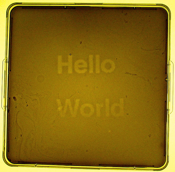
iGEM 2004 UT Austin/UCSF Team. Hello World bacterial photograph. 2005. Photograph by Aaron A. Chevalier.

Wondering where we’ve been? We’ve been busy. We went through piles of recommendations and research to decide on the works we would like to introduce, and they are finally being installed here at MoMA. The official Talk to Me website is also in its final stages of development and will launch officially on July 24. In keeping with the spirit of Talk to Me, and encouraging the communication between people and objects, both the exhibition in the gallery, the catalogue and the website harness the power of QR codes and Twitter hashtags. So stay tuned…

 

Posted in Uncategorized | Comments closed

A New Tab, A New Taxonomy

We have looked at hundreds of objects, and we are not going to stop, at least until Registrar threatens a mutiny. We are continuing to add to the queue, and the more we do research, the more we learn about our ideas for Talk to Me. There might be curators that start with a precise, well-cut thesis in their mind. That is not our case, and an important part of our curatorial process is reshuffling how we contextualize and categorize the fruits of our research. We believe in a productive biofeedback, findings reinforcing and redirecting ideas towards and sculpting the thesis.

As a result of our most recent restructuring effort, conducted in order to give the catalogue designers, London-based A2SWHK a sense of the sequence (more about this later), we now have added one tab. The checked tab is still there, temporary as it was, with projects roughly categorized according to apps, communication, interactions, interfaces, liminal spaces, mapping, pets & fairytales and visualizations—because we want to kept track of our progress, in order to adhere to this journal’s mission of transparency and documentation. We have however added our latest list under the who’s talking? tab.  Indeed, arranging the projects based on who or what is doing the talking is very effective.  It may be an object, such as a tiny cardboard robot or the interface of an airline check-in kiosk; it can be your body—a class of objects that we have decided to call I’m talking to you because it includes objects that are designed interact on an intimate level with your own body or with other people. In other cases, it is life that is talking to us, our family, our ancestors, the city we live in, the government, or, the whole world, natural or human-made.  Then there are the worlds that we enter through the terminal of a computer, video game or smartphone that create an extended reality for us to inhabit. Finally, some very special objects, which we have grouped under the double entendre heading, are all about subtext, ambiguity, and open interpretation. It is a category that is hard to define but which holds together well. The objects are subtle in their communication, translating language or ideas through the form they take.

We will use these groupings in the catalogue and there is a good chance that the objects will be organized that way also in the exhibition. Have a look around, and see what you think—this is our way of testing out the research that we have done—designs that fit into our old categories may not do well in the new taxonomy—but ones that didn’t belong in the older groupings may fall right into place.  That doesn’t mean that we necessarily eliminate them—it just means that we are continuously reshaping how we think about what we have gathered.

Posted in Uncategorized | Comments closed

The Object Whisperer: An Interview with Rob Walker

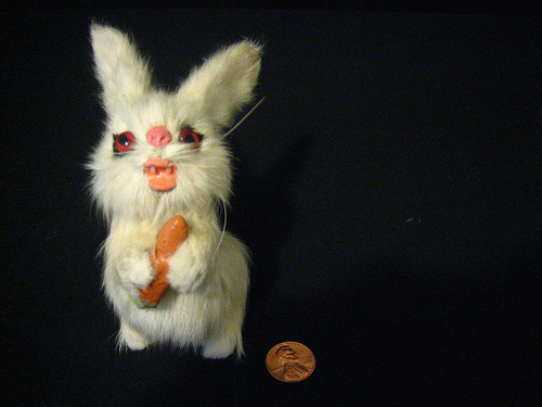
Every Saturday morning, Rob Walker’s Consumed column in the New York Times magazine is my not-so-guilty pleasure. It is always a scrumptious breakfast for thought. Rob is one of the few people I know that can drop into a trance in front of a contorted bunny rabbit, lost amongst flashbacks from its imaginary life.

Rob loves all sorts of objects, of any material (even immaterial) and in any scale, from brands to buildings and from spoons to cities. He also loves to tell their stories, both real—in his Murketing blog, for instance—and imagined.

In his groundbreaking Significant Objects, an online experiment which Rob began in 2009 with Joshua Glenn, great writers ranging from Nicholson Baker to Lydia Millet have given new, dramatic lives to objects the curators had bought for a few dollars at thrift stores and garage sales. The objects then went for auction on eBay to raise funds for non-profit organizations focused on teaching creative writing to children.

Rob’s latest online adventure—currently in the fund-raising phase—is about designing signage for fictional building uses in New Orleans.

PA – Do things actually talk to you, or do you rather kind of read them?

RW – I guess some combination — things call out for my attention 
sometimes. But you can’t necessarily trust what an object says about 
itself, can you? Many objects don’t really want you to know their 
material or labor back story, or the potential unpleasant consequences 
of their use. They just want you to know their features and their 
beauty, the usefulness and their appeal. So once some interesting 
thing has my attention, it’s more like trying to read it. The 
interesting objects are usually the ones open several readings.

PA – How did Significant Objects come about?

RW – I broke a coffee cup. It had no rational market value — but I was 
very upset about breaking it, because it had great value to me. Why? 
Because of the personal story attached to it.

Marketers, and designers too, often claim to understand the underlying 
idea here: That stories give meaning and value to objects. However, 
they often think that this means they can add meaning and value to 
object by telling stories about how it was made, or designed, who 
created it, what they were thinking about, what the process was, and 
all that.

This is flawed. The stories that matter do not descend from object 
creators. They are imposed by object owners.

That line of thought made wonder: What if you imposed completely 
invented stories upon objects? It’s a line of thought that actually 
obliterates the designer, actually. But in the case of my coffee mug, 
I don’t care who created it or why; what I cared about was how it 
happened to intersect with the narrative of my life.

Joshua Glenn edited a wonderful collection of essays called Taking 
Things Seriously, all about personal stories adding value to unlikely 
objects, in real life. I figured he would be the perfect collaborator 
to take a step in a different direction: Inventing stories about 
things, and measuring how that affected their marketplace value.

And so we ended up working with more than 200 writers, inventing 
stories about random junk we bought at yard sales and the like. We 
sold the stories & objects together, on eBay. In the original 100-
story experiment, we sold $128.74 worth of thrift-store junk for 
$3,612.51, proving our point. Then we did another 100 stories, for 
charities, with even better results. And we still do small batches of 
stories/objects — in fact the next group will be part of the first-
ever live Significant Objects event, part of Litquake in San Francisco.

PA – You knew this was coming: do you have a favorite object?

RW – Yes, it’s hard to answer and I give different and inconsistent 
responses when I’m asked this. One answer is my wedding ring, but the 
problem with that answer is that there isn’t a great to elaborate on. 
So here’s another answer. There’s a book I have that used to belong to 
my father — it’s called A Handbook For Writing, and it’s just an old 
textbook, with a very plain cloth cover. On the back, my father, as a 
bored student evidently, drew a picture of a Bugs Bunny-like rabbit. I 
was absolutely thunderstruck by this when I first encountered it. I 
was a sullen twelve years old or so, and I couldn’t believe that a) 
here was evidence of my father, a very upright fellow, having goofed 
off, and b) the drawing is quite good. His primary professional 
interest was (he’s retired now) engineering, and I ‘d never thought of 
him having an “artistic side,” per se. So this object, because of how 
he’d altered it, had the effect of opening up a different side of him, 
and simultaneously opening up this whole mystery — the mystery of 
what your parents were like before you existed, which is a difficult 
thing to comprehend at age 12. Anyway I took this book with me at some 
point and never gave it back. From time to time I take it off a shelf 
in my office and look at it. It still fascinates me.

PA – Which famous object (dead or alive) do you dream to have dinner 
with?

RW – I love this question. I don’t know what this says about me, but my 
immediate thought was: a nuclear bomb. Aside from being a dangerous 
date, and a real head-turner — an object to be seen with — I am by 
nature drawn to wallflowers, and in the context of the great design-
conversation party, not many people want to chat up weaponry. But as 
design objects, weapons are actually fascinating, I think. If one 
wants to talk about a “paradigm shift” object, well, tablet-style 
computers are interesting — but the Predator drone is mind-bending. 
Same thing with the recent emergence of malware as a weapon. (Maybe 
that’s not an object, but there is a form information design involved, 
I would say.)

 Anyway, the nuclear bomb is a particularly iconic weapon. Or maybe 
iconic is the wrong word, because it’s an object we hear about, but 
seldom see. I assume there must be quite a variety of shapes and sizes 
for nuclear weapons at this point (perhaps even the much-discussed 
”dirty” nuclear bomb exists in prototypes?). Maybe this is a class of 
object that people would prefer not to think about, let alone look at. 
Still, this is my answer.

PA – Do you think that technology has improved our communication with 
things?

RW – This is a very hot topic right now, as you know — there’s a lot of 
speculation about an “Internet of Things” and what that will mean, 
whether Bruce Sterling’s idea of the fully communicative objects that 
he gave the name “spimes” will become a reality, or are becoming a 
reality right now.


 On the other hand I would point out that many of our objects are more 
opaque than ever. Computers and their various descendent devices are 
an example others have written about — they’re easier than ever to 
use, but most of us have no idea how they really work. (And that’s 
largely the result of design decisions, because ease-of-use sells.)

 I think the question to think about here is what do we want to know 
from, or about, things — and who will decide what information will be 
available and what will be obscured? I just did a column recently, 
wondering if any of my Apple devices might have come from the Foxconn 
factories where there was an unusual wave of suicides. There’s really 
no way of knowing for sure.

PA – Does instilling meaning in an object automatically up its 
financial value?

RW – In Significant Objects, our participating writers gave invented 
meaning to objects, and their financial value increased. But right in 
the middle of that project I happened to go to an estate sale, which 
is an interesting place to contemplate what it means to “instill” 
meaning in a thing: Clearly all this stuff had meaning to whoever had 
died and left it behind, but the financial value assigned to it by 
bidders was very low. Meaning comes and goes, and more often than not 
comes from us and our life stories.

PA – How do you think consumerism is changing because of limited 
financial and environmental resources? Do you see people wanting 
more narrative and background on what they buy—really weighing what they choose to spend money on, or have in their home?

RW – I’m conflicted about this. Part of me is very skeptical about all the 
trend stories that pick a few anecdotes and make a huge claim about 
how we’re changing. There is some evidence on this front, but it’s 
more selective — some people are cutting back more out of fear, or 
lack of choice, than a new ideology. Others are putting more emphasis 
on low price above all else, which is you know may not always lead to 
the most ecologically sound choices. And even for those who are 
rethinking in a real way, there’s still a long way to go.

But even as I say all that — one of my other side projects is 
actually called Unconsumption. The centerpiece of that is a Tumblr 
blog that I contribute to, with five or six other volunteers, trying 
to highlight upbeat and positive and useful examples of reusing and 
reducing, and just generally rethinking material culture. (We’re also 
working on a wiki, though that is coming more slowly.) This was a 
spinoff from a column I did a couple of years ago in which I 
essentially asked: Can get ridding of stuff feel as good as acquiring 
it?

PA – We are seeing a lot of nostalgic aesthetics mixed in with high tech as we research for TTM (like a digital camera outfitted to look 
like an old one, with real buttons to push, or an iPod case made out 
of an old walkman, etc.) what do you make of this “post-digital” aesthetic? Is it a shortcut for establishing meaning?

RW – I think that’s a pretty good way to summarize it actually. Sometimes 
these gestures are chalked up to “nostalgia” or described as “retro 
chic,” but I think that’s too simple. I did a column not long ago 
about digital technologies designed to mimic analog-era flaws — I 
more or less argued that imperfections imply character. It’s like 
buying pre-torn jeans, or a table that’s been “antiqued.” I don’t know 
if these things really establish meaning, but they at least suggest 
meaning. And that seems to be the point.

PA – Your column on the New York Times Magazine is the only bona fide 
design criticism column in our newspaper of record (yes, we know, 
they do not want to be called that way anymore but until they cover 
design better, I will use this term). And the NYT is not the only 
publication that is guilty of this neglect. Why don’t Americans 
consider design as important as art, dance, or literature?

RW – I don’t know that I would call what I do design criticism; design is 
one thing that comes up and that I enjoy thinking about. And I think 
people enjoy reading about it. I think design is frequently 
intertwined with commerce in a way that makes it seem different from 
”the arts,” and that becomes a stumbling block: Should it be written 
about on the arts page or the business page? Or in a “shopping guide” 
in the lifestyle section? Etc. (Videogames have a similar problem.) 
Another problem, though, is that most design criticism seems to be 
written for an audience of other designers, and too often the agenda 
is sort of celebrating what (to me at least) has become a pretty 
predictable idea of “good design” is. I’m interested in “good design,” 
but I’m also interested in why things like the Snuggie or Crocs become 
popular. I think readers respond to that stuff too. That approach 
makes the column feel pretty far from the arts, but I think it’s one 
way to get at these subjects — by trying to engage an audience on its 
terms, not on the design world’s terms. Still, none of this quite 
answers the mystery. I think there’s actually quite a bit of very good 
design writing out there, and perhaps all it will take is a single 
breakthrough example of some media outlet cracking this code in a way 
that readers recognize as “design criticism,” and then it will quickly 
become an established category.

Posted in Uncategorized | Comments closed

The World of Apps

Illustration by Helga Schmid

Helga Schmid is an independent researcher who has been helping us navigate the world of apps for mobile devices.  With an eye for design and Talk to Me in mind, she shares some of her conclusions below, as a guest journal-er. See the apps we like here, and the ones we haven’t had a chance to digest yet here.

Looking for a Needle in a Haystack
Mobile devices have ushered a new era for consumers and creators who continually re-invent not only the form but also the content.  200,000 apps now and 200,002 in two more seconds.

Two months ago, when I started conducting a research as part of the curatorial team of Talk to Me, the world of apps opened up for me and left me intrigued by the range of possibilities. From fake phone calls, to remembering to buy milk, or navigating through a supermarket, there is an app for everything, guaranteed.  Even if you’ve never even thought of before, chances are somebody has, and it’s already available.

The Device-User-Relationship
In examining the app phenomenon, what is most interesting to me is the change in the relationship between these mobile devices (smartphones or tablets) and the user. It feels as if technology is losing its distance to us.

The devices become personal, social and touchable. Especially the fact that curiosity comes into play–every application has its own interface to be figured out through using and playing with it. It’s the beginning of an intuitive process: the device understands us instead of us understanding the device. The time is gone where we need to read complicated instruction booklets. The simplicity in using these interfaces should enable all our grandparents to be on Facebook and Twitter, to share with us their growing tomato plants in the garden or their interpretations of them.

The Greatness of Limitation
What is also interesting is that many apps can help to organize our lives and save time.  On the other hand we spend time in a way that we would not have before. They are transforming the way we experience life, and how we accept both the mundane moments and the shared moments of the everyday. One great aspect about apps is their limitation in function and content. When we buy a book we know exactly what to expect and how long it will take us to read it. Websites instead have infinite depth and complexity. Whenever we open a site or a link we dive into a new universe.

In contrast, the app has a clear framework and function with a beginning and an end. The difference is that there are thousands of apps but each app itself is clearly defined. For us as users, the hard part is finding the right app that provides us with the exact information or service we want.

The Unfree Flow of Information
Another emerging trend I’ve noticed is the willingness to pay for an application which provides content that is available for free on the web. A user friendly Facebook app for the iPad costs $4.99 why? And, let’s face it, we are talking mostly about Apple products here, which means that one company has the control over the available apps and therefore the content on our devices. Which brings it back to what an iPad and an iPhone are: consumer products that promise freedom and personalization.

The Age of Round Corners
After spending two months researching apps, I saw a project of a young product designer: a cardboard folding play area for kids, called my space by Liya Mairson. My first thought was “that is an iPhone for children to live in!”

However, my impression didn’t prove to be true. The project does express the impact of these products on our daily life and culture. Rounded shapes are received as inventive, young and flexible. Today all these round edged products become the definition of contemporary lifestyle and have an enormous impact on our culture both on an aesthetic and interpersonal level.

We always want technology to loose it edges: we are one step closer to a technology that is a bit more human.

Posted in Uncategorized | Comments closed

Kate’s Walk

Walking Papers is a project designed by Michal Migurski of Stamen Design in San Francisco. I first learned of it at SXSW in Austin when I heard Michal speak on the “Maps, Books, Spimes, Paper: Post-digital Media Design” panel. Paola also heard about it when she visited Maneesh Agrawala in Berkeley last February, and we were recently reminded of it again when we met with Eric Rodenbeck, also of Stamen Design, here at MoMA.   It is a service that uses a combination of wiki-style mapping and pen and paper.  In order to really understand how it works, I tried it out this past weekend.

Walking Papers is an easy way to get information into the free, editable wiki-style map, OpenStreetMap. Basic information—like street names or big colleges and parks, for instance—is already available in OpenStreetMap because of data provided by the city, government and other organizations.  However, there is a lot of useful data missing, especially amenities like post office boxes, ATMs, restaurants, supermarkets, coffee shops and Laundromats.  It’s this detailed street level surveying that Walking Papers allows you to do without needing expensive equipment or having to be too tech-savvy.

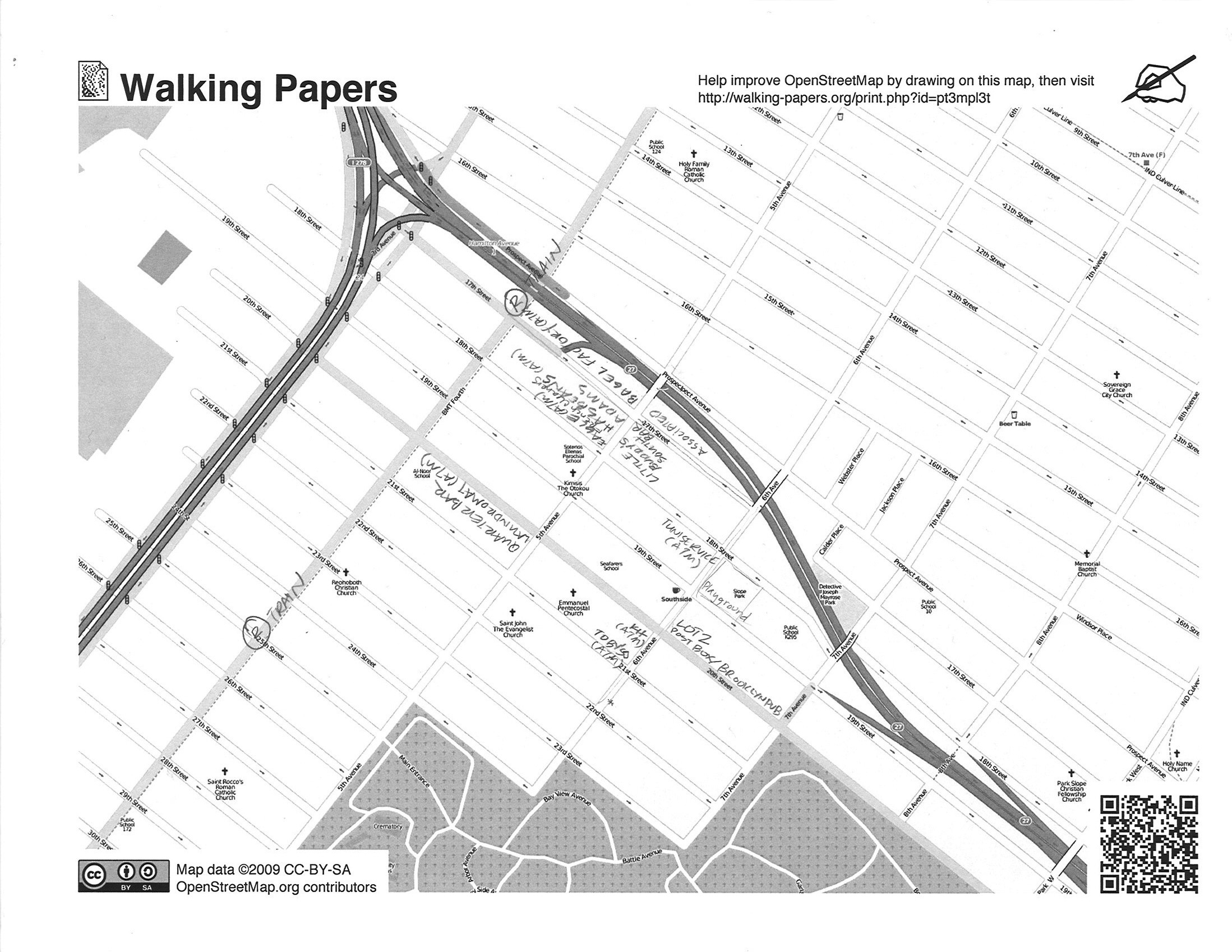
How does Walking Papers work? On the site, you select the area you wish to map, and the software automatically formats the area you choose for printing and tags the area with a QR tag.  You then take to the street, penciling in data as you go.  I chose to map my walk to the train every morning, through South Slope Brooklyn. I printed out this blank map (part of the charm of the Walking Papers site is that you can see who has made prints, how recently, and where they are from.  Today there seems to be a lot from Germany, some from Ireland, France, Ethiopia and Sweden) and went for a walk.  I filled in the subway stops, playground, restaurants, bars, coffee shops, ATMs, post boxes, supermarkets and liquor store I came across.  Here is my map (clicking on it makes it bigger):

My walk to the R train

I then scanned (if you don’t have a scanner, you can send it to them, via snail mail, and it will get scanned and uploaded eventually) and uploaded my map via the Walking Papers site.  With the help of the QR tag and Flickr, it knows exactly where to position it in OpenStreetMap.  The map-editing window is displayed directly over my hand written map, so I can trace my findings directly into OpenStreetMap (you do have to sign up for an account with OpenStreetMap, but that is painless).  Here is the finished portion of South Slope that I mapped (you have to zoom in a bit to see the changes that I made).  It is definitely addicting, and I spent a fair amount of time arranging a particular post box, trying to reflect, as accurately as possible, on which exact corner of the intersection it is. As my coworker said, we have “definitely fallen down the rabbit hole that is OpenStreetMap.”

Since I am not a professional cartographer, I did have a little trouble—some of the things I entered did not show up in OpenStreetMap—this was not the fault of Walking Papers, it seemed to be OpenStreetMap. (It may have, in fact, been human error.  But if there is anyone out there who is an experienced OpenStreetMapper—and you have an idea why my ATMs aren’t showing up—let me know.) What is great is that you can also see other people’s scans, from when and where, and Michal has broken down the stats for us in a well-designed way (we have come to expect no less from Stamen).  There are definitely a lot more people printing out there than scanning, so do your own, but be sure to scan and upload it.  It’s a big world out there, and your corner of it needs illuminating.

Why is it good for Talk to Me? Walking Papers is an interface that has made a complex process—digital mapping—and a democratic service—OpenStreetMap—clear and even more approachable by re-designing the process and technology that is needed to map detailed areas.  Walking Papers has harnessed the power of the communication tools already at our disposal to collect data, from all over the world.  It helps us to easily visualize areas that had no way of being mapped before; it’s varied applications are now being recognized. Walking Papers has proven useful in disaster situations, in Haiti, for example, when the existing mapped infrastructure was suddenly destroyed.  Camps, hospitals, and what is left can be charted in a matter of hours with a printer, scanner, and an army of helpers equipped with pens and paper.  It has also proven useful in unexpected situations—Eric told us about a sociologist working at a high school who is using Walking Papers to have students map out where certain cliques hang out in the school yard—a useful tool for navigating the complex social life of American teenagers.

Posted in Uncategorized | Comments closed

A Day in The Life

Today we’re kicking off a series of posts entitled A Day in Life, in which we will invite guests to describe a typical day of interactions with objects. We’re starting with Talk to Me “youth advisor” Frankie Michel. Frankie is a student at Bronx Science in New York, and is helping us with research for Talk to Me. As a representative of the first generation that has grown up in a completely digital world, she provides an immensely valuable perspective. Besides this first post, she will also write about how technology is viewed and used by her and her friends in their daily lives.

My Interactive Day 1: Frankie Michel

I wake up in the morning, and the only thing that gets me out of bed is turning on music that I really like.  One of my favorites is “In the Flowers” by Animal Collective.  I listen to all my music on my computer, a Mac Book or my iPod, and get it all from iTunes.

Before I leave my house I check my BlackBerry because my friend Jordana texts me to tell me where the school bus is so I’m not late.

I arrive at school around 8:00 AM and I have to swipe in with my student I.D.

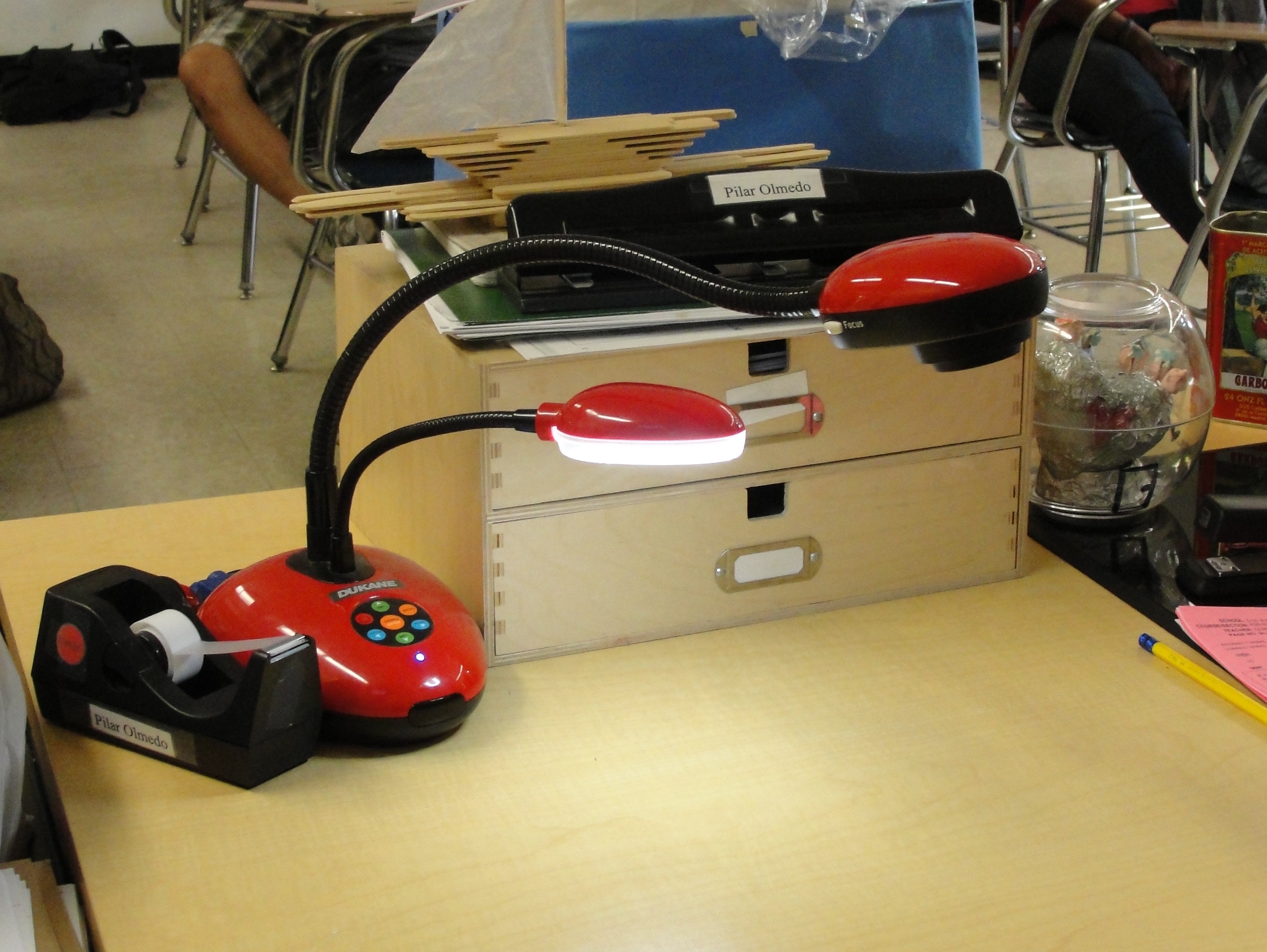
A Flex Cam in Spanish Class

In all of my classes there are machines that teachers can use called Flex Cams. They are little cameras that the teacher can direct at a handout and the image gets projected onto the board so the whole class can see it. We also use them to watch movies.

In Physics class we learned about magnetic field lines, by doing a really cool experiment where we put a magnet on our desk and then put a sheet of paper on top of it. We then sprinkled little shards of iron onto the paper and they made a pattern that showed where the magnetic field lines were.

When I am bored in Spanish class my friends Max and Jackson play a game with me where we divide a piece of paper into three sections. The top section is for someone to draw a head, the middle is for another person to draw a torso, and the bottom is for a third person to draw the legs. No one is allowed to see what the other people drew until it’s finished.

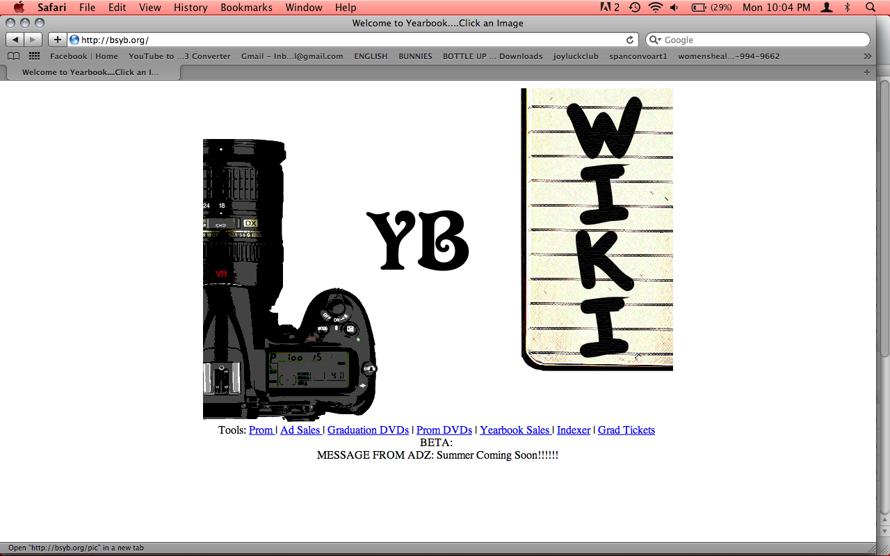
I’m one of the yearbook designers and photographers, so I take lots of photos around school of kids during lunch, sporting events, Earth Day and other things. We also have a yearbook website for our yearbook staff, where we can all share articles and photos, I use it all the time. I also help my yearbook teacher make posters using Photoshop on one of our school’s computers.

Our Yearbook Page

I take the subway home and always swipe my Metrocard at the turnstile.

When I get home I go on Facebook and see who’s posted on my wall. Maybe one of my friends has posted a video, or I play Robot Unicorn Attack. I also often look at interviews of people I’m interested on YouTube, bands I like or celebrities I’m interested in. One time I looked up an  Aldous Huxley interview when I was reading his book Brave New World for school.

I usually watch movies and TV on my computer, because I buy them on iTunes. the most recent movie I watched was Drugstore Cowboy and I loved it. One of my favorite TV shows is True Blood which is on in the summer.

Here’s a cool video I like. It’s of this guy, Reggie Watts, who posts videos on YouTube of himself beatboxing, using a machine to play back the different noises he makes.

I make mixed media art pieces. I paint with acrylic paint on canvas, and often paste on cutout images of artwork from old Sotheby’s art books that my upstairs neighbor, who works there, gives to me.

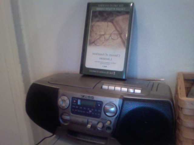
Dad's Casette Player

I like to read literary essays and poems in old books that my dad shows me from his many books. He’s also slightly obsessed with listening to historical cassette tapes he bought, that are recorded lectures from college professors on literature, and different events in history. He has a tape player and I often listen with him when he plays something that relates to my A.P. U.S. History class, or an author I might be reading for English.

Posted in Uncategorized | Comments closed

Meeting with Designer James King

Paola and I met with speculative/critical/experimental/wonderful designer James King while he was in New York—he is based in London.  It was great to get caught up on what he has been doing since his contribution to Design and the Elastic Mind two years ago. James’s work in biotechnology and interaction design is really interesting, and we especially liked the E. Chromi project that he realized with fellow designer Alexandra Daisy Ginsberg and Cambridge University’s iGem Team (International Genetically Engineered Machine competition, a unique showdown between synthetic biologists held yearly at MIT in Cambridge, Massachusetts).  You can read all about it on the website, but to summarize: James and Daisy worked with students of synthetic biology at Cambridge to envision future uses for a biological technology that they have developed—colorful E. coli bacteria that can be engineered to react to chemicals in the human body.

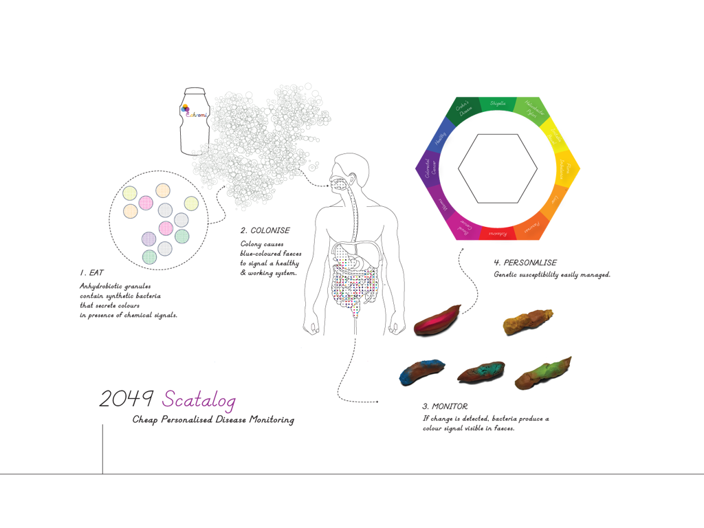
The E. chromi cycle. Image courtesy of James King and Daisy Ginsberg

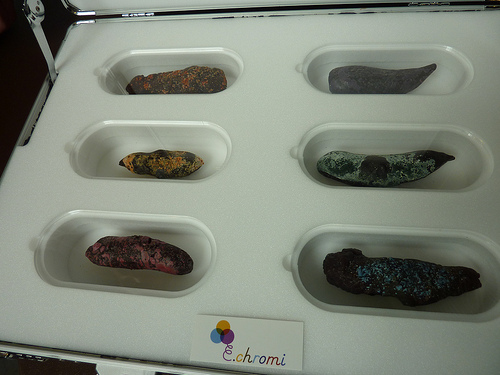
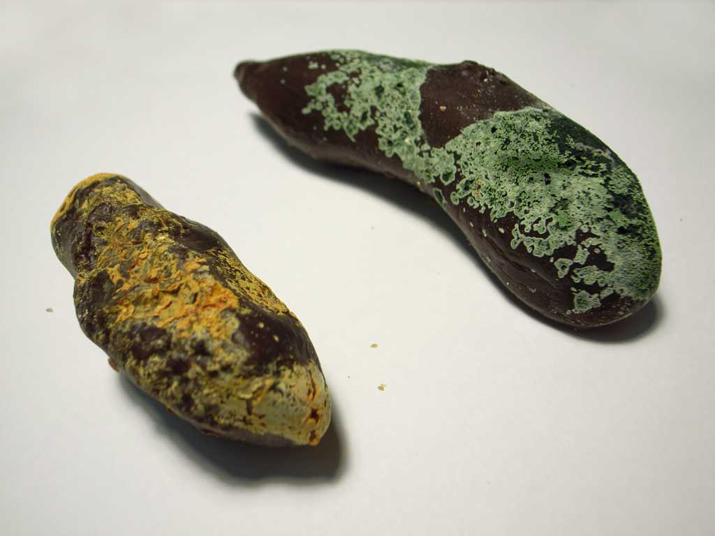
For example, a test subject would ingest a drink with the E. Chromi (their re-named organism) in it, like a probiotic shake.  The bacteria would react with chemicals in the GI tract, and turn a certain color if there is disease or infection present.  The output of the body would then signify what is going on inside–in other words, the color of the patient’s feces would signal what state of health the patient is in.  To get this concept across, James and Daisy developed a Scatalog—a collection of samples that presented the potential applications of E. chromi in immediate terms.

The Scatalog. Image courtesy of James King and Daisy Ginsberg

So how does color-changing bacteria fit in with Talk to Me?
Good question!  It would be a little creepy if the end result was actually “talking to us” in this specific case. What we are looking at here is how the designers allow us to access complex networks and systems and make results immediately understandable—what could be more complex than the inner workings of the human body?  How do we apply this new technology of color-changing E. coli? The designers are able to make all of this immediately comprehensible to anyone—the interaction of the E. chromi organisms with the patient’s system present an immediate response that fits in with the visualization category of Talk to Meseeing is understanding. And what could be more understandable than colorful, ahem, “output”?

Scatalog Samples. Image courtesy of James King and Daisy Ginsberg

Posted in Uncategorized | Comments closed

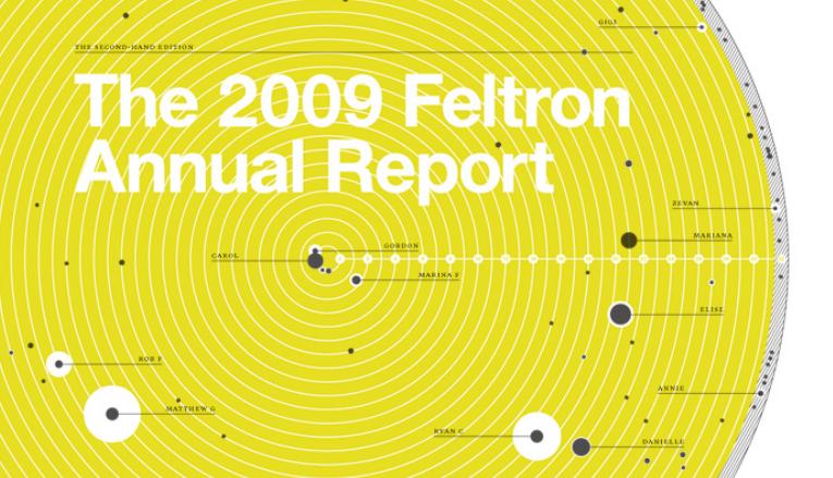
The 2009 Feltron Annual Report

The 2009 Feltron Annual Report © Nicholas Felton

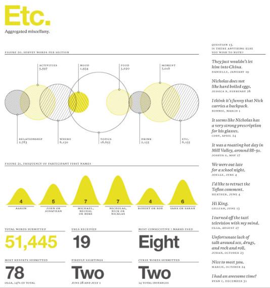
For every person with whom Nicholas Felton had a “meaningful” encounter in 2009, he asked them to answer an online survey about their meeting. The only requisite is that the encounter was face-to-face and substantial enough so that the person could report about his personality and habits. The resulting product of his year of data is compiled in the elegant visualizations of the 2009 Feltron Annual Report. While Felton spends much of his time analyzing and visualizing data for journals and companies, his annual reports, produced since 2005, tackle different research scopes each year. Each one communicates, in a quantitative way, about his personal experience.

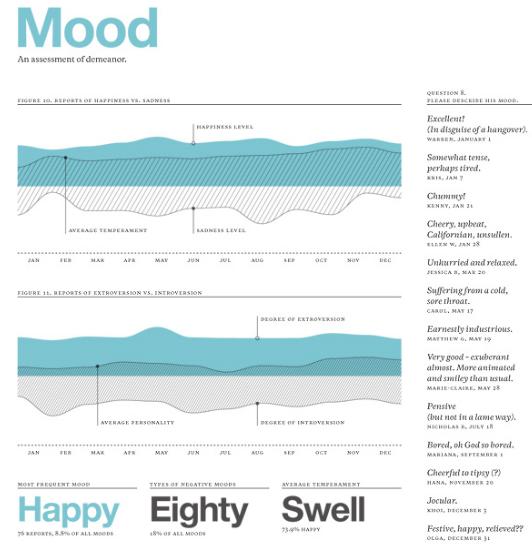
The collected data for 2009 ranges from facts to more subjective material, for example, where he went, what he drank and even his frame of mind. In the category, “Mood: An assessment of demeanor”, he projects his temperament during the encounter along a happiness and sadness scale. From his 179 distinct relationships, such as Dentist, Friend/Esteemed Colleague, Statistic, Ex-wife and Grill Master, they reported his state of mind: “Earnestly industrious,” “Unhurried and relaxed,” “Pensive (but not in a lame way)”. Through the Annual Report, we are able to visualize relationships that are deeply personal, yet presented in an objective way.

The 2009 Feltron Annual Report © Nicholas Felton

It’s not surprising that Felton made his first Annual Report in 2005, a year after Facebook and a year before Twitter. Many of us produce and consume endless Internet feeds, tweets and updates, however where does all the data go? Felton investigates this question to an extreme logical end. In the spirit of open-source software, he also welcomes anyone else to use his interface for their own data.

The 2009 Feltron Annual Report © Nicholas Felton

In researching for Talk to Me, we are looking for projects that innovate and address new problems through design. Felton has designed a way to understand the outputs of ubiquitous online culture. He re-imagines facts into elegant visualizations, printing limited edition series that revert to old values of craftsmanship and individuality. The hand-signed and numbered books remind us that while online is one of our new homes, we still connect on a deep emotional level to traditional interfaces.

We are considering the Feltron Annual Report for Talk to Me because it fits our idea of great design: Felton is not only using elegant design to tell an emotional story, but it is also a parody on the corporate Annual Report. By distilling a human being’s emotional state into quantitative information, the visualizations are trying to make sense of how he feels on a given day and along the course of one year. The piece has provoked us to reflect on how we process information.

Posted in Uncategorized | Comments closed

Braun Lectron System

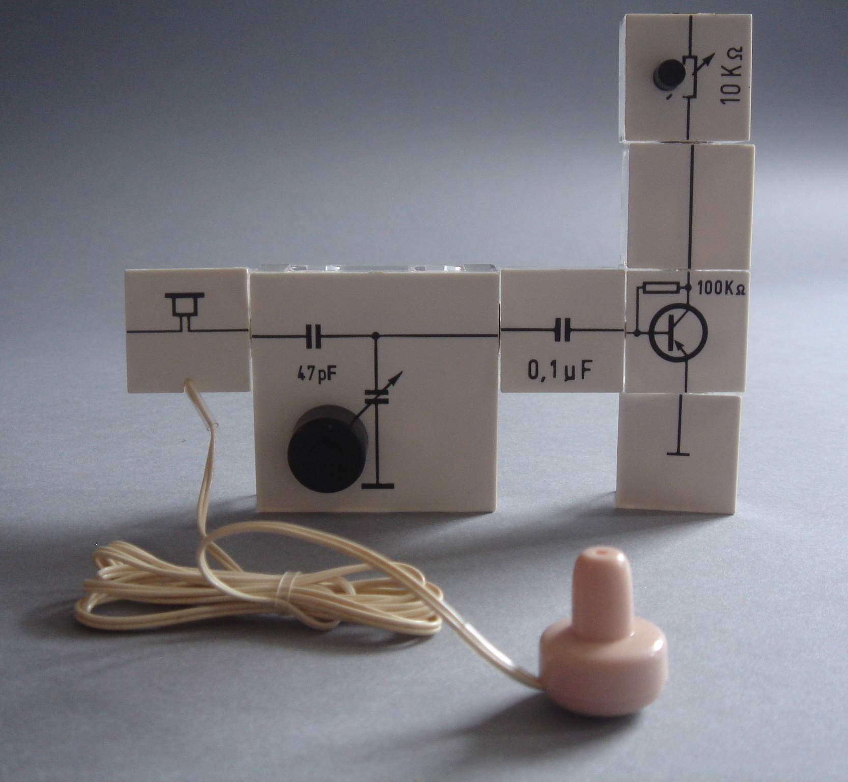
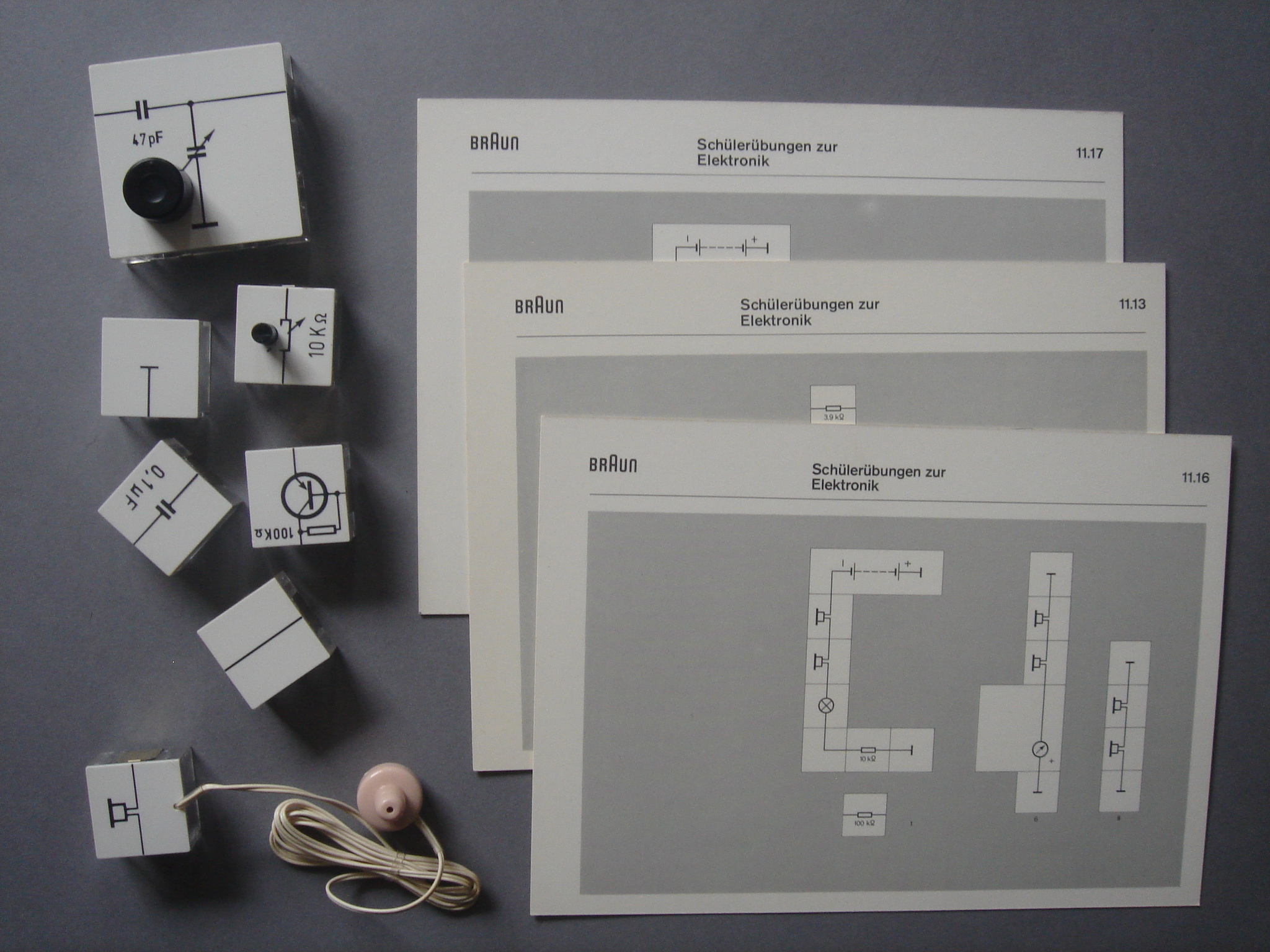
Braun Lectron System, Georg Greger, 1967-69

Georg Greger designed the Lectron System (1967- 69) as a teaching tool for use in schools and universities. It is made up of a large range of little bricks, like dominoes, that magnetically connect to one another. Once the blocks are organized on a conductive plate, they can form a variety of functional circuits. See this great article on it from a 1967 issue of Electronics Illustrated, where they discuss “what a drag” it is to make your own circuits, but “now it can be as much fun to put electronic circuits together and to learn fundamentals as it is to put words together when you play Scrabble.”

The purpose of the system was to dispel the mystery of electronics by encouraging children to engage in the construction of their own operational systems –light meters, electric thermometers, tone generators, transistor radios, transmitters, etc. Most of the blocks have transparent plastic walls through which the electronic component housed can be directly observed, whilst the blocks upper surface is printed with the diagrammatic icon corresponding to its contents.  It also came with a “recipe book” of different experiments to try with the included set of circuit “dominoes.” It is an early attempt to get children interested in learning about physics, electricity and physical computing, a sort of “erector-set” for tiny electrical engineers.  It is remembered fondly by those who were able to play with it growing up.  According to some sites, Lectron (which hasn’t been produced by Braun since the mid 1970s) is still in development (if you know German you can read about it here), but only for limited use.

Cards from the Braun Lectron System, 1967-69

Talk to Me will rely on few germinal historical examples such as this to set the stage for contemporary practice. Lectron represents one of the major ideas at the root of the exhibition: making the invisible visible, the technical understandable, the educational playful, and communication clear and elegant.

Many thanks to Michael Maharam for alerting us to this great piece, and a special thanks to Michael Peters for helping us set the record straight regarding the original creator of the Lectron System, Georg Greger.

Posted in Just In | Comments closed