I find that the process of many design jobs is a journey between two extremes, both of which are usually to be avoided, but if you strike the right balance, you end up in some interesting places. Finding the graphic identity for the exhibition Counter Space: Design and the Modern Kitchen</a> was a classic example.
Posts tagged ‘graphic design’
MA at MoMA
While we always believe in the works we propose for addition to the MoMA collection, some works stand apart in extraordinarily strong ways. They speak to us because of their great historical significance, aesthetic power or, in my case with the above poster, because of true love.
MoMA by Hand
Taking a Hammer to Modern Design: Jordi Canudas’s Less Lamp
I love Jordi Canudas‘s Less Lamp, seen in the video above—a super playful and no-nonsense approach to the business of bringing light into a space. Assuming that the primary purpose of a light fixture is simply that of casting light, you can’t get more explicit than a bulb, a hanging cord, and a shade to cut the glare and to reflect and amplify the light.
Protect Me from What I Want
In previous posts we’ve showcased exhibition and wayfinding graphic developments and looked at interesting ephemera created by the Graphic Design department throughout MoMA’s past. This post is about a much more humble, but extremely important, type of design: the warning sign. These signs are created for a wide range of purposes—to prevent overcrowding in the galleries, to prevent damage to the artwork or Museum spaces, to alert people about potentially controversial artworks in the galleries, etc.—and they represent a collaboration between Graphic Design and the Curatorial, Legal, Visitor Services, and/or Education departments. Some signs, such as room-capacity notices, are required by law; others, such as the “warning” notices at the entrance to the Marina Abramović exhibition, are more of a courtesy. They all have one thing in common: they’re designed to make sure each guest has a safe and fun time at MoMA. The slide show above includes just a few of the signs we’ve made over the years. Enjoy… at your own risk!
Art/Work: MoMA’s Creative Minds: Claire Corey

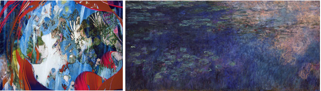
Left: Claire Ellen Corey. Cove. 2009. Archival inkjet on canvas. © Claire Ellen Corey. Right: Claude Monet. Water Lilies. 1914-26. Oil on canvas, three panels, each 6′ 6 3/4″ x 13′ 11 1/4″ (200 x 424.8 cm), overall 6′ 6 3/4″ x 41′ 10 3/8″ (200 x 1276 cm). The Museum of Modern Art. Mrs. Simon Guggenheim Fund
Many of MoMA’s employees aren’t just guardians of the Museum’s collection: they are artists in their own right, and have found inspiration for their own work through their engagement with artwork shown at MoMA. Our jobs do sometimes force us to hurry by breathtaking works, with no time to let their power wash over us. But at other moments—whether retouching a paint job, placing a wall label, or installing a work of art—we find ourselves alone, in empty galleries, confronted with some of the greatest works of art made in the last century. This new series of blog posts will focus on a few of MoMA’s many employee/artists, and will address the ways in which they have incorporated their daily work experiences into their own artistic processes.
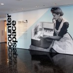
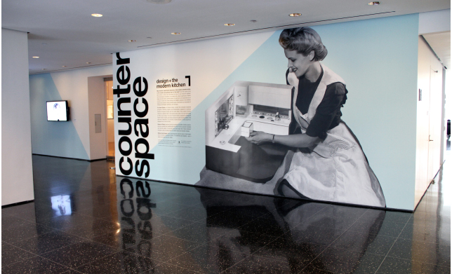
As Production Manager in the Museum’s department of graphic design, Claire Ellen Corey produces various components of many of MoMA’s exhibitions, installations, and marketing campaigns. Outside of her duties at MoMA, she’s also a painter, a practice that has been informed time and again by all she has learned within the Museum. In fact, Corey combines techniques of painting and the tools of graphic design to create her multilayered paintings, ultimately producing her final image on an ink-jet printer.
Magnetic MoMA: A Graphic Look at Shape Lab

The yellow shapes are movable magnets, which can be repositioned to fit into the small forest scene at bottom right. Photo by Michael Nagle
When we first met with the educators from MoMA’s Education Department to discuss the Shape Lab installation, we knew instantly that this project had to be FUN for us, the designers—and that FUN needed to be part of the design for the visitors.
Shape Lab is an interactive educational space for families. The educators’ intention for this space is to encourage visitors to interact with the space and explore the different ways artists use shapes in painting and sculpture. The space was filled with interactive tools and furniture, educational toys, art books, and shape learning activities. The original project request was to design an identity for its title wall. Instead, we designed a multifunctional activity wall, which both communicates its message and functions as a fun learning game.
3D Burton: Shadows and Reflections

Three-dimensional rendering of the entrance to Tim Burton (left) by TwoSeven, Inc., based on an untitled drawing (right) by Tim Burton for the unrealized project Trick or Treat (1980)
Tim Burton was one of the most challenging exhibitions our graphic design department has had the pleasure of fully developing. It explores a wide spectrum of Tim Burton’s creative work, including drawings, paintings, photographs, moving images, concept art, storyboards, puppets, maquettes, costumes, and cinematic ephemera. For the exhibition graphic design, our goal was to take all these diverse visual references and distill them into a simple graphic treatment that celebrated Burton’s work.
Different Strokes: Custom Alphabets Help Us Introduce Audiences to Artists

Left: "A" from alphabet created for Tim Burton exhibition graphics; Right: "A" from alphabet created for Marina Abramović exhibition graphics
What’s so special about a “special” exhibition? For us, MoMA’s graphic designers, they’re special enough to require their own unique graphic identity, and oftentimes a unique identity is all in the letters. For two very different shows now on view at MoMA, Tim Burton and Marina Abramović: The Artist Is Present, we created two very different title typefaces.
Rediscovering The New Typography
When I got off the elevator at the Architecture and Design department for a quick meeting with Juliet Kinchin about a new exhibition she was curating called The New Typography, I was surprised to see some original posters from the 1920s lined up along a wall, and many tiny pieces of stationery systems, brochures, flyers, and ads carefully spread out on a table. We don’t usually get to see the real artwork until just before the show, when installation is underway, and until then, we use exhibition catalogs or digital images for reference.
I felt like an anthropologist in the presence of an early human ancestor. As a graphic designer, I could relate to these pieces more than any other art I had worked with at MoMA. These ninety-year-old posters communicated loud and clear, and still looked amazingly cool. But when I took a close look, their difference from contemporary graphics was apparent: these works had a hand-crafted feel—a beautiful contrast to the clean geometry of the layout.

From left: Theo H. Ballmer. Neues Bauen (New building). 1928. Poster for traveling exhibition of the Deutscher Werkbund. Offset lithograph. Gift of The Lauder Foundation, Leonard and Evelyn Lauder Fund. Walter Dexel. Fotografie der Gegenwart (Contemporary photography). 1929. Poster for an exhibition in Magdeburg, Germany. Linocut. Gift of the designer. Walter Dexel. Die Sport Ausstellung Magdeburg (Sport exhibition Magdeburg). 1929. Offset lithograph. Special Purchase Fund
If you are interested in reproducing images from The Museum of Modern Art web site, please visit the Image Permissions page (www.moma.org/permissions). For additional information about using content from MoMA.org, please visit About this Site (www.moma.org/site).
© Copyright 2016 The Museum of Modern Art


