
When I got off the elevator at the Architecture and Design department for a quick meeting with Juliet Kinchin about a new exhibition she was curating called The New Typography, I was surprised to see some original posters from the 1920s lined up along a wall, and many tiny pieces of stationery systems, brochures, flyers, and ads carefully spread out on a table. We don’t usually get to see the real artwork until just before the show, when installation is underway, and until then, we use exhibition catalogs or digital images for reference.
I felt like an anthropologist in the presence of an early human ancestor. As a graphic designer, I could relate to these pieces more than any other art I had worked with at MoMA. These ninety-year-old posters communicated loud and clear, and still looked amazingly cool. But when I took a close look, their difference from contemporary graphics was apparent: these works had a hand-crafted feel—a beautiful contrast to the clean geometry of the layout.
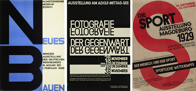
From left: Theo H. Ballmer. Neues Bauen (New building). 1928. Poster for traveling exhibition of the Deutscher Werkbund. Offset lithograph. Gift of The Lauder Foundation, Leonard and Evelyn Lauder Fund. Walter Dexel. Fotografie der Gegenwart (Contemporary photography). 1929. Poster for an exhibition in Magdeburg, Germany. Linocut. Gift of the designer. Walter Dexel. Die Sport Ausstellung Magdeburg (Sport exhibition Magdeburg). 1929. Offset lithograph. Special Purchase Fund
Once the show had opened, I often returned to the gallery, wondering what it was like being a graphic designer in the 1920s. I decided to ask Juliet some questions.
While standing in this exhibition, off to the left I see posters in the International New Art section that precede the ones in The New Typography by about thirty years. They couldn’t be more different.
That’s certainly true. Just look at the difference between the way Jules Chéret in 1893 and Max Burchartz in 1928 handle posters related to modern dance. Chéret concentrates on creating an impression of the dancer’s shimmering swirling dress, whereas Burchartz uses an integrated combination of type, photography, and solid color to enhance the dancers’ dynamic poses.
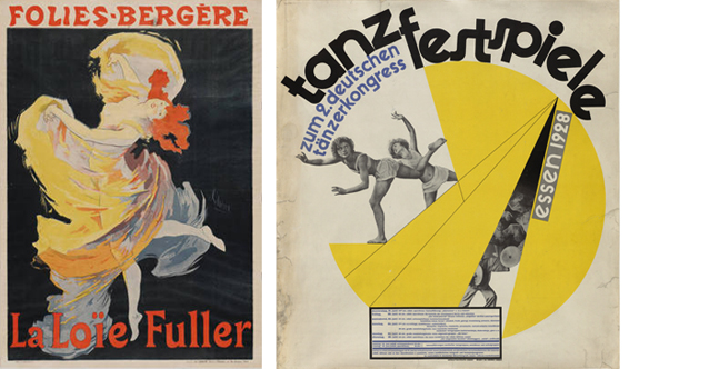
From left: Jules Chéret. Folies-Bergère, La Loïe Fuller. 1893. Publisher: Folies-Bergère, Paris. Printer: Chaix. Lithograph. Acquired by exchange. © 2010 Jules Chéret/Artists Rights Society (ARS), New York. Max Burchartz. Tanzfestspiele (Dance festival). 1928. Poster for the Second German Dance Congress, Essen. Letterpress and gravure. Purchase Fund, Jan Tschichold Collection
The New Typography developed from Constructivism and uncompromising geometrical abstraction. For the first time, designers really begin to see the poster, the magazine cover, the advertisement as a blank sheet on which they could move all the elements around, invariably in an asymmetric composition. What makes the New Typography a more mature kind of graphic design than the artistic posters of the 1890s is the way they combined slabs of flat color, photography, printers’ “guide lines,” and standardized letter forms or body text. The overriding concern was to clarify the visual and verbal communication of meaning on a number of different levels.
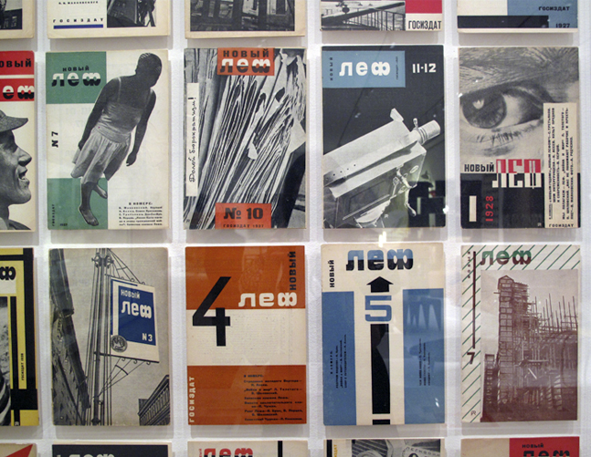
Installation view of LEF (Left front of the arts) magazine covers. 1928. Aleksandr Rodchenko. Letterpress and photolithography. Jan Tschichold Collection, Gift of Philip Johnson
The exhibition shows posters and graphic works from Jan Tschichold’s personal collection, including some of his own. Did Tschichold know the other designers whose works are in this exhibition personally? Did they exchange ideas?
He knew many of them personally because they had corresponded and met at various congresses, exhibitions, and events around modernist design, and of course he illustrated work by many of them in his lectures and his groundbreaking book of 1928, Die Neue Typographie (The New Typography). In fact, Tschichold was in regular touch with many of the leading figures of design, art, and architecture of that period—even Soviet Russians like [Aleksandr] Rodchenko and the Stenberg brothers—and avant-gardists in The Netherlands, Poland, Czechoslovakia. He also had a habit of picking up odd bits and pieces of graphic design that he found interesting, without knowing who the designer was.
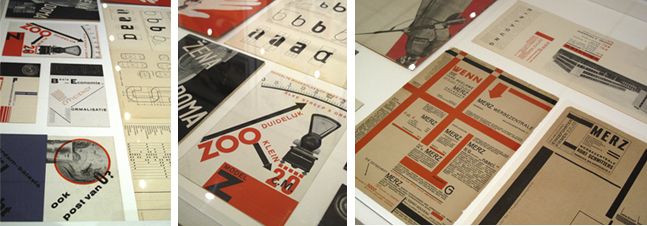
Installation view of The New Typography
Nowadays we go to graphic design school to become graphic designers. How about these guys? What was their background?
Among his contemporary designers, Tschichold is unusual because he was trained as a printer and book designer, so he had a background in the trades, whereas Herbert Bayer, Kurt Schwitters, Ladislav Sutnar, and many others came from an art school background. There was a tremendous buzz around graphics at the time. It was more than a means for artists and architects to earn a little extra cash. It was art that seemed to matter, that could make itself seen and heard almost instantaneously, and on a huge scale, outside the confines of an art gallery or collector’s home. Developments in industrial printing and photomechanical reproduction, the proliferation of printed ephemera, and their international circulation seemed to offer such potential for reforming social consciousness.
I am almost embarrassed to say this, but I can’t help but find the slight imperfections in some of these designs charming. Do you think Tschichold and the others were aware of this?
The funny thing is, I don’t notice the imperfections! What I come away with is an overwhelming sense of his restraint and subtle control of the limited means at his disposal. At the time, Tschichold had a reputation for typographical perfection. He was often referred to by colleagues and contemporaries as “The Master.” By 1937, when he came to design the last poster in our New Typography exhibition for an exhibition of Constructivist paintings in Basel, it is as if he has pushed this reductivist aesthetic to its absolute limit. I’m not sure how effective it was as a poster—it’s almost too refined—but it is a beautiful, ethereal image.

From left: Jan Tschichold. Plakate der Avantgarde (Posters of the avant-garde). 1930. Poster for a Munich exhibition. Letterpress. Peter Stone Fund. Detail photograph of the same poster
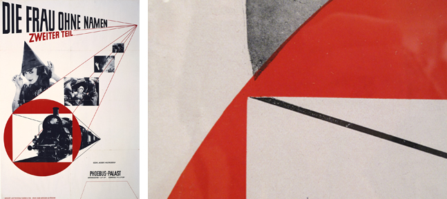
From left: Jan Tschichold. Die Frau ohne Namen (The woman without a name). 1927. Film poster for the Phoebus-Palast cinema, Munich. Photolithograph. Peter Stone Poster Fund. Detail photograph of the same poster
––
Later, when we were working on options for the title graphic, our geometric shapes and type drawn on the computer and printed on a laser printer looked terribly boring by comparison to the 1920s posters. Which reminds me that perfection is attractive, but it is the imperfections that make me fall in love.
Happy Valentine’s Day everyone!