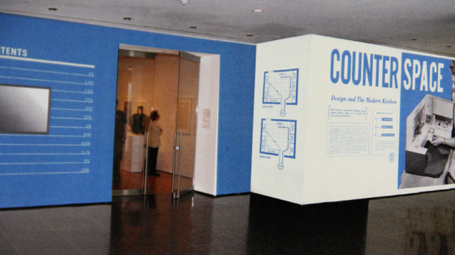
Counter Space: Design and the Modern Kitchen</a> was a classic example. </p>
I wouldn’t call myself a feminist, but when we entered the design kick-off meeting, I noted with a smirk that we were an all-women team working on an exhibition about kitchens. Of course the fact that we were in a conference room, and not meeting around a kitchen table, meant that there was no stereotype here to be worried about.
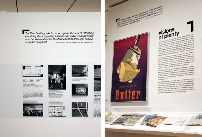
Curator Juliet Kinchin and Curatorial Assistant Aidan O’Connor, the organizers of the exhibition, explained that Counter Space would explore the evolution of kitchens throughout the last century by focusing on three distinct themes. “The New Kitchen” starts in post–World War I Germany, where new housing projects demanded a radical rethinking of kitchens for ultimate efficiency and the rapid industrialization of the 1920s and 1930s gave rise to further design innovations. “Visions of Plenty” examines the dream of the “perfect kitchen” and the rise of (over-)consumption in the 1940s and 1950s, and “Kitchen Sink Dramas” looks at artists’ critical or playful responses to this idealized kitchen culture. The exhibition also deals with the role of women, and the concurrent evolution of the kitchen and women’s place in it—and beyond it. On one hand, you have the idea of the “perfect housewife,” and on the other, professionals like Margarete Schütte-Lihotzky, one of the architects of the Frankfurt Kitchen featured in the exhibition, and Christine Frederick, author of The New Housekeeping: Efficiency Studies in Home Management. We soon realized that the housewife and the architect, the dream and the design, were our two extremes in this design exploration.
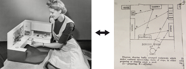
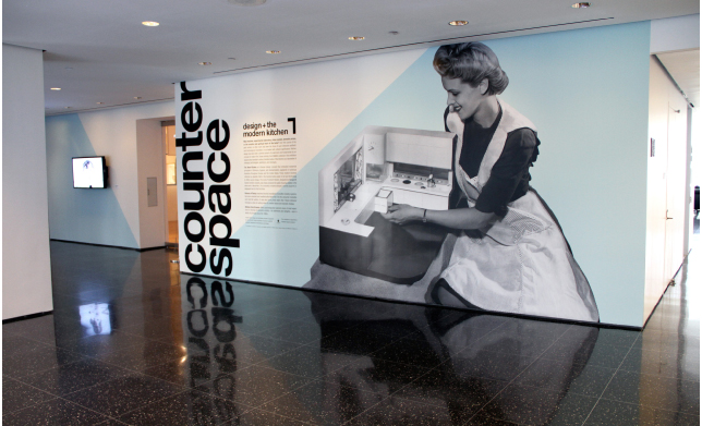
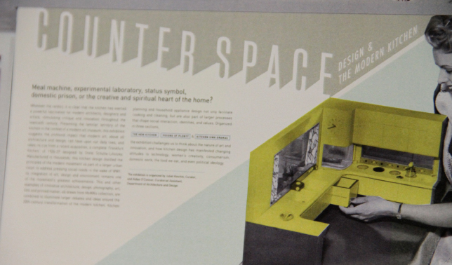
Juliet and Aidan had given us a photograph of a beaming model housewife playing with her model kitchen (above left), with the idea of making it the focus of the title wall. We liked the image, but thought it skewed heavily toward “perfect housewife.” We decided the graphics we added should either embrace this but not be too serious about it, or balance it with elements that referenced architecture.
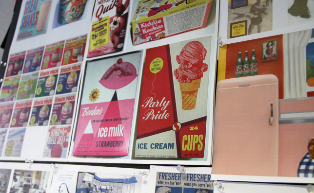
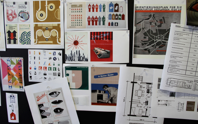
We started by researching 1940s and 1950s food packaging (above) for bright color inspiration and kitchen culture iconography, but we also looked at charts and graphics that spoke to architecture and planning, without being too cold (below).
We decided to silhouette the lady and her kitchen, and started playing with the resulting diagonals to achieve a dynamic composition and color. This is an early sketch, with a very “space-age” title.
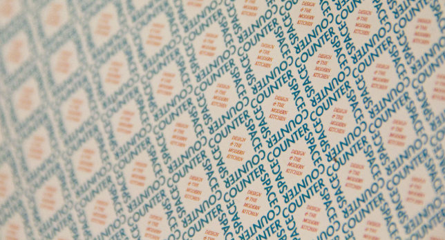
Suddenly in love with 1940s graphics, one of our designers locked up the exhibition title and subtitle in a wallpaper pattern. We used it in the sketch below, but soon realized that with the addition of “cake-frosting” type, we were taking things too far towards “happy homemaker” and the 1950s—even if it had an ironic twist that we liked.
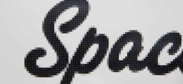
In a last attempt to make the script more contemporary and “rational,” we tried adding a pixel-raster to it, but then discarded this concept altogether.
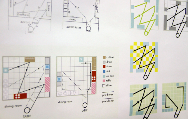
Steering back to the architectural end of the spectrum, we explored ways to modernize Christine Frederick’s charts for kitchen efficiency, for possible use on the title wall or gallery interior.
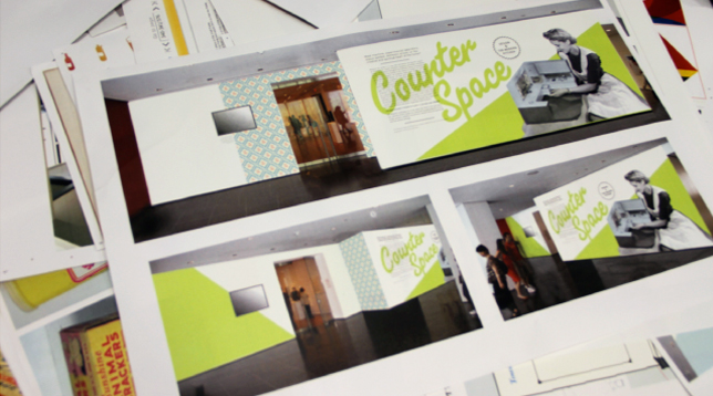
Below, another sketch that draws inspiration from old blueprints and instruction manuals, but the blue and creamy white also reminded us of milk packaging. We usually superimpose our sketches onto photographs of the gallery exterior, to get a better idea of the effect in situ.
The studies below followed the realization that the quintessential shape of a kitchen in architectural plans is an ‘L’, and could also replace the ‘r’ in the title. Getting closer!
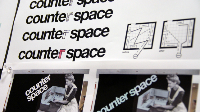
After many more refinements, the design below was chosen by the curators for the final title wall. The image of the kitchen and housewife, as well as the pale blue and creamy white reminiscent of old refrigerators, are offset by stark typography and a dynamic composition that references the rational aspects of the exhibition. The white triangle functions as a literal “counter space” to the image of the housewife, and also points to the exhibition entrance. The L-shape became a useful element throughout the exhibition, to anchor walltexts and quotes.
We hope that the final title graphic speaks to all women (and men) involved in the evolution of kitchen culture—perfect housewives and architects alike—and provides a balanced visual introduction to the exhibition.