MoMA
Posts by August Heffner
April 9, 2010  |  Design
From the Archives 03: Graphic Families

Another dive into our archives reveals a popular graphic design technique we tend to forget about today: serials! Below are a few examples of printing processes determining design, as colors are switched out to create families of posters, brochures, and invitations.

FrankStella1987

Different Strokes: Custom Alphabets Help Us Introduce Audiences to Artists

Left: "A" from alphabet created for Tim Burton exhibition graphics; Right: "A" from alphabet created for Marina Abramović exhibition graphics

What’s so special about a “special” exhibition? For us, MoMA’s graphic designers, they’re special enough to require their own unique graphic identity, and oftentimes a unique identity is all in the letters. For two very different shows now on view at MoMA, Tim Burton and Marina Abramović: The Artist Is Present, we created two very different title typefaces.

February 26, 2010  |  Design
From the Archives 02: A Brief Homage to Franklin Gothic

The MoMA Department of Graphic Design's metal set of Franklin Gothic

The Franklin Gothic typeface is the primary influence for nearly all MoMA materials; it’s the basis of our logo (see the top of your screen) and our official font “MoMA Gothic,” which were both created by Matthew Carter. We were happy to see that MoMA used a version of Franklin Gothic as long ago as the 1930s. We found these printed materials in our archives while doing some research on our current identity.

We understand not all people are totally crazy typographic aficionados like us, but more often these days, casual observers are able to recognize subtle differences in typefaces that were once thought to be the domain of only the obsessed. Can you spot Franklin Gothic on the walls of MoMA, in our subway advertisements, or anywhere else? Look for the “two story” lowercase “g” with a unique “ear” to be certain!

January 8, 2010  |  Design
From the Archives, Part 1: Ivan Chermayeff

As the days remain short and post-holiday gloom sets in, we wanted to spread some cheer from our latest trip to the archives.

Any creative rut can be cured by a quick dive into historic printed ephemera. The Museum Archives are quite extensive, and we’ll often use their finding aids before beginning on new exhibition or advertising projects. Recently we all took a trip to the archives to look through our department’s files

Below is a small sampling of work created in the 1960s by design legend Ivan Chermayeff and his firm Chermayeff & Geismar. Enjoy!

Chermayeff_Banners

Ivan Chermayeff, design for banners for The Museum of Modern Art

Ellen Lupton Inspires a New Kind of Visual Literacy

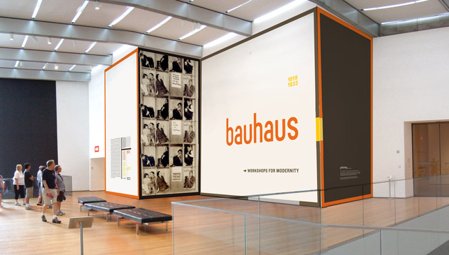
After nearly a month of visiting the Bauhaus 1919–1933: Workshops for Modernity exhibition, many of us throughout the Museum took away at least one powerful message: don’t be afraid to cross disciplines. The fearlessness, enthusiasm, and collaboration of the students and masters is apparent in the show’s work.

So, upon learning that design education legend and DIY hero Ellen Lupton would be running several workshops in the Bauhaus Lab series, our Graphic Design department decided not to make a poster for her visit, but rather to shoot and edit a video. Of course, stepping out of your area of expertise requires collaboration, so we teamed up with two of the Museum’s video experts: Beth Harris, Director of Digital Learning, and David Hart, Associate Media Producer. It was a humbling and exciting experience.

November 6, 2009  |  Behind the Scenes, Design
Bauhaus: The Graphic Design Department Goes Back to School
01

Rendering of the title wall for Bauhaus 1919-1933: Workshops for Modernity

In December 1938, hordes of visitors packed the opening of MoMA’s Bauhaus retrospective in the temporary galleries at 14 West Forty-ninth Street in Rockefeller Center. Guests followed painted footprints and abstract graphics on the floor guiding them through the show’s seven hundred items, while reading titles rendered in handsome pin-mounted condensed letterforms. The Bauhaus’s own graphic design and typography legend, Herbert Bayer came to New York to design the exhibition himself. And today, over seventy years later, it was both the Bauhaus and Bayer’s legacy that kept most of MoMA’s Department of Graphic Design awake at night, as we began to design the title wall for Bauhaus 1919–1933: Workshops for Modernity.