The Whole Picture
A conversation about Frances Benjamin Johnston’s mesmerizing photo album, now published in its entirety for the first time
Sarah Meister, Marc Sapir
May 3, 2019
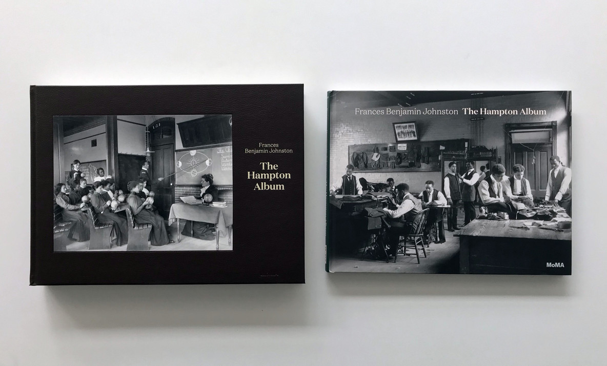
When you hold a beloved book in your hands, you may not register all the details that make it so special, from the design (font, colors, layouts) to the production (paper, inks, binding methods). The content is more evident, especially the images. (I’m aware that not everyone reads the words we write and edit with such painstaking care, but I wish they would!) I recently worked on a book—*Frances Benjamin Johnston: The Hampton Album*—that exemplifies all I cherish about working at MoMA, and above all, the joy of getting to know unique objects from the Museum’s collection.
Frances Benjamin Johnston was commissioned to photograph the Hampton Normal and Agricultural Institute (now Hampton University) in anticipation of a display in the 1900 Paris Exposition that was meant to highlight African American progress since the Civil War. By the time Lincoln Kirstein found the album in a Washington, DC, bookstore during the Second World War, no one knew its author or original purpose. These were only discovered in 1965 by my predecessor, Grace Mayer, when Kirstein was persuaded to give this precious album to the Museum, and to write an introduction for a small catalogue that reproduced about a third of it. We are now publishing this album in its entirety for the first time, providing a new framework through which we can approach Johnston’s luminous platinum prints and grapple with their contemporary significance.
Beyond getting to know the album, I am grateful to so many people (especially LaToya Ruby Frazier) who helped to critically examine the intertwined histories of African American education and photography in the US and reflect on their meaning today. And equally, what a gift to work with other brilliant colleagues at MoMA to study the album’s material evidence and to translate what we learned into a book so that all this can be shared more broadly. I recently sat down with Marc Sapir, production manager in MoMA’s Department of Publications, to discuss his behind-the-scenes efforts that make this book such a treasure.
Sarah Meister: Let’s begin when the Museum decides to move forward with producing a book like Frances Benjamin Johnston’s Hampton Album. Where do you start?
Marc Sapir: One of the first things that we did was to look at the original Hampton Album and think about how we can produce something that respects the actual art object. There are two aspects to consider. One is the art of making a book that most resembles the object itself, because it can’t exactly match the original photographs. The other aspect is figuring out how we can make it work from a budget point of view. In this case, we decided to have two versions: one limited, more expensive edition with reproductions that are exactly the same size and order as the original, with some additional scholarly apparatus as a part of it. We realized that would appeal to a very dedicated audience, so we decided to also do what we would call the trade edition, which would not be at the same scale and would be much more reasonably priced, but would still contain the same content.
After you’ve familiarized yourself with the original work’s materiality, mood, and scale, what comes next?
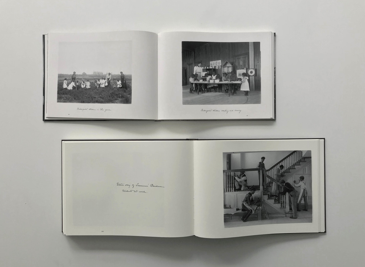
I come up with a reproduction concept. How do I approach building an object that closely resembles what we have in the collection? You’re emulating making a photograph, through a completely different process and completely different materials. We can come close but it will never be exact because we’re trying to mimic the platinum printing process using offset printing inks. (With offset printing, the gamut of reproducible tones is by necessity truncated.) I start checking into materials and seeing how they might work within our budget. As you know, I initially imagined making an exact facsimile of the album, using interleaving vellum pages over each photo, with the original handwritten captions printed on them but was told, “Yeah, we’d have to sell the book for something like $1,000.” That was when we decided to eliminate interleaving in favor of reprinting the captions (exactly as they appear in the original album) on the pages opposite the photos as a way of coming close to the original without making that edition unaffordable. Maintaining the handwriting even in the trade book was something we really wanted to do, because it’s such an integral part of the character of the object itself.
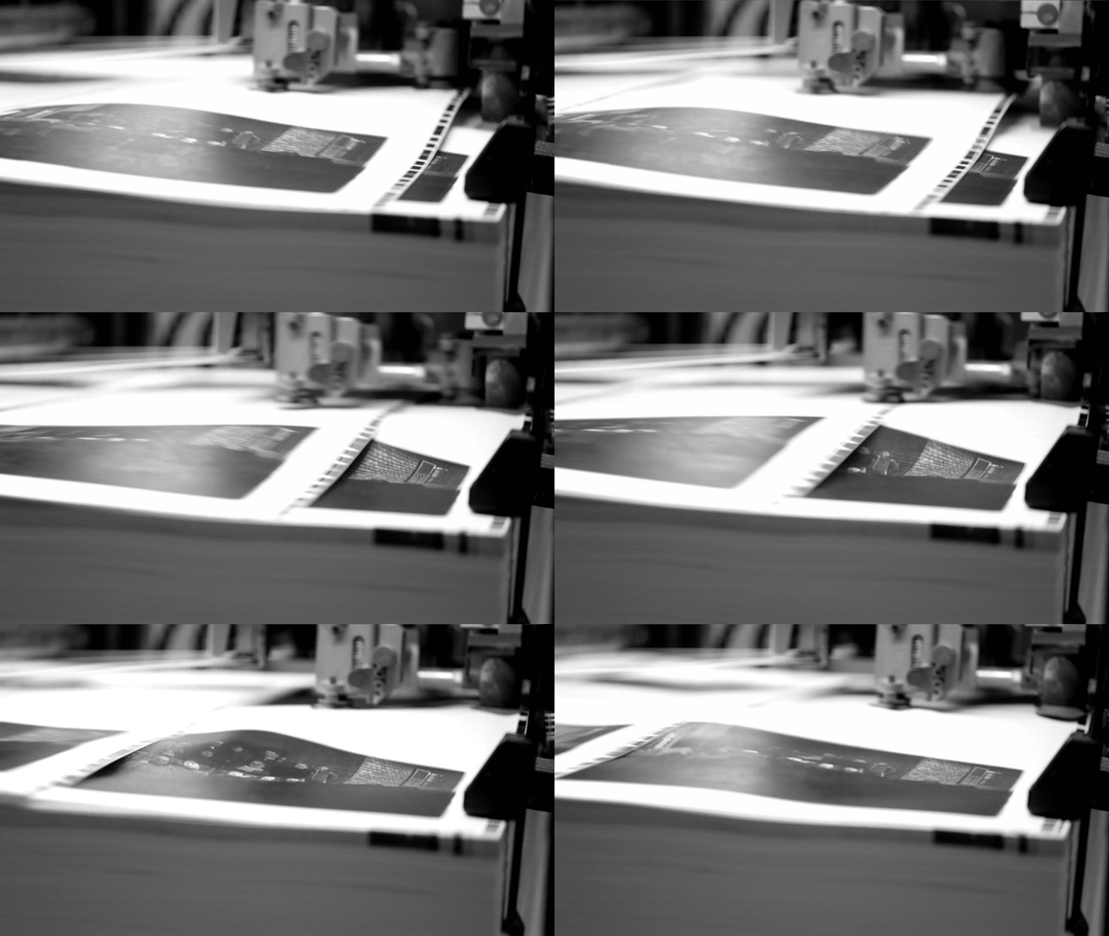
Printed sheets being fed into the press to be used for “making ready” the next printed sheets. We use a sheet multiple times in order to minimize paper waste. Video by Marc Sapir
I agree. It also, from a curatorial perspective, removes the potential for the reader to think that we are somehow structuring the way in which these pictures are presented or framing them according to a certain logic that, in fact, was applied at the time they were made.
Exactly, and they’re tied to the era. You get around that by reproducing the handwriting.
I’ve noticed that you often have a particular printer in mind from the beginning.
Right. I have a small stable of quality bookmakers and printers that I use. All of the books we make are really high quality, but some need more attention than others and have a bigger budget to accomplish that. My top printer is one of the best printers in the world. They’re called Trifolio, based in Verona, Italy—a very artisanal-like company. One of the owners, Massimo Tonolli, is a technical wizard and they’re not just about turning a profit, they’re about making really great books and doing so creatively. For this project, we knew we’d get to the moment of printing and need to change things on the fly to make the book a little more extraordinary, in a way that most people might not even notice, so I had Trifolio in mind from the beginning.
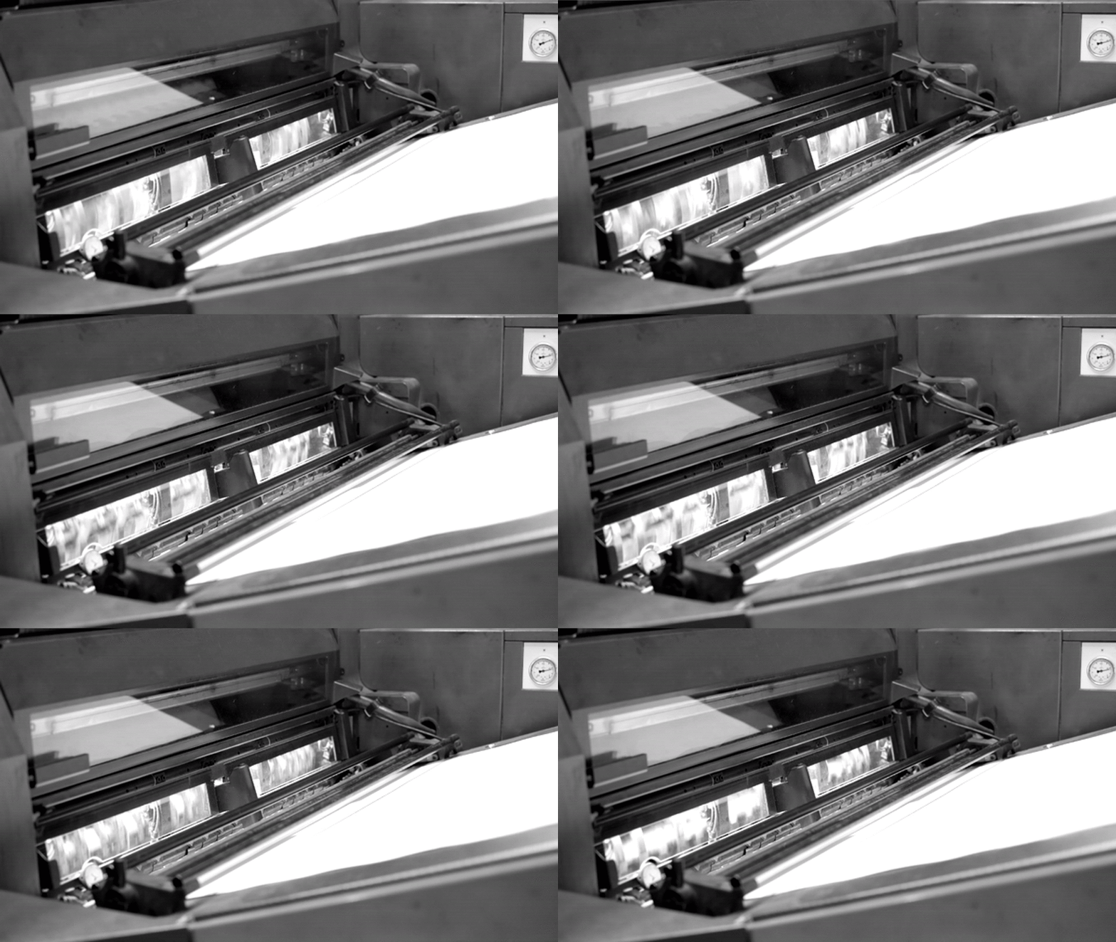
Printing paper being fed into the machine and wrapping around the printing cylinders. Video by Marc Sapir
Do you have an idea for the kind of papers and inks you use?
First we start with testing. We do press proofs, which were made on a number of book papers with various printing approaches. I can’t do it for every book but this was a project that really required special measures in order to faithfully replicate the quality and unique nature of these amazing photographs. We went through a number of variations of these proofs in order to test differing approaches. By the second batch, we were much closer to what we wanted but still not exactly there. In the back of my mind I thought that because we were in the ballpark we can finally go print the book, with the final adjustments done at the plant, in real time.
Are there certain challenges with photographs that perhaps don’t exist with paintings?
It’s certainly a different sort of challenge. It goes back to the idea of reproducing a particular visual medium by another, reductive process. Reproducing the full number of colors that exists in the visual spectrum, by mechanical means, is not possible. With current technology we cannot get the full range down on paper, or even on a computer monitor. But black-and-white photography has a different problem since it’s not about a color range, but rather about the tonal values. So you can actually come close to matching a black-and-white photograph, with ink on paper, a bit more easily. But the trick is maintaining smooth tonal transitions.
Are there other things that you’re doing between when the proofs are approved and when you go on-press?
We made multiple visits to the Photography department to look at the work. Two days before I left to go print the album, I wanted to see it one last time just to have it fresh in my mind and make a few notes. That’s for the production part. I’m also dealing with making sure we have the right materials. For example, we had to find a leather that was economical enough but resembled the original, bonded leather.

The spectrophotometer reading ink densities on a printed sheet in order to maintain consistency throughout the print run. Video by Marc Sapir
Would you talk through some other fun decisions with respect to this book that people may not know about?
There are a number of decisions that relate to the book design, as beautifully executed by our talented senior book designer Amanda Washburn. For example, what does the cover look like? If it matched the original there wouldn’t be any writing on it, but we have to have the title on the cover in order to give it an identity in bookstores. How are we going to print on leather? Well, it has to be foil-stamped, not printed. We had made the decisions and everything was set, but when the bindery tested it, the foil we chose wouldn’t adhere to the leather. So we had to find the right material that would work well with the design without flaking off. While I was in Italy printing the interior, we were still going back and forth with more testing.
After we make all of these decisions, then in this instance, you flew to Italy to work with Massimo. Tell us about the plant and Massimo’s role.
Well, he started out at age 18 sweeping the floor at another legendary printing plant. He became a pressman, worked his way up, gained a ton of knowledge, and then with two other people that worked with him started their own company. Their idea has always been to do something special while—as much as possible—disregarding the extra cost in order to make it right; and use the knowledge that he has gained over the years in order to do that. It’s also helpful that my years of experience have given me an intimate knowledge of the printing process, which allows for a real collaboration with Massimo. I know what limits there are, so I know how we can push in different directions to get the effects we want.
Take us through your first printing day when you show up.
We are still doing testing for the first half day. We took a typical printing sheet for the book, put it on the press to see what we got, and to see what needs adjusting. For example, the photographs that were originally shot inside have a slightly different tonality than the ones that were shot outside. We needed to understand how to address that. Massimo said, “Well, we’ll just treat them differently on press,” and we did so to maintain that subtlety that most people won’t notice.
Side view of the paper feeder. Video by Marc Sapir
What happens when you’re done with the printing process?
Since Trifolio does not have their own bindery, they contracted it out. Normally, Massimo uses one really close by, but he wanted a special bindery for this project, so we used one in Naples. The sheets get loaded on a truck and they go to the bindery. During the binding process, the sheets are folded in a particular sequence that gives you what’s called a signature. First, those signatures are sewn individually, then they’re sewn together to make a stack of the book—a block we call it—and then they’re trimmed and cased into the covers.
What happens when the binding is complete?
They go into a shipping container and they come to us by sea. They have to go through customs and then to the warehouse, so it takes a little while to get them even once they arrive on these shores. We do get advance copies, but it’s a really, really happy day when you walk into the bookstore and you see the book for the first time. It’s a singular joy.
It’s a really fascinating process, beginning to end. Thanks to you and the Publications team.
Yes, the whole team. We make a fair number of books with a quite limited staff. We have editors, production people, our in-house designer, and we have business people clearing rights and dealing with warehouses, contracts, and promoting our books. Really, it is like a miniature publishing house within MoMA.
Both the deluxe and trade editions are available for purchase online. The Hampton Album is currently on view in Lincoln Kirstein’s Modern.
Related articles
-
Lincoln Kirstein, Reader
Ten books offer a sense of Kirstein’s literary tastes, from war journalism to a cultural history of the cat.
Elizabeth Welch
Apr 18, 2019
-
Notre Dame, an Inspiration
In the aftermath of the Notre Dame fire, MoMA curators reflect on works that depict the cathedral not only as an enduring work of art, but as a landmark for modern artists.
Glenn D. Lowry, Ann Temkin, Martino Stierli, Sarah Meister, Samantha Friedman, Phil Taylor
Apr 17, 2019
