MoMA
Posts in ‘Design’
April 9, 2010  |  Design
From the Archives 03: Graphic Families

Another dive into our archives reveals a popular graphic design technique we tend to forget about today: serials! Below are a few examples of printing processes determining design, as colors are switched out to create families of posters, brochures, and invitations.

FrankStella1987

Different Strokes: Custom Alphabets Help Us Introduce Audiences to Artists

Left: "A" from alphabet created for Tim Burton exhibition graphics; Right: "A" from alphabet created for Marina Abramović exhibition graphics

What’s so special about a “special” exhibition? For us, MoMA’s graphic designers, they’re special enough to require their own unique graphic identity, and oftentimes a unique identity is all in the letters. For two very different shows now on view at MoMA, Tim Burton and Marina Abramović: The Artist Is Present, we created two very different title typefaces.

March 24, 2010  |  Behind the Scenes, Design
@ in Context: Criteria for an Acquisition


Screenshot of “@ at MoMA” post

Our recent acquisition of the @ symbol has challenged what most people think of as a typical object that a Museum acquires.  We thought it best to let you in on our process—how we think about shaping our collection here at MoMA.  As you know, museums are defined by their collections. Each collection has a unique point of view that is carefully shaped by its curators, who are always mindful of historical precedents as they look ahead to future developments. When it comes to contemporary design, MoMA’s collection seeks to remain on the cusp of innovation and to support the emerging talents, ideas, and concepts that will become tomorrow’s designed environment.

March 22, 2010  |  Collection & Exhibitions, Design
@ at MoMA

Ray Tomlinson. @. 1971. Here displayed in ITC American Typewriter Medium, the closest approximation to the character used by a Model 33 Teletype in the early 1970s

MoMA’s Department of Architecture and Design has acquired the @ symbol into its collection. It is a momentous, elating acquisition that makes us all proud. But what does it mean, both in conceptual and in practical terms?

Contemporary art, architecture, and design can take on unexpected manifestations, from digital codes to Internet addresses and sets of instructions that can be transmitted only by the artist. The process by which such unconventional works are selected and acquired for our collection can take surprising turns as well, as can the mode in which they’re eventually appreciated by our audiences. While installations have for decades provided museums with interesting challenges involving acquisition, storage, reproducibility, authorship, maintenance, manufacture, context—even questions about the essence of a work of art in itself—MoMA curators have recently ventured further; a good example is the recent acquisition by the Department of Media and Performance Art of Tino Sehgal’s performance Kiss

February 26, 2010  |  Design
From the Archives 02: A Brief Homage to Franklin Gothic

The MoMA Department of Graphic Design's metal set of Franklin Gothic

The Franklin Gothic typeface is the primary influence for nearly all MoMA materials; it’s the basis of our logo (see the top of your screen) and our official font “MoMA Gothic,” which were both created by Matthew Carter. We were happy to see that MoMA used a version of Franklin Gothic as long ago as the 1930s. We found these printed materials in our archives while doing some research on our current identity.

We understand not all people are totally crazy typographic aficionados like us, but more often these days, casual observers are able to recognize subtle differences in typefaces that were once thought to be the domain of only the obsessed. Can you spot Franklin Gothic on the walls of MoMA, in our subway advertisements, or anywhere else? Look for the “two story” lowercase “g” with a unique “ear” to be certain!

February 25, 2010  |  Artists, Collection & Exhibitions, Design
Signs of Life: The Life of the Exit Man

Freddie Yauner. Signs of Life. 2007-09. © Freddie Yauner

Signs of Life, the animated pictographic exit sign by British designer Freddie Yauner, takes the most banal everyday object—something that we see daily but rarely notice—and brings it to life.

February 23, 2010  |  Design, Rising Currents
Rising Currents: The Hudson

Hudson River, 2006. Courtesy Architecture Research Office

As we get ready to begin the installation of the MoMA exhibition next week, I wanted to take a step back and offer a visual reflection on a central figure in this exhibition. Our thanks to Architecture Research Office for poetically capturing the essence of Rising Currents. Click on the image to view the video clip.

February 19, 2010  |  Design, Tech
A Few Words with Legendary Web Designer Yugo Nakamura

The Design and the Elastic Mind website

We initially suggested five design firms as candidates to design and build the Design and the Elastic Mind website. Paola Antonelli, the exhibition curator, had gone through around twenty links from three firms when we showed her Yugo Nakamura’s personal site, yugop.com. The simple white page that greeted us was immediately invaded by dark, two-dimensional cascading balls. We watched for a few minutes, mesmerized by the simple physics of bouncing. Paola decided to go with Yugo’s firm, tha ltd., on the spot.

Yugo’s work has been inspirational to me since 1998, when I first came across MONO*crafts 2.0 (more on that below). In fact, I can honestly say that seeing that website was one of the reasons I decided to transition from print to web design. His site was among the first to effectively and convincingly instill “life”—flexibility, mutability, playfulness, depth, speed—into what was then a very static experience.

So it was quite an honor for me to ask him a few questions about his experience working on the Design and the Elastic Mind website, and about Web design in general.

February 12, 2010  |  Behind the Scenes, Design
Rediscovering The New Typography

When I got off the elevator at the Architecture and Design department for a quick meeting with Juliet Kinchin about a new exhibition she was curating called The New Typography, I was surprised to see some original posters from the 1920s lined up along a wall, and many tiny pieces of stationery systems, brochures, flyers, and ads carefully spread out on a table. We don’t usually get to see the real artwork until just before the show, when installation is underway, and until then, we use exhibition catalogs or digital images for reference.

I felt like an anthropologist in the presence of an early human ancestor. As a graphic designer, I could relate to these pieces more than any other art I had worked with at MoMA. These ninety-year-old posters communicated loud and clear, and still looked amazingly cool. But when I took a close look, their difference from contemporary graphics was apparent: these works had a hand-crafted feel—a beautiful contrast to the clean geometry of the layout.

From left: Theo H. Ballmer. Neues Bauen (New building). 1928. Poster for traveling exhibition of the Deutscher Werkbund. Offset lithograph. Gift of The Lauder Foundation, Leonard and Evelyn Lauder Fund. Walter Dexel. Fotografie der Gegenwart (Contemporary photography). 1929. Poster for an exhibition in Magdeburg, Germany. Linocut. Gift of the designer. Walter Dexel. Die Sport Ausstellung Magdeburg (Sport exhibition Magdeburg). 1929. Offset lithograph. Special Purchase Fund

February 9, 2010  |  Design, Rising Currents
Rising Currents: Public Space Redefined

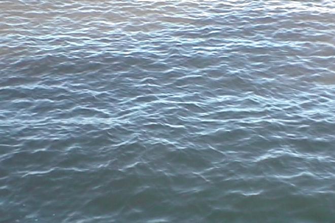
This morning I got on the Staten Island ferry to tour parks on the island with Parks Department officials and the leadership of a major environmental foundation. For several of them, it was the first trip to Staten island where they actually got off the ferry and went onto the island. Along the way, we talked about the harbor and the upcoming Rising Currents exhibition at MoMA.

I was fortunate to be able to attend the final weekend of open studio at P.S.1, where the five teams shared the ongoing process of their work, and I joined a few other city officials, including City Planning Chair Amanda Burden and Leslie Koch, who is directing the development of Governors Island. The whole place was wonderfully crowded, and the final session where each team gave presentations was held in a room crammed to the gills with people, including many sitting or lying on the floor.

From the Parks point of view, the proposals represent some innovative ways to create new realms of public space, places that are not traditional parks, but rather are flexible zones of water and land and plants and animals. We currently tend to look at parks as distinct from other urban forms, with fences, walls, planted buffers— different vocabularies of building materials. While each team has proposed concepts very different from the others, they all redefine the interaction of streets, parks, seawalls, canals, piers, and even the harbor itself. From a purely selfish point of view, many of the proposals offer a major expansion of flexible green space.