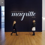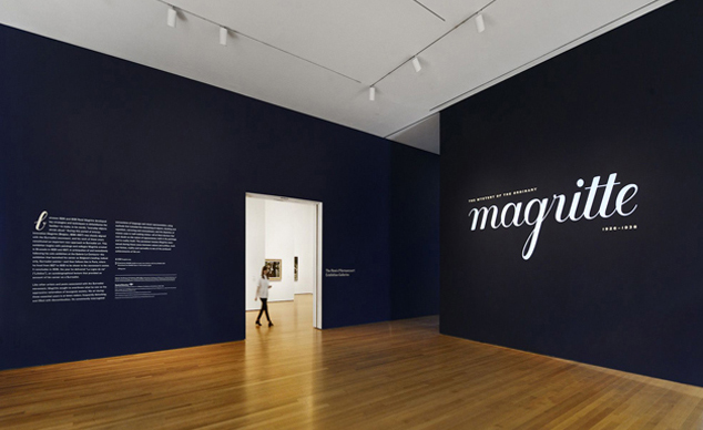
Title wall of Magritte: The Mystery of the Ordinary, 1926–1938 at The Museum of Modern Art. Photo: Martin Seck
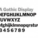
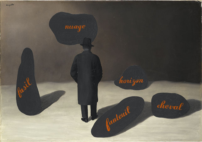
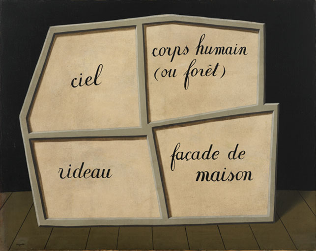
For most graphic designers, typography is one of the most important, challenging, and seductive parts of graphic design. So when Anne Umland, The Blanchette Hooker Rockefeller Curator of Painting and Sculpture, and curatorial assistant Danielle Johnson, who organized the exhibition Magritte: The Mystery of the Ordinary,1926–1938, suggested incorporating Magritte’s beautiful lettering style—or a version inspired by it—for the title wall design, I was, of course, very excited. I began my work on the project by researching and gathering samples of where Magritte’s lettering appeared, such as in his paintings La Trahison des images (The Treachery of Images), L’Apparition (The Apparition),</a> and Le Masque vide (The Empty Mask).
![René Magritte. La trahison des images (Ceci n’est pas une pipe) (The Treachery of Images [This is Not a Pipe]). 1929. Oil on canvas, 23 3/4 x 31 15/16 x 1 in. (60.33 x 81.12 x 2.54 cm). Los Angeles County Museum of Art, Los Angeles, California, U.S.A. © Charly Herscovici-–ADAGP—ARS, 2013. Photograph: Digital Image © 2013 Museum Associates/LACMA,Licensed by Art Resource, NY](https://www.moma.org/wp/inside_out/wp-content/uploads/2013/10/moma_magritte_treacheryofimages.jpg)
René Magritte. La trahison des images (Ceci n’est pas une pipe) (The Treachery of Images [This is Not a Pipe]). 1929. Oil on canvas, 23 3/4 x 31 15/16 x 1 in. (60.33 x 81.12 x 2.54 cm). Los Angeles County Museum of Art, Los Angeles, California, U.S.A. © Charly Herscovici-–ADAGP—ARS, 2013. Photograph: Digital Image © 2013 Museum Associates/LACMA,Licensed by Art Resource, NY
René Magritte. L’apparition (The Apparition). 1928. Oil on canvas, 31 7/8 x 45 11/16″ (81 x 116 cm). Staatsgalerie Stuttgart. © Charly Herscovici—ADAGP—ARS, 2013
René Magritte. Le Masque vide (The Empty Mask). 1928. Oil on canvas, 28 3/4 x 36 1/4″ (73 x 92 cm). Kunstsammlung Nordrhein-Westfalen, Düsseldorf. © Charly Herscovici—ADAGP—ARS, 2013
There were many variations from one artwork to another: some had greater contrast of thick and thin, others were more condensed, and there were perceptible shifts in stroke weight—largely due to the proportion of sizes between the brush and the letters he was drawing. Yet, it surprised me to see how incredibly consistent his letterforms were. The letter “p,” for example, the most notably unique character in his alphabet, always had an open counter, and looked like an “n” with a prolonged stem. The end of the letter “s” consistently looped inwards into a soft twirl that finished with a small, delicate node.
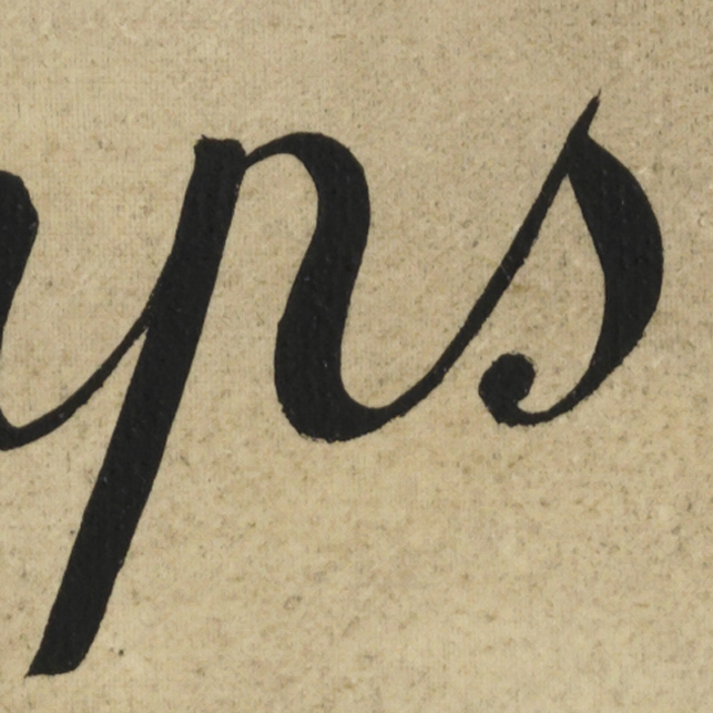
Detail of the letters “p” and “s” from a Magritte painting
To say that my first attempts were not quite there is an understatement.
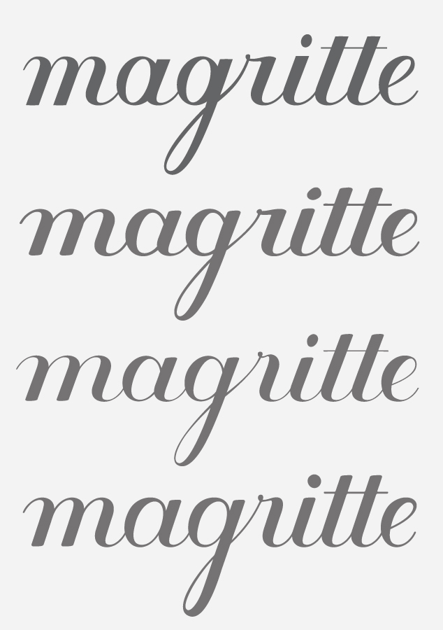
The author’s lettering experients
It took dozens of variations, testing, tweaks, and just plain old graphic designer obsession to get it to a point that felt right and captured the elegant, rhythmic, and gestural quality of Magritte’s original lettering. When I got stuck on how to resolve a particular transition between letters—for example, between the “B” and “r” in Brussels—I would go back to my research and sure enough, Magritte was there to give me a helping hand.
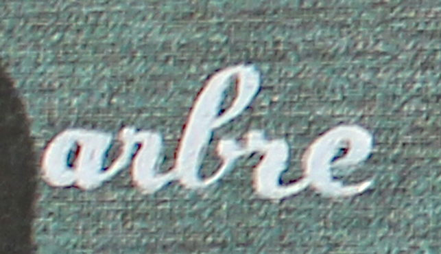
Detail of the letters “b” and “r” from a Magritte painting
My finished lettering is used in five places throughout the exhibition. Taken out of it’s familiar context in Magritte’s paintings, it now functions as signage that both guides visitors through the galleries and draws them in.
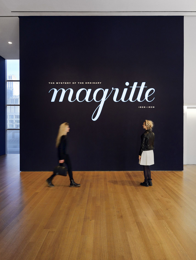
The exhibition title wall. Photo: Martin Seck
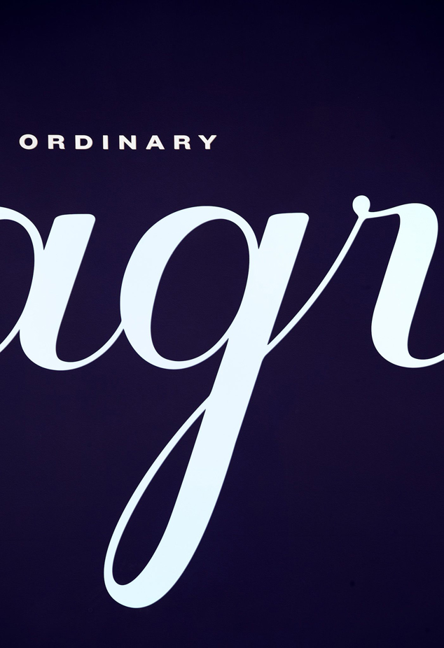
Detail of lettering on the exhibition title wall. Photo: Martin Seck
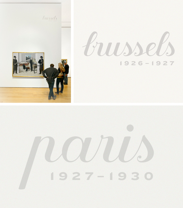
Close-up views of lettering in the exhibition galleries. Shown: René Magritte. The Menaced Assassin. Brussels, 1927. Oil on canvas, 59 1/4″ x 6′ 4 7/8″ (150.4 x 195.2 cm). The Museum of Modern Art. Kay Sage Tanguy Fund. © 2013 Charly Herscovici, Brussels/Artists Rights Society (ARS), New York. Photo: Martin Seck