
Although there are a million typefaces to choose from, MoMA Design Studio chose to only use one typeface for the majority of The Museum of Modern Art’s exhibition identities. Why?
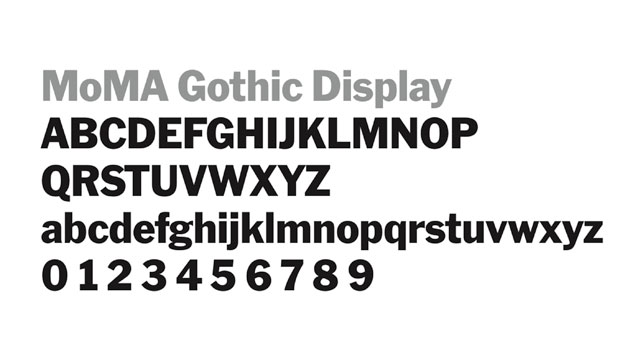
MoMA Gothic typeface. Typeface designed by Matthew Carter
At MoMA, we are tasked to design roughly 40 different title walls each year to accompany a wide variety of exhibitions. To manage workload, we made the decision four years ago to have two-thirds of the workload “templatized” by sticking to one typeface—our house font, MoMA Gothic (which is based on Franklin Gothic)—for all collection rotations.
Our goal was not only to alleviate workload, but to inject some visual consistency in the designs, to help create a distinction between the 12 “special exhibitions” (temporary loan shows on the sixth and third floors) and the 28 collection rotations, and to give us enough time and energy to focus on the big shows by making those designs more unique.
At first, our decision to eliminate the choice of different typefaces for the collection rotations got quite mixed reviews from curators and our in-house designers. The fear of losing their freedom of expression and “templatizing” ourselves was a scary proposition.
As someone who loves typography, I shared their concern. But I truly believe a good designer can communicate any concept with any typeface. I also think it’s incredibly important to first sketch out an idea on a piece of paper rather than on a computer where you’re forced to choose a font (even if it’s just a default typeface). By eliminating automated typeface options, the designer can focus on their idea instead of figuring out which one of the million computerized typefaces to choose from, and the design inevitably becomes stronger as a result. The designer Massimo Vignelli once stated that designers only need five typefaces.
The result was nevertheless stellar. Not only did we cut down our workload as we’d hoped, we also enabled ourselves to create title walls for exhibitions that each have their own voice yet are uniquely branded as MoMA exhibitions. I believe this can be applied to other variables, like color or budget constraints. When one variable is taken away from the design process it doesn’t have to limit you; it can actually make your design more impactful.
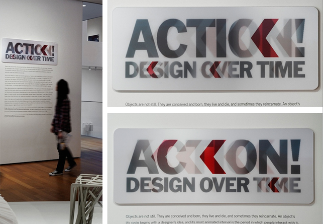
That said, we truly enjoy the exception to our rule, when we use other fonts, and even create new fonts ourselves, for the 12 special exhibitions that go up each year at MoMA.
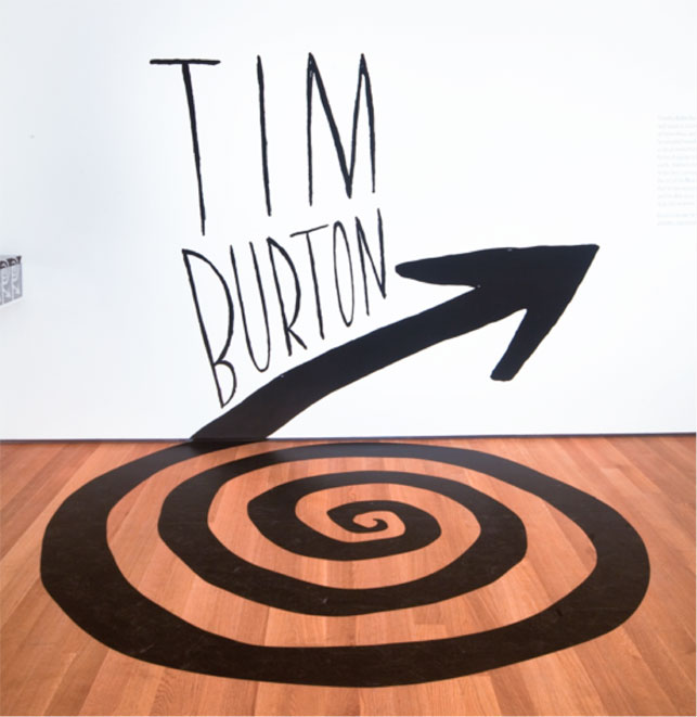
Title wall for the exhibition Tim Burton on view at MoMA from November 22, 2009–April 26, 2010
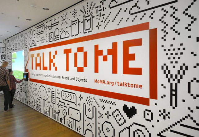
Title wall for Talk to Me: Design and the Communication between People and Objects on view at MoMA from July 24–November 7, 2011
Visit the MoMA Design Studio website to see even more examples.