

When I got off the elevator at the Architecture and Design department for a quick meeting with Juliet Kinchin about a new exhibition she was curating called The New Typography, I was surprised to see some original posters from the 1920s lined up along a wall, and many tiny pieces of stationery systems, brochures, flyers, and ads carefully spread out on a table. We don’t usually get to see the real artwork until just before the show, when installation is underway, and until then, we use exhibition catalogs or digital images for reference.
I felt like an anthropologist in the presence of an early human ancestor. As a graphic designer, I could relate to these pieces more than any other art I had worked with at MoMA. These ninety-year-old posters communicated loud and clear, and still looked amazingly cool. But when I took a close look, their difference from contemporary graphics was apparent: these works had a hand-crafted feel—a beautiful contrast to the clean geometry of the layout.
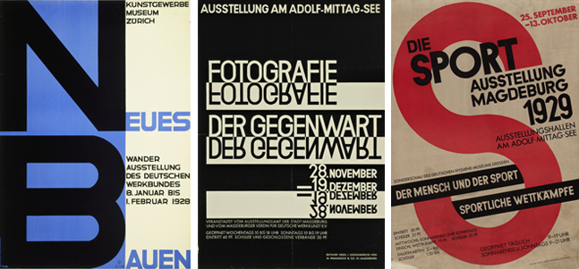
From left: Theo H. Ballmer. Neues Bauen (New building). 1928. Poster for traveling exhibition of the Deutscher Werkbund. Offset lithograph. Gift of The Lauder Foundation, Leonard and Evelyn Lauder Fund. Walter Dexel. Fotografie der Gegenwart (Contemporary photography). 1929. Poster for an exhibition in Magdeburg, Germany. Linocut. Gift of the designer. Walter Dexel. Die Sport Ausstellung Magdeburg (Sport exhibition Magdeburg). 1929. Offset lithograph. Special Purchase Fund