MoMA
Posts in ‘Collection & Exhibitions’
April 1, 2010  |  Collection & Exhibitions
Joan Jonas: Upon Reflection

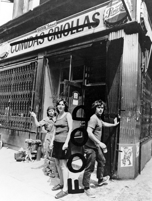
Carol Goodden and Gordon Matta-Clark opened Food, on the corner of Prince and Wooster, in the early 1970s. The restaurant, one of the first in Soho, was run by artists and served mostly artists, with the cooking itself becoming a performance of sorts.

The other day I caught up with Joan Jonas at her studio, around the corner from where she first performed MirageAnthology Film Archives’ former Soho location. Forty years ago Soho was inhospitable, even dangerous, with zero amenities. Surrounded by what were then inexpensive, down-and-dirty lofts, Anthology film and video screenings were integral to neighborhood artists’ daily lives. Jonas performed for several nights over a number of weeks in 1976. Her audience included many locals—artist, musician, and dancer friends. They all dined at Food, Gordon Matta-Clark’s wholesome restaurant. Nearby, Richard Foreman presented his Ontologic Hysteric Theater, Jack Smith carried out his midnight events, and Alanna Heiss hosted other happenings on Bleecker Street and at the Clocktower.

Leo Castelli and Ileana Sonnabend had recently launched their Soho galleries at 420 West Broadway, and Jonas later performed at each. Joyce Nereaux directed Castelli-Sonnabend Tapes and Films, and distributed Jonas’s and other visual artists’ media works to museums and art schools. These works leaned towards narrativity. Two blocks away a different media faction congregated at The Kitchen, the alternative space founded by Woody and Steina Vasulka. Artists there knew how to put technical things together.

Finding Burton

Tim Burton. Untitled (The Melancholy Death of Oyster Boy and Other Stories). 1998. Pen and ink and watercolor on paper, overall: 11 x 14" (27.9 x 35.6 cm). Private collection. © 2009 Tim Burton

We found Tim Burton in London. Just as was the case with the Museum’s Pixar exhibition in 2005, we discovered that he, too, held a body of work that had never before been seen by the public. In Tim’s case, there was childhood ephemera, high school papers, cartoons, early 8mm and 16mm amateur films, sketchbooks, drawings, verse, art for a number of unrealized film and book projects, work related to well-known feature films, and material cut from his 1997 book The Melancholy Death of Oyster Boy. Keeping things new and fresh would not be a major concern, and we recognized that we would be relying less on studio archives than we had originally expected. The obvious issues were what to select from a personal archive that contained close to 10,000 elements, and how to make sense of it all.

Visitor Viewpoint: Marina Abramović

Installation view of Marina Abramović’s performance The Artist Is Present at The Museum of Modern Art, 2010. Photo by Scott Rudd. For her longest solo piece to date, Abramović sits in silence at a table in the Museum’s Donald B. and Catherine C. Marron Atrium during public hours, passively inviting visitors to take the seat across from her for as long as they choose within the timeframe of the Museum’s hours of operation. Although she will not respond, participation by Museum visitors completes the piece and allows them to have a personal experience with the artist and the artwork. © 2010 Marina Abramović. Courtesy the artist and Sean Kelly Gallery/Artists Rights Society (ARS), New York

We asked a number of visitors to Marina Abramović’s performance retrospective, The Artist Is Present, to share their impressions with us. Visitor participation is central to this exhibition—Abramović’s own performance for the show asks visitors to come sit with her and essentially become a part of the performance piece, while the “reperformances” in the sixth-floor galleries turn viewers into spectators and confront them in a way art objects never could. We wanted to hear from visitors about their experiences with these works.

Different Strokes: Custom Alphabets Help Us Introduce Audiences to Artists

Left: "A" from alphabet created for Tim Burton exhibition graphics; Right: "A" from alphabet created for Marina Abramović exhibition graphics

What’s so special about a “special” exhibition? For us, MoMA’s graphic designers, they’re special enough to require their own unique graphic identity, and oftentimes a unique identity is all in the letters. For two very different shows now on view at MoMA, Tim Burton and Marina Abramović: The Artist Is Present, we created two very different title typefaces.

March 25, 2010  |  Artists, Collection & Exhibitions
Dieter Roth’s Hat

Dieter Roth. Hat. 1965. Screenprint over offset. Publisher and printer: the artist, New Haven. Edition: approx. 20 unique variants. The Museum of Modern Art. The Print Associates Fund, 2009. © 2010 Estate of Dieter Roth

Dieter Roth was a singularly important figure in postwar European art—an iconoclast, really—whose wide-ranging practice, including artist’s books, prints, drawings, sculpture, assemblages, sound recordings, film, music, and poetry, reverberated for decades to come. He was associated with kinetic art, Fluxus, Conceptual art, and concrete poetry, often blurring the boundaries between mediums and movements of the 1960s and 1970s.

As a printmaker, he totally pushed the envelope. He sent slices of greasy sausage and cheese through the printing press, stuck strips of licorice onto etchings, glued croissants onto the covers of the books he designed. He also worked with more traditional techniques like screenprint and etching, sometimes combining them to play with different experimental effects.

Listening to Marina Abramović: Rhythm 10

When artist Marina Abramović and curator Klaus Biesenbach first met with the Publications team to discuss the catalogue that would accompany her exhibition at MoMA, Marina knew she wanted to create a book that offered a different kind of reading experience. Hoping to address the eternal challenge of capturing the complexity of live performance on the printed page, she proposed the addition of an audio component, which she felt would allow for a more personal, intimate, and experiential understanding of the work. What you hear in this video is a track from the resulting CD, which comes with the book.

March 23, 2010  |  Collection & Exhibitions
9 Screens: Take Your Time The Big Clock, 2010

Preliminary sketch for The Big Clock

In 1999, Bernadette Corporation (BC) adopted the catchphrase “Pedestrian Cinema” (or “Ped Cin”) as a way of describing a specific kind of fragmentation and dismantlement to be applied to the increasingly historicized role of moving imagery in the arts. Important to this approach is for something to lie stranded within a cine-conceptual framework, without technically being a video or a film.

“This slimy, slug-minded mystery thriller starts out dead on arrival and then, like three-day-old fish, gets really bad really fast. And it stays bad, ensnaring its star and every other cast member in its wretched net.”

A couple of clichéd sentences pulled from a bad film review are a reverse operation of the Ped Cin concept: their crude familiarity and redundancy, without context, produce an almost delicate emptiness.

Documentation Diaries: Content vs. Technology

Joan Jonas. Mirage (installation details). 1976/1994/2003. The Museum of Modern Art. Gift of Richard Massey, Clarissa Alcock Bronfman, Agnes Gund, and Committee on Media Funds

Migrating media to accommodate rapidly evolving playback technology is a common occurrence. Our daily tendency to preserve images and sounds as we progress technologically means that we often discard old recording forms and playback equipment for digital replicas. Yet this drive to preserve content unexpectedly distorts the importance of technology as more than mere platform for content. When we disconnect media from its method of presentation we must consider the loss of contextualization for an object. Technology may seem disposable, but is it?

March 22, 2010  |  Collection & Exhibitions, Design
@ at MoMA

Ray Tomlinson. @. 1971. Here displayed in ITC American Typewriter Medium, the closest approximation to the character used by a Model 33 Teletype in the early 1970s

MoMA’s Department of Architecture and Design has acquired the @ symbol into its collection. It is a momentous, elating acquisition that makes us all proud. But what does it mean, both in conceptual and in practical terms?

Contemporary art, architecture, and design can take on unexpected manifestations, from digital codes to Internet addresses and sets of instructions that can be transmitted only by the artist. The process by which such unconventional works are selected and acquired for our collection can take surprising turns as well, as can the mode in which they’re eventually appreciated by our audiences. While installations have for decades provided museums with interesting challenges involving acquisition, storage, reproducibility, authorship, maintenance, manufacture, context—even questions about the essence of a work of art in itself—MoMA curators have recently ventured further; a good example is the recent acquisition by the Department of Media and Performance Art of Tino Sehgal’s performance Kiss

Baroque Bones and Challenging Loans: How to Ship an Abramović Installation

Six thousand pounds of cow bones after cleaning at Skulls Unlimited.

In late 2008, six thousand pounds of cow bones sat boxed in a Dutch warehouse. Marina Abramović, whose retrospective is on view at MoMA, had requested that we ship the bones, a major component of her installation Balkan Baroque, far in advance of the exhibition. We could not have anticipated that the next fifteen months would involve our learning about bovine spongiform encephalopathy (BSE), incineration plants in New Jersey, the dearth of slaughterhouses in the western United States, or that a place called Skulls Unlimited existed.