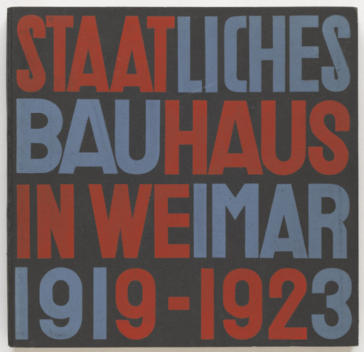
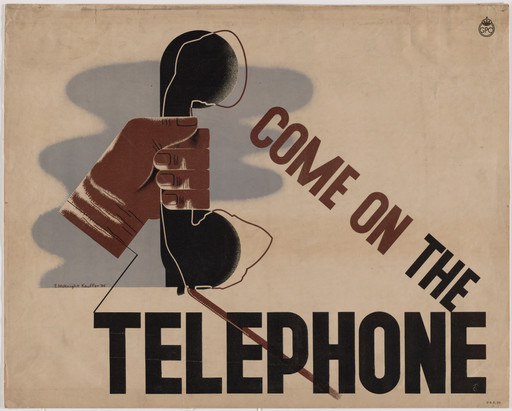
This poster announcing a slide talk to be given by a guest lecturer, Hans Poelzig, an architect and professor, exemplifies what came to be known as the “new typography” of the 1920s: a strict use of sans-serif type, a single type treatment (here the exclusive use of uppercase letters), an underlying grid for the layout, and an asymmetrical composition. This revolutionary arrangement of type afforded a greater rationalism in the organization and communication of information.
As director of the new printing workshop established at the Bauhaus in 1925, Bayer had sought to overturn the typography styles prevailing in the early part of the twentieth century, in particular the overly decorative typefaces of the Art Nouveau and Gothic lettering commonly used in Germany. Building on what he had learned as a Bauhaus student under László Moholy-Nagy, Bayer promoted a new form of typography, a logical and universal means of graphic expression aimed, above all, at clarity. Bayer hoped to do what he called “a thorough alphabetical house-cleaning” in all publications issued by the Bauhaus. He and other devotees of the new style discarded the art of illustration, which they found subjective, in favor of unadorned typography, photography, and the modern technique of collage.
The Museum of Modern Art, MoMA Highlights, New York: The Museum of Modern Art, revised 2004, originally published 1999, p. 129.
Explore more
Herbert Bayer
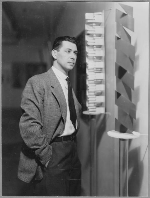
American, born Austria. 1900–1985 164 works onlineArtistic polymath Herbert Bayer was one of the Bauhaus’s most influential students, teachers, and proponents, advocating the integration of all arts throughout his career. Bayer began his studies as an architect in 1919 in Darmstadt.
Learn more →


From MoMA Design Store


Installation views
We have identified this work in the following photos from our exhibition history.
Licensing
Artwork or archival images
If you would like to reproduce an image of a work of art in MoMA's collection, or an image of a MoMA publication or archival material (including installation views, checklists, and press releases), please contact Art Resource (publication in North America) or Scala Archives (publication in all other geographic locations).
Audio and film clips
MoMA licenses archival audio and select out of copyright film clips from our film collection. At this time, MoMA produced video cannot be licensed by MoMA/Scala. All requests to license archival audio or out of copyright film clips should be addressed to Scala Archives at [email protected]. Motion picture film stills cannot be licensed by MoMA/Scala. For access to motion picture film stills for research purposes, please contact the Film Study Center at [email protected]. For more information about film loans and our Circulating Film and Video Library, please visit Circulating Film and Video Library.
Text from a publication or the archives
If you would like to reproduce text from a MoMA publication, please email [email protected]. If you would like to publish text from MoMA's archival materials, please fill out this permission form and send to [email protected].
Feedback
This record is a work in progress. If you have additional information or spotted an error, please fill out this feedback form.