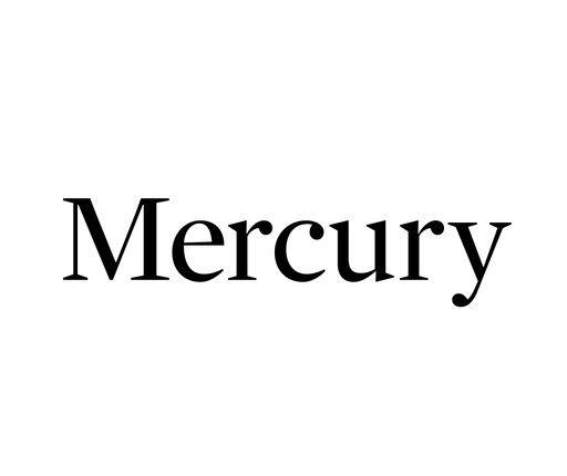
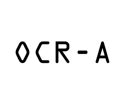
The Wall Street Journal commissioned Frere-Jones to design this typeface for its financial tables to increase legibility while condensing the letterforms to save space. Informed by how the human eye perceives fine print, he designed Retina to be used at small sizes—7 point or below—and made its letterforms as dissimilar from one another as possible, prioritizing readability over visual uniformity. He cut notches, or “ink traps,” into the glyphs—the visual representations of characters, such as letters or punctuation marks, in typesetting—to compensate for ink spread on poor-quality paper. Many newspapers now use Retina for high-density texts, including stock listings, sports scores, and classified ads.
Pirouette: Turning Points in Design, January 26, 2025–November 15, 2025
Gallery label from Standard Deviations , 2011
The Wall Street Journal commissioned this typeface for its financial tables with the goal of increasing legibility while condensing the letterforms to save space. Designed to be used at very small sizes—7-point or below—Retina departs from traditional letterforms altogether to instead provide letters that are as dissimilar from one another as possible. Retina, in the words of the designers, fills in what "human eye needs and what the brain expects" when reading very fine print. By playing up the differences between each letter, the designers have taken "its essence, the thing that makes it this letter and not something else" and amplified it. Notches, or ink traps, are cut into the glyphs to compensate for ink spread on poor-quality paper. Many newspapers now use Retina not only for stock listings but also for sports scores, classified ads, movie and TV listings, and other high-density texts.
Standard Deviations, 2011
Explore more


From MoMA Design Store


Licensing
Artwork or archival images
If you would like to reproduce an image of a work of art in MoMA's collection, or an image of a MoMA publication or archival material (including installation views, checklists, and press releases), please contact Art Resource (publication in North America) or Scala Archives (publication in all other geographic locations).
Audio and film clips
MoMA licenses archival audio and select out of copyright film clips from our film collection. At this time, MoMA produced video cannot be licensed by MoMA/Scala. All requests to license archival audio or out of copyright film clips should be addressed to Scala Archives at [email protected]. Motion picture film stills cannot be licensed by MoMA/Scala. For access to motion picture film stills for research purposes, please contact the Film Study Center at [email protected]. For more information about film loans and our Circulating Film and Video Library, please visit Circulating Film and Video Library.
Text from a publication or the archives
If you would like to reproduce text from a MoMA publication, please email [email protected]. If you would like to publish text from MoMA's archival materials, please fill out this permission form and send to [email protected].
Feedback
This record is a work in progress. If you have additional information or spotted an error, please fill out this feedback form.