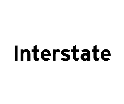
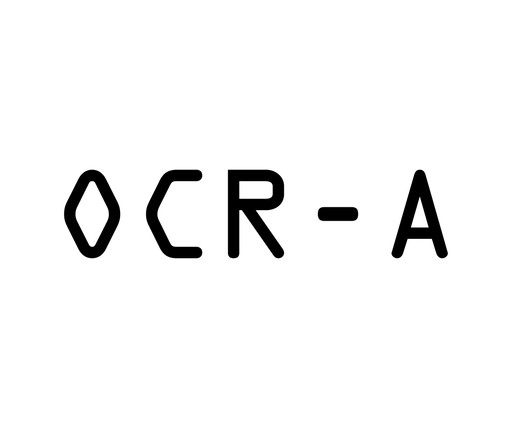
Gotham is one of the most successful typefaces of the early twenty-first century. Originally inspired by the lettering on Manhattan's Port Authority Bus Terminal sign, it was designed after Frere-Jones conducted an extensive study of New York City's vernacular lettering. A distillation of the "letters of paint, plaster, neon, glass and steel that figure so prominently in the urban landscape," as the typographers have said, Gotham has a familiar quality even though it is newly designed. The letterforms are simple and straightforward—an engineer's idea of "basic lettering."
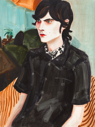
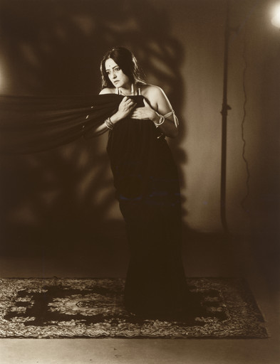
Standard Deviations, 2011.
Explore more

From MoMA Design Store


Licensing
Artwork or archival images
If you would like to reproduce an image of a work of art in MoMA's collection, or an image of a MoMA publication or archival material (including installation views, checklists, and press releases), please contact Art Resource (publication in North America) or Scala Archives (publication in all other geographic locations).
Audio and film clips
MoMA licenses archival audio and select out of copyright film clips from our film collection. At this time, MoMA produced video cannot be licensed by MoMA/Scala. All requests to license archival audio or out of copyright film clips should be addressed to Scala Archives at [email protected]. Motion picture film stills cannot be licensed by MoMA/Scala. For access to motion picture film stills for research purposes, please contact the Film Study Center at [email protected]. For more information about film loans and our Circulating Film and Video Library, please visit Circulating Film and Video Library.
Text from a publication or the archives
If you would like to reproduce text from a MoMA publication, please email [email protected]. If you would like to publish text from MoMA's archival materials, please fill out this permission form and send to [email protected].
Feedback
This record is a work in progress. If you have additional information or spotted an error, please fill out this feedback form.