 Coinciding with the 40th anniversary of MoMA’s groundbreaking Projects series, we’ve redesigned the Projects website, including a vast expansion of the archives.

Posts tagged ‘Web design’
January 11, 2012
|
Behind the Scenes,
Tech
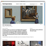
The Projects Project
October 6, 2010
|
Collection & Exhibitions,
Tech
Fall Harvest Online

The end of summer often means time to go back to school. For those of us at MoMA, it also means a slew of new exhibitions. And this fall we have quite a bounty, many of which are accompanied by a special online feature. For today, we present five websites for five exhibitions:

April 2, 2010
|
Tech
Prints and the Web—Introducing Picasso: Themes and Variations

Screenshot of the Picasso: Themes and Variations website
When you think about printmaking, the Web may not be the first thing that comes to mind. You may envision instead old etching presses, or heavy lithographic stones, or stacks of paper waiting to hit the press. But in fact, MoMA’s Prints Department has long been interested in using the Web as a way of sharing information: using animated, interactive multimedia components as a way to make the material come alive. Our online projects are all available on MoMA.org, from our earliest experiments all the way back in 1998 with Miró’s Black and Red Series…
March 5, 2010
|
Tech
MoMA.org turns 1…and 15
It was one year ago tomorrow that we launched the latest redesign of MoMA.org. (March 6 is a day that will be forever ingrained in the Digital Media team’s memory!) But MoMA has had an online presence for fifteen years now, since 1995, when an exhibition site for the design show Mutant Materials in Contemporary Design was developed. The following year, the Museum’s website, MoMA.org, officially launched, and we’ve been doing exhibition feature sites ever since (including our most recent one for William Kentridge: Five Themes).
Talk about a blast from the past. Here’s a look at MoMA.org through the ages:

Homepage of the Mutant Materials site, MoMA, 1995
A Few Words with Legendary Web Designer Yugo Nakamura

The Design and the Elastic Mind website
We initially suggested five design firms as candidates to design and build the Design and the Elastic Mind website. Paola Antonelli, the exhibition curator, had gone through around twenty links from three firms when we showed her Yugo Nakamura’s personal site, yugop.com. The simple white page that greeted us was immediately invaded by dark, two-dimensional cascading balls. We watched for a few minutes, mesmerized by the simple physics of bouncing. Paola decided to go with Yugo’s firm, tha ltd., on the spot.
Yugo’s work has been inspirational to me since 1998, when I first came across MONO*crafts 2.0 (more on that below). In fact, I can honestly say that seeing that website was one of the reasons I decided to transition from print to web design. His site was among the first to effectively and convincingly instill “life”—flexibility, mutability, playfulness, depth, speed—into what was then a very static experience.
So it was quite an honor for me to ask him a few questions about his experience working on the Design and the Elastic Mind website, and about Web design in general.
February 5, 2010
|
Design,
Events & Programs,
Tech
Meet Me: From Paper to Pixels
The Graphic Design and Digital Media departments work on the same floor in the MoMA offices, and though we may disagree on how many overhead fluorescent lights should be on (the correct answer is zero), we all enjoy getting the chance to work together. It’s not often that we get the chance to work on a project from its inception, so the Meet Me website was a unique opportunity.

Screenshot from the Meet Me site
Last week, Ingrid Chou explained the process of creating the lovely Meet Me publication. For the website, we worked with Ingrid and designer Sam Sherman (as well as the Education Department) to translate elements from the publication into a digital format. We also wanted to take advantage of some of the new features and frameworks we created for the MoMA.org redesign.
December 18, 2009
|
Artists,
Collection & Exhibitions,
Tech
The Gabriel Orozco Website: Stacking the Deck

The Gabriel Orozco website
“There is no way to identify a work by Orozco in terms of physical product. Instead, it must be discerned through leitmotifs and strategies that constantly recur, but in always mutating forms and configurations.”
—Ann Temkin, the Marie-Josée and Henry Kravis Chief Curator of Painting and Sculpture, from the Gabriel Orozco exhibition catalogue
Uh oh.
That was my first reaction to Ann’s description of Gabriel Orozco’s practice. We were researching the artist, looking for persistent visual themes, devices, or elements in his work that could be used to anchor or accent the design of the exhibition website. The works that I was familiar with at the time—Black Kites, Citroen DL, the Atomist series—didn’t share obvious aesthetic connections, so I assumed that a common thread would be found in the pages of the catalogue. But here Ann was saying that Orozco’s mercurial practice provided little in the way of overt physical similarity. And that, given a looming deadline, was daunting. More fruitful were meetings Allegra Burnette (Creative Director of Digital Media) and I had with Ann and Paulina Pobocha, a curatorial assistant who worked on the exhibition. Though we didn’t come up with concrete ideas about the look of the site, the curators did provide insight as to its desired spirit: simple and playful. Simple, because the curators wanted something that was easy to use and understand, and playful, because what better way to conceptualize a website dedicated to an artist whose work has included the customization of both billiard and ping pong tables (Carambole with Pendulum, 1996, and Ping-Pond Table, 1998) and chess- and checkerboards (Horses Running Endlessly, 1995, and Lemon Game, 2001)?
December 4, 2009
|
Collection & Exhibitions,
Film,
Tech
The Tim Burton Website: As Beetlejuice said, “Nice [bleeping] model!”
A couple weeks back we previewed the Tim Burton exhibition site. Now that you’ve seen the initial directions that Big Spaceship proposed for the site, let’s see how they created the final product.

Process sketch from Big Spaceship
November 20, 2009
|
Behind the Scenes,
Collection & Exhibitions,
Film,
Tech
The Tim Burton Website: It’s Aliiiiiive!
Months before an exhibition opens we meet to plan out any related online features. Since we’re a small team we often get developers or designers to help for bigger sites. For the Tim Burton exhibition, we worked with the Brooklyn company Big Spaceship, who built the site for our Contemporary Voices exhibition in 2005.

The Big Spaceship offices. No, they don't eat astronaut ice cream.
Having nearly broken my VHS copy of Beetlejuice from overuse while growing up, I knew the project would be an exciting one for a design firm to sink their teeth into. In the words of Big Spaceship, “Having the opportunity to work with MoMA for an artist as admirable as Tim Burton was amazing. The quality and imagination inherent to his art speak for themselves—we’re particularly inspired by his breadth of work and desire to experiment.”
One of the most exciting parts of the process is the concept meeting with the designers. After an initial meeting to discuss the exhibition, the crew from Big Spaceship put together three different directions for the site, and we sat down together with the curators to pick a design to build out. We asked them to talk about the three directions they proposed.
If you are interested in reproducing images from The Museum of Modern Art web site, please visit the Image Permissions page (www.moma.org/permissions). For additional information about using content from MoMA.org, please visit About this Site (www.moma.org/site).
© Copyright 2016 The Museum of Modern Art
Welcome to MoMA.org. To take full advantage of all the site’s features, including the option to save works in the collection, please upgrade your browser to Firefox,
Google Chrome, Safari, or Internet Explorer 9.
See our help page for more information.
To take full advantage of all of the features on MoMA.org, please upgrade your browser to Firefox, Google Chrome,
Safari, or Internet Explorer 9.