
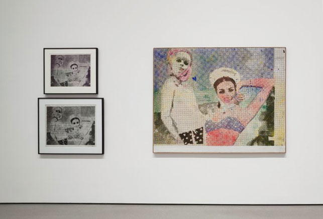
Installation view of Alibis: Sigmar Polke 1963–2010, The Museum of Modern Art, New York, April 19–August 3, 2014. © 2014 The Estate of Sigmar Polke/Artists Rights Society (ARS), New York/VG Bild-Kunst, Bonn, Germany
Within the arsenal of unusual and experimental techniques on clamorous display in Alibis: Sigmar Polke 1963–2010, the artist’s prints are notable for their sly celebration of the halftone dot pattern, the tonal register that has enabled images to be reproduced in newspaper photographs, magazine ads, consumer packaging, etc. since the late 19th century. Although Polke exploited the regular dot pattern in paintings and drawings as well, in his graphic works the tension between “high” art and “low” print culture is especially redolent and primary.
To make his prints, Polke typically employed techniques that had commercial associations, such as photolithography (also known as offset printing) and screenprinting. His first print, Girlfriends I (1967), a photolithograph, already bears the hallmarks of his approach, including his self-referential dots (in 1965 he famously claimed: “I love all dots…. Dots are my brothers”) and his fascination with such print-based concepts as layering, transference, replication, and accident. To create the work, Polke provided the German publisher August Haseke with a photograph of a found press clipping. Haseke then reproduced the photograph as an offset print. By enlarging the clipping beyond legibility, Polke exposed irregularities in the dot pattern, thus further degrading an already “cheap” printing method. Polke’s print and his photograph are both included in the exhibition, next to a related painting that is thought to have been created when Polke projected the press image onto canvas. In contrast to the mechanical methods used to create the print, Polke likely produced the painting using a combination of stencils, a spray gun, and his own hand to apply the dots and color splotches.
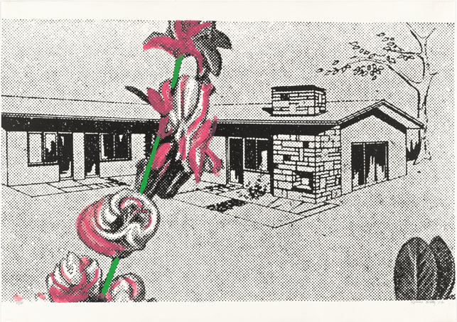
Sigmar Polke. Weekend House (Wochenendhaus) from Graphics of Capitalist Realism (Grafik des Kapitalistischen Realismus). 1967. One from a portfolio of six screenprints, comp.: 20 1/2 x 32 15/16″ (52 x 83.9 cm). Publisher: René Block for Stolpe, Berlin. Printer: Birkle, Thomer, & Co., Berlin. Edition: 80. The Museum of Modern Art, New York. Linda Barth Goldstein Fund, 1995. © 2014 The Estate of Sigmar Polke/Artists Rights Society (ARS), New York/VG Bild-Kunst, Bonn, Germany
This tension between the mechanical and the gestural is also found in Polke’s first screenprint, Weekend House (1967), which is displayed near the group of Girlfriends in the second gallery (see image at top). Although Weekend House also began with a newspaper advertisement, this time Polke developed the composition by copying the found image by hand (the original drawing is now lost), mimicking the dots of the ad. He then photographically transferred the drawing to a screen for printing; on a second printing screen Polke added the pink and green brushstrokes that overlay the central flower motif. In the resulting print, the uninflected uniformity of the house contrasts with Polke’s vivid, painterly marks, creating an irreconcilable sense of disconnect.
Though a weekend home is traditionally viewed as a personal retreat from the monotony of urban life, here, Polke uses the vocabulary of printmaking to render the house as something impersonal and infinitely reproducible. Where Polke’s choice of subject matter in Weekend House signaled an increasingly affluent German leisure class, the painting that hangs immediately to the right of the work, Front of the Housing Block (1967), depicts another side of the postwar economy. Initially the towering urban development and the low-slung country home appear to be a study in contrasts. Each work features Polke’s signature dots, yet in an ironic twist that seems to belie their subject matter Polke created Front of the Housing Block as a unique object, while Weekend House was produced in an edition of 80.
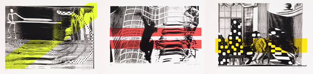
Sigmar Polke. The First Cut (Der erste Schnitt), The Second Fall (Der zweite Fall), and The Third Estate (Der dritte Stand). 1995. Series of three screenprints, sheet: 21 5/8 x 29 1/2″ (55 x 75 cm). Publisher and printer: Edition Staek, Heidelberg. Edition: 60. The Museum of Modern Art, New York. Riva Castleman Endowment Fund, 2012. © 2014 The Estate of Sigmar Polke/Artists Rights Society (ARS), New York/VG Bild-Kunst, Bonn, Germany
In the final gallery of the exhibition, a group of three screenprints created almost 30 years after those two early prints represent the first time Polke deliberately misused a Xerox machine by quickly moving an image across the scanning bed to achieve surprising results. The screenprints—The First Cut, The Second Fall, and The Third Estate (1995)—are hung alongside paintings, photocopies, and slide projections that were similarly inspired by printing errors. In this series of three works, Polke’s dots have been subjected to chance. Now blurred and elongated, they reflect the technologies of the rapidly evolving digital age at the brink of the 21st century.