

Johannes Itten. Color Sphere in 7 Light Values and 12 Tones (Farbenkugel in 7 Lichtstufen und 12 Tönen). 1921. Lithograph, composition (irreg): 17 3/16 x 11 7/16″ (43.7 x 29 cm); sheet: 18 5/8 x 12 9/16″ (47.3 x 31.9 cm). Committee on Prints and Illustrated Books Fund. © 2013 Johannes Itten/Artists Rights Society (ARS), New York/PROLITTERIS, Switzerland
“Color deceives continuously.” – Josef Albers
Take a deep breath…
Eugène Delacroix, Neo-Classicism, Romanticism, Claude Monet, Auguste Renoir, Camille Pissarro, Post-Impressionists, Symbolism, Georges-Pierre Seurat, Paul Cézanne, Vincent van Gogh, Paul Gauguin, Félix Fénéon, Paul Signac, Sonia Delaunay-Terk, Robert Delaunay, Paul Sérusier, Odilon Redon, Charles Baudelaire, Henri Matisse, Ernst Ludwig Kirchner, Vasily Kandinsky, André Derain, Impressionism, Neo-Impressionism, Fauvism, Expressionism, Orphism, Pop, Minimalism, Conceptualism, electromagnetic spectrums, wavelength, frequency, Munsell Color System, hue, value, chroma, tint, shade, tone, additive/subtractive color, chromoluminarism, microscopy, Raoul Dufy, Barnett Newman, Die Brücke, Der Blaue Reiter, Franz Marc, Karl Schmidt-Rottluff, Kasimir Malevich, Georgia O’Keeffe, Walter Gropius, Josef Albers, Bauhaus, Johannes Itten, László Moholy-Nagy, Paul Klee, Anni Albers, Robert Rauschenberg, Wilhelm Ostwald, Georges Braque, Lyubov Popova, monochromes, Aleksandr Rodchenko, Ad Reinhardt, Willem de Kooning, visible/ultraviolet/transmitted/reflected/polarized light, pigment, binder, glaze, fadeometry, micro faders, spectrometers, colorfast, lightfast, celluloid, Lucite/Plexiglas, Bakelite, polyethylene, injection molding, Pantone, thermoplastics, polypropylene, fiberglass, linoleum, Formica, cellulose, cellulose nitrate, melamine, Robert Ryman, Agnes Martin, Yves Klein, Tom Wesselmann, Andy Warhol, John McCracken, Verner Panton, Joe Colombo, Eero Aarnio, Marco Zanuso, Charles Rennie Mackintosh, Margaret MacDonald, Margarete Schütte-Lihotzky, cyanotype, autochrome, chromogenic, kodachrome, CRT monitors, oscilloscopes, luminance, chrominance, wave form monitors, vectorscopes, Edward Steichen, William Eggleston, John Baldessari, Cindy Sherman, Kelley Walker, Carrie Mae Weems, Andreas Gursky, Edward Steichen, Stephen Shore, Joel Meyerowitz, Helen Levitt, Thomas Struth, John Chamberlain, Dan Flavin, Ed Ruscha, Daniel Buren, Jennifer Bartlett, Shirin Neshat, Cory Arcangel, and Lynda Benglis…
…are just a selection of the terms, topics, artists, and ideas covered in the online course From Pigment to Pixel: Color in Modern and Contemporary Art.
Earlier this year Deborah Howes, Director of Digital Learning at MoMA, wrote a post about How to Make Online Courses for Museums. This new online course on color reflects the considerations and techniques she presented, and strives to create a dynamic, deep, and varied experience for the student.
Conceiving a course around the broad topic of color was very enticing since color is an elemental component of art and design (along with line, form, texture) as well as something we live with and respond to daily. The importance of color pervaded early 20th-century teaching and engagement with art and related fields. Since understanding color is one of the key building blocks, the famous preliminary course of the Bauhaus school (taught by such artists as Vasily Kandinsky, Paul Klee, and Josef Albers) emphasized the understanding of color for all its students, whether they were painters, designers, architects, or weavers.
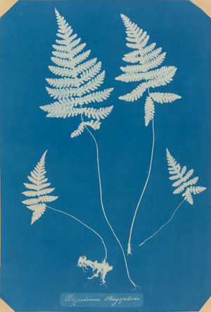
Anna Atkins. Polypodium Phegopteris. 1850–54. Cyanotype, 12 3/4 x 8 5/8″ (32.4 x 22 cm). David H. McAlpin Fund
How to begin to construct a course? One way of helping to focus the field was to look at color through the MoMA’s diverse collection. From oil paintings by Georges-Pierre Seurat to video work by Lynda Benglis, the Museum’s collection provides a unique view of how early modern to contemporary artists, designers, and photographers were challenged and inspired by color. Numerous staff members at the Museum, including curators, conservators, educators, and graphic designers (many of whom are featured in this course) used their specialized knowledge to help identify key moments in modern and contemporary art in which color played an especially important role (as well as MoMA’s role in collecting and preserving the work created), and these various perspectives played a part in developing the course.
The expertise and diverse viewpoints of staff and specialists are featured in weekly lectures, videos, interviews, and studio demonstrations, which give students a number of entry points into the content—from Henri Matisse’s radical use of color to a conservator’s analysis of a pigment sample under a microscope and a contemporary artist’s new take on an old medium—in this case, Christian Marclay’s approach to cyanotypes (see above left and below).
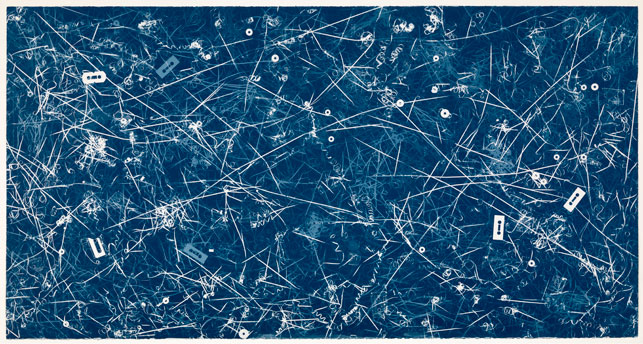
Christian Marclay. Allover (Genesis, Travis Tritt, and others). 2008. Cyanotype, sheet & composition: 51 1/2 x 97 3/4″ (130.8 x 248.3 cm). Publisher: Graphicstudio, University of South Florida, Tampa. Printer: Graphicstudio, University of South Florida, Tampa. Edition: unique. Acquired through the generosity of Steven A. and Alexandra M. Cohen. © 2013 Christian Marclay
Studio demonstrations and hands-on exercises relating to the featured content allow students the chance to explore color in a variety of mediums at home. Following the changing use and significance of color through the objects in the Museum affords us new tools that can help reveal the underpinnings of artistic explorations and enhance our perception and appreciation of the technological advancements and changes in modern life that have impacted how we perceive color today. Share with us some of the ways in which color impacts your everyday life!
An instructor-led version of the course was launched this spring, and, beginning in the summer MoMA, will also offer a self-guided version.