Imperfection and roughness are part of type history: in the predigital era, wood and metal letterforms wore down unevenly, and randomized differences were inevitable; truly consistent letterforms only became possible with digitized type. FF Beowolf brings uncertainty back to typography: it features a randomization feature in its code dictating that its forms change shape every time they are printed, so no letter will look the same twice. "A certain roughness or varying unevenness is quite pleasing to the eye," van Rossum has said. " . . . For reading, sameness is not necessary: we can read handwritten text, type superimposed on flickering TV images. The sameness of type seems an arbitrary thing that we can do away with in certain cases." In order to achieve this effect, they substituted the programming commands "lineto" and "curveto" in the PostScript code (PostScript is a computer program that describes what the outlines of letterforms are designed to look like) with their own command "freakto." "Freakto" causes a letter to be randomly generated with erratic outlines.
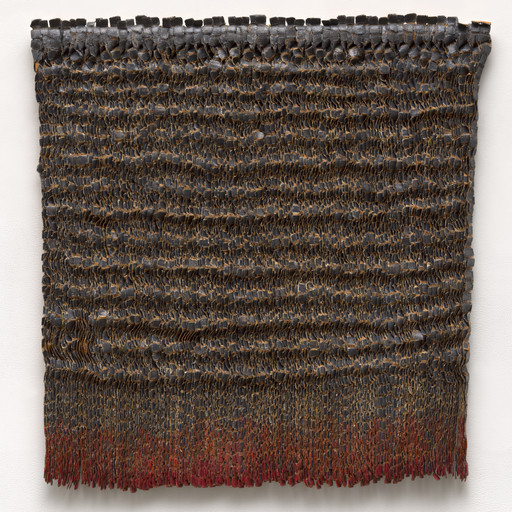
Standard Deviations, 2011.
Explore more


From MoMA Design Store


Licensing
Artwork or archival images
If you would like to reproduce an image of a work of art in MoMA's collection, or an image of a MoMA publication or archival material (including installation views, checklists, and press releases), please contact Art Resource (publication in North America) or Scala Archives (publication in all other geographic locations).
Audio and film clips
MoMA licenses archival audio and select out of copyright film clips from our film collection. At this time, MoMA produced video cannot be licensed by MoMA/Scala. All requests to license archival audio or out of copyright film clips should be addressed to Scala Archives at [email protected]. Motion picture film stills cannot be licensed by MoMA/Scala. For access to motion picture film stills for research purposes, please contact the Film Study Center at [email protected]. For more information about film loans and our Circulating Film and Video Library, please visit Circulating Film and Video Library.
Text from a publication or the archives
If you would like to reproduce text from a MoMA publication, please email [email protected]. If you would like to publish text from MoMA's archival materials, please fill out this permission form and send to [email protected].
Feedback
This record is a work in progress. If you have additional information or spotted an error, please fill out this feedback form.