
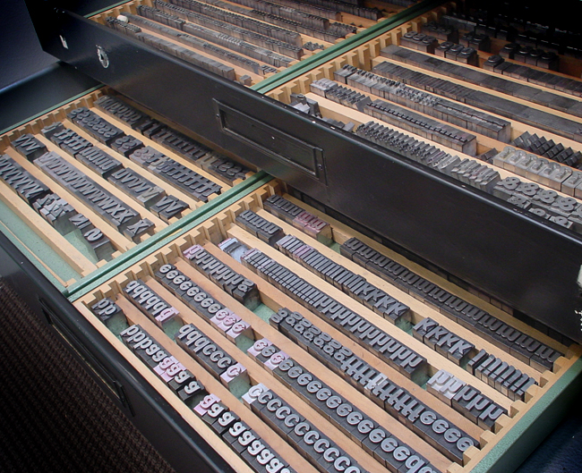
The MoMA Department of Graphic Design's metal set of Franklin Gothic
The Franklin Gothic typeface is the primary influence for nearly all MoMA materials; it’s the basis of our logo (see the top of your screen) and our official font “MoMA Gothic,” which were both created by Matthew Carter. We were happy to see that MoMA used a version of Franklin Gothic as long ago as the 1930s. We found these printed materials in our archives while doing some research on our current identity.
We understand not all people are totally crazy typographic aficionados like us, but more often these days, casual observers are able to recognize subtle differences in typefaces that were once thought to be the domain of only the obsessed. Can you spot Franklin Gothic on the walls of MoMA, in our subway advertisements, or anywhere else? Look for the “two story” lowercase “g” with a unique “ear” to be certain!
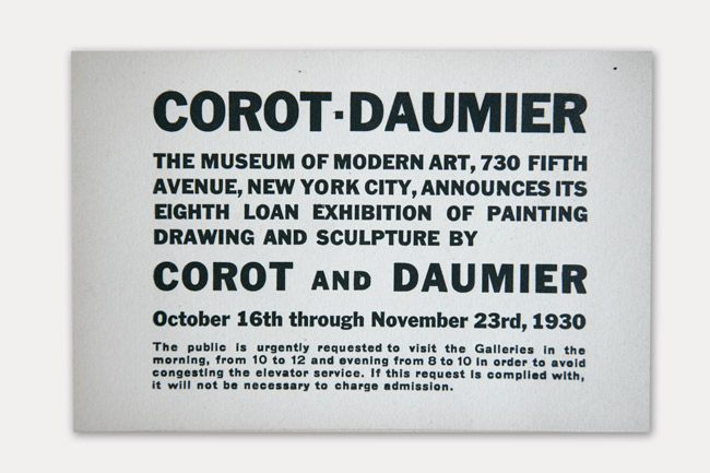
An exhibition announcement for Corot-Daumier, The Museum of Modern Art, 1930
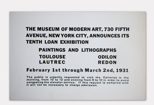
An exhibition announcement for Paintings and Lithographs: Toulouse Lautrec & Odilon Redon, The Museum of Modern Art, 1931
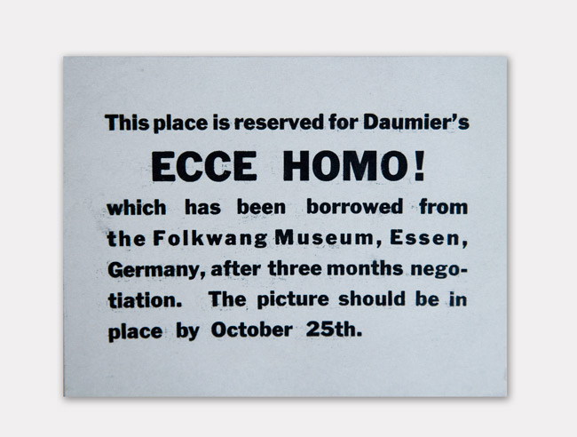
A MoMA wall label from the 1930s
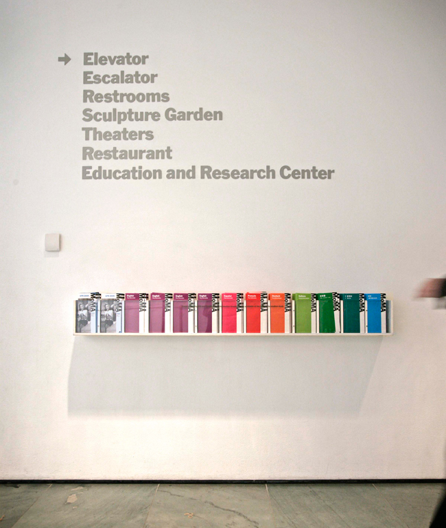
The typeface in use at MoMA today