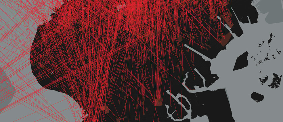
Laura Kurgan (South African, b. 1961), Eric Cadora (American, b. 1962), David Reinfurt (American, b. 1971), Sarah Williams (American, b. 1974). Spatial Information Design Lab (est. 2004), Graduate School of Architecture, Planning and Preservation, Columbia University (USA, est. 1881). Architecture and Justice from the Million Dollar Blocks project. 2006. ESRI ArcGIS software. Gift of the designers. © Laura Kurgan, Spatial Information Design Lab, GSAPP, Columbia University.
Million Dollar Blocks (Spatial Information Design Lab)
From the curators: Of the more than two million people in jails and prisons in the United States, a disproportionate number come from a few neighborhoods in the country’s biggest cities. In some areas, the concentration is so dense that states are spending in excess of a million dollars a year to incarcerate the residents of single city blocks. Using rarely accessible data from the criminal justice system, the Spatial Information Design Lab and the Justice Mapping Center have created maps of these “million dollar blocks” and of the city-prison-city-prison migration flow in five of the nation’s cities. Shown here is the map of Brooklyn, NY.
Information graphics have been given a bad name by USA Today. Many people think of them as ways of tarting up the trend of the day into a bit of eye candy. Nothing could be further from the truth. Our ability to understand cause and effect in the world depends on grasping complicated relationships among variables—how people, money, actions, power, things, and qualities are distributed in space, how they vary in time, and how they affect one another. The human brain did not evolve to do such complex calculations. But we are primates, with almost a third of our brain devoted to vision and visual cognition. Translating complicated relationships into a visual format is the best way we have of co-opting our primate neural circuitry to meet the demands of understanding our world. And it is a challenge where the creativity of artists, graphic designers, and other visual thinkers is essential. We have made do with standard graphical formats—pie charts, line graphs, organizational charts, and so on—for more than a century. We need ways to figure out how to use the resources of the page or screen—shape, contour, color, shading, motion, texture, depth—not just to channel data into brains, but to reveal subtle relationships as visual patterns.
Nowhere is this need more apparent than in the understanding of violence. Murder, rape, assault, and robbery all shot up in the 1960s, then came crashing down again in the 1990s, and no one really understands why. The American imprisonment boom had something to do with it, since people behind bars cannot commit crimes on the street. But it’s apparent that long ago we reached diminishing or even reversing returns, and we throw far too many people in jail for far too long. Knowing the right amount of criminal punishment—enough to keep rapists off the streets, but not so much to ruin lives and communities and divert resources from more productive uses—is the kind of continuous, analog, multidimensional challenge that common sense is not equipped to handle. Million Dollar Blocks is an eye-opening way to get us to grasp the social and economic costs of over-imprisonment, in a way that no list of sentences or table of numbers could do.
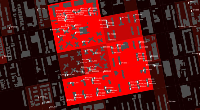
Laura Kurgan (South African, b. 1961), Eric Cadora (American, b. 1962), David Reinfurt (American, b. 1971), Sarah Williams (American, b. 1974). Spatial Information Design Lab (est. 2004), Graduate School of Architecture, Planning and Preservation, Columbia University (USA, est. 1881). Architecture and Justice, from the Million Dollar Blocks project. 2006. ESRI ArcGIS software. Gift of the designers. © Laura Kurgan, Spatial Information Design Lab, GSAPP, Columbia University.
October 24, 2013, 4:46 pm
Giorgia
The debate in these days mostly rotates around a supposed “objectivity” of data-visualisation; to me, this is not a real matter or a topic of conversation, in a certain way it would be like posing the question of objectivity in journalism, which makes no sense.
From my point of view data-visualization can (and should) open new perspectives on the ways we interact with information and stories; very important is always to understand in which contexts we should interpret the data we gather and analyze, and questioning ourselves about what it is interesting in these numbers and what possible correlations with other information we might experiment to unveil hidden stories, or to raise new questions (rather than expecting to have ultimate answers).
To this regard, whenever the main purpose of visualizations is to clarify reality, open readers’ eyes to new knowledge or to engage and entertain the audience about a topic, it’s often impractical to avoid a certain level of visual complexity.
And this because the world is complex, compound, rich in information that can be combined in endless ways, therefore catching new points of view or discovering something that you didn’t know before often cannot happen at a glance: this process of “revelation” often needs and require an in-depth investigation of the context. Consequently, we should also think at those certain kinds of data visualizations as visual ways to convey the richness, the involvement and feelings (being engagement or concern) that we experience in our everyday lives rather than a simplifications of the world.
If we aim at understanding the world we should cope with its own peculiar features: reality is most of the time complex, hard to read, brutal, violent, why should its visualization be different?
October 24, 2013, 10:19 pm
Farai Chideya
The New Jim Crow, Continued
Author Michelle Alexander wrote a powerful and provocative book called The New Jim Crow which deals with the racial patterns of incarceration in America. If you take this neighborhood-to-prison-to-neighborhood visualization, it’s also worth examining the realities of a gentrifying New York that could be layered on top of this.
For example, the map linked below shows how black New Yorkers no longer can afford to live in Harlem, and are mainly concentrated in Brooklyn.
http://www.wired.com/design/2013/08/how-segregated-is-your-city-this-eye-opening-map-shows-you/
As someone who lives in Crown Heights, a rapidly-gentrifying Brooklyn neighborhood that has gone from crack vials to $11 organic juice in the supermarket, I see how policing is affected by gentrification.
‘ve lived in NYC for 20 years, mainly in Manhattan. I remember being afraid when I visited Crown Heights in my early years. There were many wonderful residents then who felt trapped in their homes by drug-related violence. I have lived in the neighborhood for three years. I am two blocks from the Botanic Garden and a couple more from the Brooklyn Museum, so you can see why it’s desirable real estate. But one of the important paradoxes is that the neighborhood is getting MORE heavily policed — I presume to protect the newer, wealthier, and often-but-not-always whiter residents. (I consider myself, for better or worse, a “brown gentrifier.”)
An important part of the neighborhood-to-prison-to-neighborhood pipeline is the paradox that violence and crime are seen as less problematic when the neighborhood is less wealthy. And of course, much of the crack cocaine sold in the old Crown Heights was sold to wealthier and whiter people who came to get their supply, and then left to smoke at home.
October 25, 2013, 2:52 pm
Shana Agid
Whose violence are we seeing here?
Pinker suggests that “the imprisonment boom” had something to do with the reductions in reported crime levels in the US over the past now close to 40 decades. But Ruth Wilson Gilmore, a geographer and scholar / activist who traces the impacts and origins of the exploding prison industrial complex on California in her excellent book *Golden Gulag: Prisons, Surplus, Crisis, and Opposition in Globalizing California,* demonstrates otherwise. She argues that while the typical assumption is, like Pinker’s, that “crime went up, we cracked down, crime came down,” when we look at the relationship of the prison boom to the change in reported crime rates what we find is that “crime went up, crime came down, we cracked down.” Her book is dedicated to working out how and why this might have happened. She does this through the lenses of racial stratification and racism, shifting economic ground in a post-industrial society, and demonstrating that it is and was through the questions that get asked by people both impacted by prisons and imprisonment and fighting against the use of prisons to address social concerns that produce poverty, lack of opportunity, and what Gilmore calls “group differentiated vulnerability to premature death,” that we learn what really makes this system tick.
Gilmore argues that racism is violence, and that the prison and its instruments are instrumental in a system that produces and maintains this violence. Looked at in this way, we might imagine, then, that Billion Dollar Blocks is not showing the violence that Pinker describes – the ways that violence is perceived as it is written into the criminal code – but rather that it is, in deeply important ways, visualizing the impact of someone else’s experience of violence: the violence of the system of imprisonment itself. What Billion Dollar Blocks does as an infographic is make almost outrageously visible the act of emptying out whole neighborhoods of people, in the name of “safety,” along with many of the fiscal resources, such as they are, tied to those neighborhoods through census counts. Numbers and even charts and graphs can “show” us all manner of things, but this design work makes evident, if given a complex read across what we sometime imagine are the parameters of discussion of “violence,” the dissolving impact of prisons and imprisonment on the neighborhoods – most often poor, working class, and / or whose residents are largely people of color – targeted for policing. I’d be curious to see Billion Dollar Block overlapped with the New York Times map from 2009 of Stop and Frisk stops in those same neighborhoods. (You can see that interactive map here: http://www.nytimes.com/interactive/2010/07/11/nyregion/20100711-stop-and-frisk.html?_r=0)
In my own design work with an organization working in mid-size west coast US city on issues of policing, I’ve been wondering what happens to designers’ practices when we allow ourselves to question the construction of some basic ideas that bring order and structure to our capacity to identify “problems” and “stakeholders.” The group with which I work does not take “crime” for granted as a static category, but rather as one that is constructed to produce particular – and limited – ideas of both “violence” and “safety.” If we, as designers, are willing to read across the grain, to not take for granted, for example, the idea that police are the primary experts on “crime” or that “violence” can be traced through arrest rates, then it has the capacity to greatly shift our practice, acknowledging that design (and designers) are one more contingent and moving part in complex design processes. This mapping project by The Spatial Design Lab and the Justice Mapping Center helps to reveal not only patterns of confinement and removal, but assumptions about what is worth seeing and how we learn to interpret what we see in relationship to hotly contested issues regarding policing, imprisonment, racism, and space. These questions are, and must be made, central to any designing around issues of imprisonment, violence, or “crime.”
November 14, 2013, 3:44 am
cameron tonkinwise
“Eye-opening.” And then?
1a: The assumption is that the (designed) graphic does more than (undesigned) prose about the same issue. (Is the catchy title part of the design or the discourse? What about the concept that drove the research that the graphic merely illustrates?) If the graphic gains something in speed and force, it seems to lose other things with respect to complexity and context. The proposals to layer graphics onto each other would be difficult to design without re-prosifying the graphic. So there is a violence to the graphic in its reductivism and formalism.
1b: And it is of course very beautiful – in the modernist clean-lines, silhouette-with-political-red, sophisticated-i.e.-expensive-data-tech way that my class and cultural upbringing have made me value. Is there even more violence to the graphic-as-violent-to-context-detail (see 1a) when it conceals that violence beneath beauty? Or does it become even more beautiful precisely because it is manages to make state-and-capital-based violence beautiful? (Do you remember Paul de Man writing about Schiller on Kleist writing about an imprisoned dancing bear: “Aesthetic education by no means fails; it succeeds all too well, to the point of hiding the violence that makes it possible?”)
2a: Let’s say, despite or because of the violent beauty of this reductively insightful graphic, ‘reality has been clarified.’ What is the theory of change here? It’s just the old Enlightenment if not Platonic model, isn’t it? It suffices to know the good to then be doing the good. Knowledge becomes Belief becomes Value becomes Action – an implacable sequence, without the need for any further design? Clearly not. To be post-modern, i.e., post-Kantian, is to iive in constant hypocrisy, knowing what needs to be done, yet not doing it, even when on odd occasions one knows how. Does a graphic gets us any further toward action or just make our hypocrisy more intolerably visible. After having your eyes widened, you can always just blink.
2b: If design has any real significance for ethico-political issues like the violence of incarceration, it lies not in action-defeating ‘awareness-raising’ but in action-enabling. These two are not in strict opposition. The matter lies in who saw this graphic, who was made to see it, how, where and when. What was the actual material context for which the graphic was designed as an intervention. Presumably it was not designed just to sit in graphic design magazines or art galleries. Presumably it was gifted to activist and organizers, foist upon urban planners and elected representatives, attached to street corners and neighborhood organization annual reports, or mailed anonymously to investors in prison-systems with the warning, ‘we, a large mass of people, now know what you’re up to; divest now or else!’ In this way, by being given a ‘mode of existence’ as Bruno Latour is now saying, it gained some active force; it was a non-human actor in a network of other actors reassembling the social. In that case, is it the curators of this exhibition who have done the work a final violence by wrenching it from its active context in order to pin up its reified corpse for privileged people to discuss comfortably? If that has happened, then design itself is being returned, almost non-violently, to its proper quiet place, as something whose relation to violence can only ever be an ‘and’ put there by a wealthy museum.
November 24, 2013, 6:25 pm
Susan Yelavich
A final violence
The question of whether museum curators, or for that matter academics, should engage with the social from the safe distance of galleries and classrooms, has plagued my conscience since the day I realized I was not going to work ‘on the barricades’ as it were but in the realm of writing and design, in the museum and now the academy. It is true that examining objects of violence, or cautionary design projects about violence, runs the risk of masking the pain of the subject–the person to whom violence is done. Yet, I take issue with the inference that cultural institutions should not comment on fraught socio-political territory–and that when they do, they are slumming.
in a recent issue of the New York Review of Books, Zadie Smith writes about the near impossibility of imagining oneself a corpse. Writing about a Luca Signorelli drawing (c. 1500) of a man carrying a corpse, she asks: “How can I insist upon the reality of death for others, and for myself?.” And answers: “It’s a part of what art is here to imagine for us and with us.” (NYRB, 12/5/13) What about design? Particularly critical, speculative, propositional design? Can or should it imagine violence (and one of its consequences, death) ‘for us and with us’? I would say, with qualifications, yes.
Pinker’s commentary along with most of the other invited experts (of which, full-disclosure, I will be one) are measured and thoughtful but somehow unmoving. The exception, for me, is Anne-Marie Slaughter’s response to the cage-fighter fragrance. Her evocation of her husband’s back, alone, complicated and enlarged the conversation about violence in a way that the image of the vial of fragrance could not. She understood design (in this case a scent) is experience contained. Design, in the words of my friend and colleague Clive Dilnot, is ultimately “impure.”
What is the value of this kind navel gazing? Of questioning the value of commentary (through things and words) in an admittedly elite context, in the context of nowhere and everywhere–the web? What is the value of ideas without action? Hannah Arendt would, I think, have argued that political action flows from places that enable public speech. We are in one of those places here. What matters is the quality of speech it engenders. The objects seem less consequential than the comments they provoke or do not.
That said, I do wonder if in the coming weeks we’ll read about things and places less pointedly violent, whose destructive capacities are deliberately ignored? Right now, the site is largely populated with designers’ critiques of violence–things like the map, handbags, the scent. But what of the banal evil Arendt so famously exposed? What about fast food outlets, gated communities, and prisons themselves?
In 1960 George Nelson created a program for CBS’s series Camera Three called “A Problem of Design: How to Kill People.” While it was largely construed as a Cold War critique of weapons, we might also see it as a critique of the violence intrinsic to design itself. (John Harwood’s essay “The Wound Man” does just that.) Design, for years, has created things (including weapons) meant to operate between people and other things, between people and other people–and being ‘between’ can have the unfortunate affect of distancing cause and affect.
To return the the legitimate and provocative critique offered by Cameron–that cultural institutions neuter violence by their distance from it–I would say that this is the paradox of design-writ-large. We can only hope that conversations, no matter how small, no matter whether conducted through words or things, will lead us to more thoughtful action.
December 7, 2013, 10:42 pm
James Laslavic
The Unmet Need to Understand Obstacles
Does it really take a genius like Steven Pinker or talented designers like the Spatial Information Design Lab to convey the point that our best hope of solving a problem will begin with achieving better understanding of it? Yes, evidently. Actually, it’ll probably take a lot more than that, and the reasons for why it’s so difficult to implement the changes are precisely what’s missing from this effort to understand the problem enough to have serious hope for realizing and implementing an effective solution.
But please don’t misunderstand me! I’m on board with most of Pinker’s post about million dollar blocks. Both as a design practitioner and as a design studies graduate student, I applaud anybody who understands that making things pretty and increasing profits are just two of design’s (least interesting) capabilities. Calling for information design to help reduce violence and unnecessary incarceration resonates strongly with me, and Pinker did an excellent job of using the maps of the million dollar blocks to illustrate the connection between our society’s lack of understanding the problem with the bash-head-against-wall answer.
I really did want to 100% agree with Pinker’s post, instead of 99% agree. I respect him tremendously. But no, the map does not do all that he suggests it might. Let’s look at the last sentence of his post. “Dollar Blocks is an eye-opening way to get us to grasp the social and economic costs of over-imprisonment, in a way that no list of sentences or table of numbers could do.”
What counts as having a grasp? Does knowing the severity of a cancer diagnosis imply having a grasp of the problem? How about knowing the incredible costs, or how widespread it is, or how much it affects certain neighborhoods? If having a grasp of a problem means understanding the reasons why a solution has not yet been found, then no, it’s not enough for cancer, and it’s not enough for over-incarceration.
The critical missing ingredient – and hopefully the next step for the Million Dollar Blocks project – is the identification of past efforts at addressing the problem, accompanied by an explanation of the institutional resistances that have hindered them and the organizations that are currently working on it.
December 9, 2013, 12:39 am
Veronica Uribe
The negotiation capability of design
As much a design might be intended by its designer to enable a specific action that seeks to resolve a problem, its use in the world is unpredictable. In that sense every design must negotiate between many goals—some intended by the designer and others not.
Furthermore, designs sometimes must bring together incommensurable goals. In contrast to what Cameron Tonkinwise states in his, post I don´t think that action and discourse are goals of this kind. Discourse is indeed a kind of action. And therefore I don´t think that presenting this information in a design magazine or an art gallery is in vain. The act of recognition (material or symbolic) has always had an impact in those communities that receive it. I agree that the mere symbolic recognition is not enough for resolving this problem of racially disproportionate incarceration, but sometimes it is part of the solution or is a necessary step to determine the range of the problem. Finally, introducing the Million Dollar Block map into this forum opens up the possibilities for new points of view on prisons and social violence as well as different interpretations of the mapping process and its communication value.
March 5, 2014, 8:41 pm
Gina
Information graphics are key in understanding and making sense of problems, research, and findings in order to come up with new conclusions about the subject being studied. What information graphics do for viewers is go beyond words in describing the problems a city, group, or person may be facing and in some way can make sense of it. Along with this they can also lead to new perspectives hat further research and draw new ideas regarding a subject. I believe that information graphics have a strong presence and can communicate research more clearly than words alone can in many cases.