
As part of an ongoing exhibition series with the Hyundai Card Design Library in Seoul, Korea, MoMA senior curator Paola Antonelli has organized three capsule exhibitions that highlight new frontiers in contemporary design and encourage international dialogue. The second exhibition, Data Visualization, opened in Seoul in July 2015 and has recently concluded. We live in an age where we are bombarded by data gathered by sensors, arrayed by software, and dispersed via ever-proliferating networks. To visualize this data is to understand it. As the projects in this exhibition demonstrated, designers and scientists create diagrams, three-dimensional maps, and other graphics to help us make sense of the copious amount of information with which we are confronted daily. The New York-Seoul exchange has deepened during in-person visits to Korea where Antonelli met with designers to discuss their current work. Here, one of these designers, Sey Min, reflects on the specific circumstances of data visualization design in the Korea.—Michelle Millar Fisher, Curatorial Assistant, Department of Architecture and Design
How do we design digital realism in a networked environment?
In visual art, Realism often means artistic representation of reality as it is, an act of mimesis. Compared to Romanticism, which emphasizes subjective experience and emotion, Realism focuses on facts and ordinary life. In the 19th century, Realists depicted figures and scenes as they were experienced—or might be experienced—in everyday life. They often participated in social movements through their paintings. For example, Gustave Courbet (1819–1877) portrayed working-class life in his paintings. In the digital era, which we’ll define as “life with smartphones,” how has realism been adopted in a networked environment? Does new technology help to continue the artistic intentions, achievements, and aesthetics of Realism? If so, how?
Data can be a medium for digital realism. Web-browsing histories show recent interests. Instant messaging services keep your personal conversations as unstructured data. Credit card usage shows things you eat and buy regularly. Digital data collected from our daily lives can describe, depict, and represent facts and truths about ourselves and our surroundings. Digital data allows us to picture not only what we can readily see, but also the things that aren’t visible.
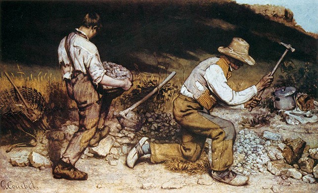
Gustave Courbet. The Stone Breakers. 1849
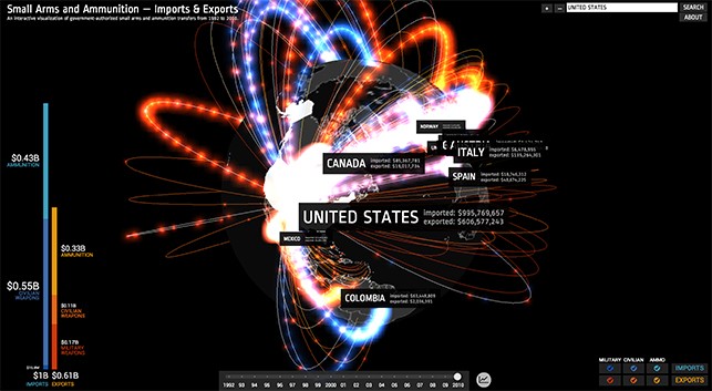
Small Arms Imports/Exports: an interactive visualization of government-authorized small arms and ammunition transfers from 1992 to 2010. Google idea (2012). (chromeexperiments.com)
Data as visual?
Data consists of facts that can be analyzed or used in an effort to gain information. Mankind wrote texts, numbers, and drew pictures in caves, on objects and paper to record their lives dating back to ancient history. Nowadays, we leave our trace and history with digital devices, and smart sensors do it automatically without our permission at times. According to IDC (international Data Corporation), by 2020 the data we create and copy annually will reach 44 zettabytes, or 44 trillion gigabytes. As you see, data is exploding.
Personal location data collected through smartphones. It can tell where I have been, how long I have stayed, and how many times I have visited. (randomwalks.org)
Visualizing data depicts the world without emotional interpretation or subjective frames (or at least it seems to, at first glance). It purports to allow the viewer to experience clear and rational representation. Data collecting and sharing systems such as Open API, public data, wearable devices, and video analytics empower us to dive into the real world with ground to global perspectives.
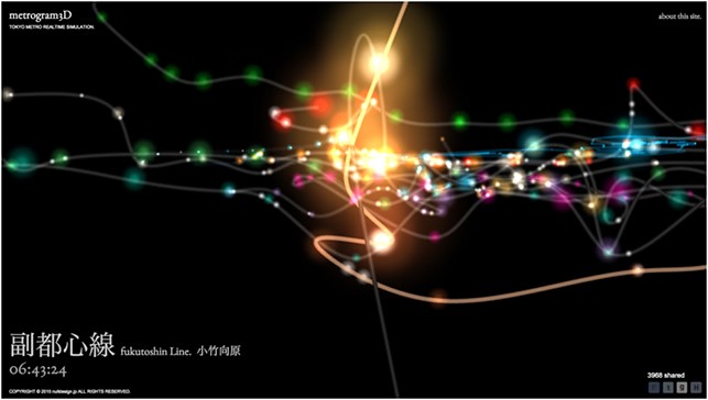
Metrogram: real time 3-D interactive map of Tokyo subway by Hiroshi Koi (chromeexperiments.com)
The raw world, data visualization
Seeing data is often an unpleasant experience—reality isn’t always easy to stare straight in the face. Human memory and understanding is not always accurate, and most of our memories can be expanded, twisted, and colored in the ways we want to remember. But digital data is, to a certain extent, pure. At a surface level, there is no fantasy or illusion in the data world.
Data visualization is interesting because we can have different perspectives from the same exact data: good results, unexpected views, things already known, things never seen before, unusual topics, and find common issues. For example, Stamen Design highlights patterns driven by data in their project “Cabspotting,” traffic data of taxis in a city tell us about citizens’ daily routes, accidents that have happened, and special events occurring in a city through the rhythms of data transition. Recently, the New York City Taxi & Limousine Commission released information on 1.1 billion individual taxi trips in the city from January 2009 through June 2015. This data set shows rush hour traffic, New York’s nightlife hot spots, and more. We can navigate through this data to find beauty and value from multiple angles. To paraphrase the viewpoint of the Realist painters, beauty does not only exist in high status, but it can be everywhere in many other forms, including raw and processed data sets.
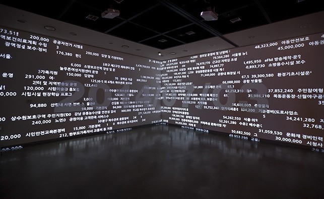
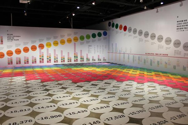
Seoul Expenditure Data—What Seoul did today: Seoul city’s daily undertakings and amounts by Random Walks
Art and Information, data visualization in Korea
Data visualization in Korea has not fully blossomed yet. The open data movement and information design are relatively active, but not many data visualization works have been published in Korea. Control is perhaps one reason. Information design in the form of infographics delivers intentions and messages directly to viewers in clear forms. The role of the viewer is as a consumer, not producer. However, data visualization asks viewers to be information producers, shaping the data in relation to their own understandings, experiences, and interpretations.
A few prominent design studios in Korea such as Vice Versa Design, Neuro Associates, and Infographics 203 focus on information design that especially uses government and industry market data. Their clients and market experts collect the data first, and then apply designs later for better understanding.
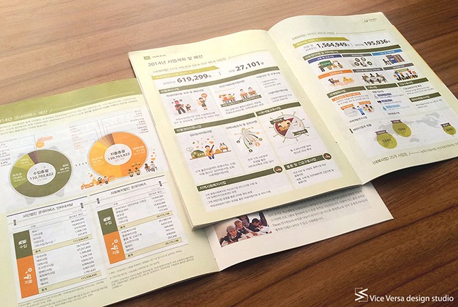
2014 Good Neighbors business plans and budgets by Vice Versa
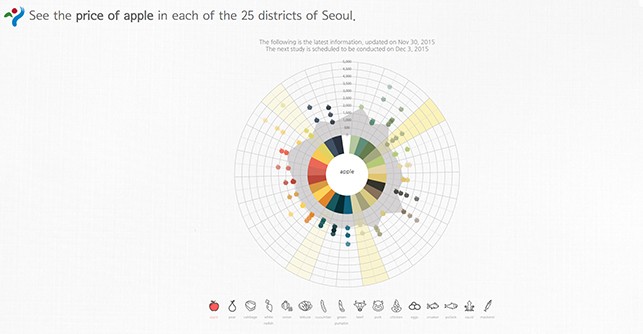
Seoul city grocery price comparison map by Neuro Associates
The Korean Modern history project by Infographics 203 transformed South Korea’s complicated historical issues into understandable graphics.
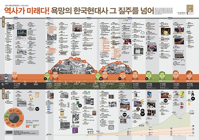
Korean Modern history by Infographics 203
Journalism also uses data visualization in an attempt for total objectivity. The New York Times and The Guardian use data journalism and interactive news to deliver impartial reports to their readers. In Korea, YTN and KyungHyang News do the same.
Real time news map published by YTN
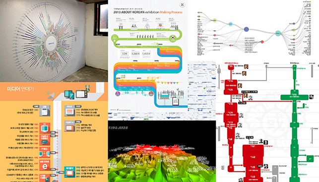
History of Korean political parties published by Kyunghyang News
Some Korean artists and creators experiment to test the influence of data visualization on social action. Random Walks and Optical Race position themselves between art, design, and information. They share their installations, online services, and prints so that people can experience data visually and physically. They create experimental art beyond media, but always with data.
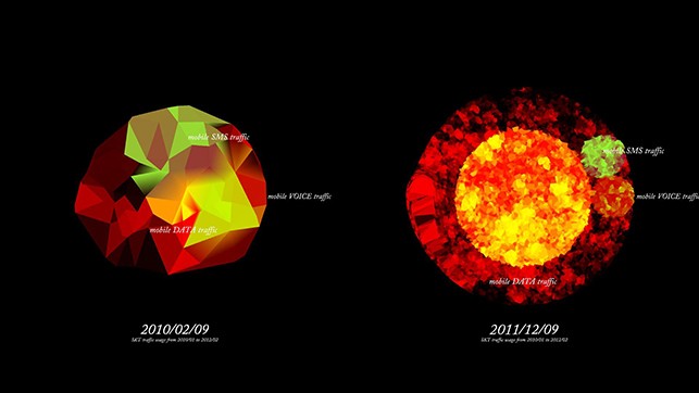
Data can be visual: South Korea mobile data traffic from 2010–12 from Random Walks
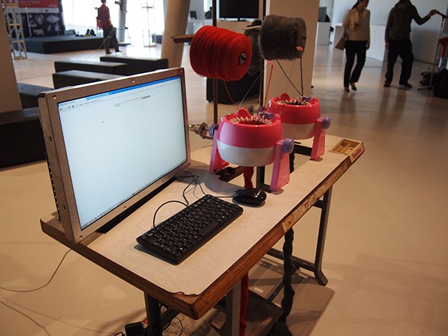
Data Currency: A hybrid knitting machine powered by online search activities from Random Walks
Probability Family: A suggested house by financial status from Optical Race
One thing we should remember when visualizing data is that biases can never be totally avoided, no matter how pure the original intention. Data, like the historical archive, is always partial and subject to the decisions that frame its collection. Data artists and designers present data to communicate what is happening in reality, but that sometimes causes unintended prejudices and preconceptions. As creators, it is not easy to eliminate subjective interpretation. This is the dilemma between data, art, and objective desires.
Sey Min is a data visualization artist and designer, who is interested in dealing with live data sets in various media formats. She makes projects that reimagine how humans relate to technologies, to societies and cities, and to environments. Combining elements of environmental studies, visual art, programming, and data storytelling, her projects range from building a real-time interactive information graphics system for a music club (Gender Ratio, 2007) to visualizing Seoul City expenditure data (City DATA: Seoul Daily Expenditure, 2014). She is the founder and organizer of Random Walks (randomwalks.org), which is a data visualization studio in Korea. Her work has been shown at National Museum of Modern and Contemporary Art, Korea; TED 2011; TEDGlobal 2012; Art Center Nabi in Seoul, and Lift Conference, and featured on CNN Asia, Lift09, and aliceon.net. Sey Min received an MFA in the interactive media from Pratt institute (2004) and worked at MIT SENSEable City Lab as an urban information design researcher. She was a 2011 TED Fellow, and selected as Senior Fellow from 2012 to 2013. Her work is also available at ttoky.com, which is written in English.