
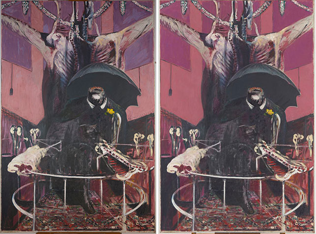
Francis Bacon. Painting. 1946. Oil and pastel on linen, 6′ 5 7/8″ x 52″ (197.8 x 132.1 cm). Purchase. © 2015 Estate of Francis Bacon/Artists Rights Society (ARS), New York/DACS, London. From left: a photograph of the painting from May 2015; Digital restoration of Painting (1946), 2015. Photoshop was used to digitally manipulate the background colors, suggesting how the painting may have looked prior to fading
With Francis Bacon’s Painting (1946) in the conservation studio for radiography, we had the opportunity to give the painting a closer look overall, checking it for changes in condition or other problems that might require conservation treatment of some sort. Since MoMA acquired the painting in 1948, it has shown vulnerabilities inherent to the materials Bacon used in its creation. Bacon purchased his linen canvas pre-primed with a white oil-based ground layer. Though later in his career he would routinely paint on the unprimed side of the commercially prepared linen canvas—as in Study of a Baboon (1952)—Painting was made on the primed side. The foreground elements were painted in oil paint, with thick impasto brushwork throughout. The pink background and purple window shades, by contrast, were made with crushed pastel or raw pigment mixed into a slurry, possibly with water, and applied by brush. Bacon explained his choice to paint with pastel as purely a result of his inability to find “Phoenician Red,” the vivid magenta color he desired, in paint form. The resulting paint layer is—and has always been—extremely fragile, prone to flaking due to poor adhesion to the oil ground, and susceptible to fading from light exposure.
It is evident from Bacon’s letters from 1946 that the fragile pastel areas were suffering from instability almost immediately following its creation and sale to the gallerist Erica Braunsen, from whom MoMA acquired the painting. In August of the same year, prior to an exhibition of the painting in Paris, Bacon wrote to his friend, the artist Graham Sutherland, thanking him for “spraying” the painting, likely an allusion to Sutherland having applied fixative to the pastel areas—which is substantiated by correspondence found in Tate Archives. Although applying a fixative is a well-documented and common practice among artists using pastel, in this case the flaking persisted over the ensuing seven decades despite Sutherland’s fixative application.
In addition to this flaking, the original pink and purple areas in the background appear quite pale, a far cry from the magenta color that Bacon sought by using “Phoenician Red” pastels. Microscopic analysis of the background colors shows that the red pigment in the background of Painting is a red-dye-based lake pigment. This type of pigment is among the most light-sensitive, so it is no surprise that the color has shifted since the painting was made. The purple window shades are made with the same dye-based pigment, with the addition of cobalt violet. Unlike the organic red pigment, however, cobalt violet is very light-stable, so when the dye-based red began to fade in the window shade areas, the overall color mix shifted toward blue; the original color of the window shades was likely closer to a raspberry color, while the pink areas were likely a more saturated magenta. The digital restoration shown above (right) is suggestive of how the painting may have appeared before the background colors had faded so dramatically.
Bacon is not the only artist whose works have altered over time as a result of the fading of light-sensitive pigments. The fading of red-dye-based pigments has been famously observed in the works of Vincent van Gogh, who enthusiastically embraced early formulations of synthetic organic reds in the late 1880s. A recent exhibition at The Metropolitan Museum of Art highlighted these light-induced changes in a series of Van Gogh’s paintings from 1890. The fading of Bacon’s materials is no different than the fading of Van Gogh’s, both being a result of photo-degradation of synthetic red-dye-based pigments. The fading is irreversible and, when observed in a work of art, is often accepted as part of the work’s natural aging process and a direct result of the artist’s original material choices. As analytical and imaging techniques advance, digital reproductions like the one above, showing what a painting may have looked like prior to light-induced fading, are being used as a way to virtually restore faded works. The Harvard Art Museums recently held an exhibition of Mark Rothko’s Harvard murals, which had suffered substantial fading from light exposure, in which the faded works were digitally restored to their original appearance by projecting a carefully calibrated image of the lost color onto the painted surface. Digital reproductions and projections allow viewers to experience something closer to the original appearance of a faded painting without altering the original materials.
In the next blog post on Painting, we will consider the evolution of Bacon’s thoughts on the painting’s faded colors and other conservation concerns.