
A finished diagram on the site with notes about underlying data
MoMA’s recently launched website, Louise Bourgeois: The Complete Prints & Books, seems to effortlessly reveal Bourgeois’s creative process. You might not suspect that a highly organized sea of intricate data lives behind that elegant design.
The collection of Louise Bourgeois prints and illustrated books at MoMA is an archive of almost 3,500 works. This multitude of art objects, produced from the 1940s until 2010, not only chronicles the artist’s work over a lifetime, it also reveals a network of themes woven with recurring subjects that restlessly hover between the blunt and the mysterious, the crude, and the nuanced. Transporting this enigmatic body of work onto a digital platform was a complex process but, with diligent analytical consideration during the initial data management, it was possible to remain true to its nature.
To accomplish this, one of the most critical steps was transforming descriptions of the artworks into discrete data. This process began with the meticulous physical examination of each object and the rigorous study of its context within the artist’s overall production. As the cataloguer, I work with the project’s curator, Deborah Wye, Chief Curator Emerita of MoMA’s Department of Prints and Illustrated Books, and my colleague, cataloguer Majida Mugharbel, to thoroughly extract these details and record them with utmost consistency.
Working out some early ideas
Distilling such data from artwork wouldn’t be possible without a close collaboration with Jeri Moxley, Manager of MoMA’s Department of Collection and Exhibition Technologies. Jeri’s role is to understand our curatorial objectives, translate them first into data management standards, and then into technical specifications for a team of website programmers. Combining my intimate knowledge of the collection, Jeri’s database management expertise, and initial visualization by the Digital Media team, we were able to arrive at several exciting innovations for the website, including its Evolving Composition Diagrams. CogApp, the developers, were then able to convert this data into the markedly straightforward illustrations of complex relationships now found on the site.
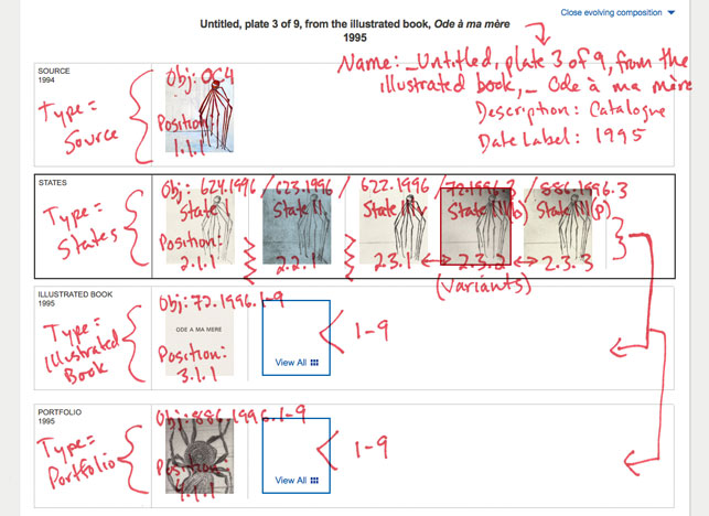
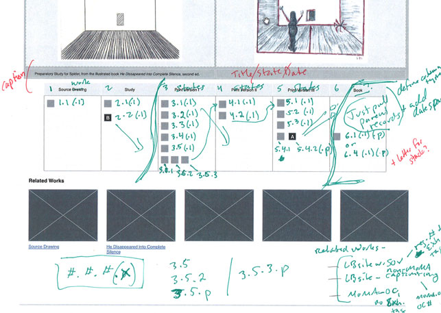
The Evolving Composition Diagrams are an interactive mapping of the artist’s creative process. They highlight one of the great distinctions of MoMA’s Bourgeois print archive: the fact that it includes not only final compositions, but also hundreds of proofs the artist made as tests, experiments, or variations along the way. These proofs open an extraordinary window into Bourgeois’s conceptualization of each work.
Once we resolved a successful visual design for the diagrams (thanks to the incredible work done by firms Kiss Me I’m Polish and Redub), it became clear there was not yet a method for achieving this design from existing data structures. Over many long hours of discussion, Jeri and I wrestled with how relationships between various types of proofs should be defined in the collections database so the information could then be leveraged into clear graphic representations. Traditional narrative descriptions of these relationships could never convey Bourgeois’s creative process so dynamically. Through our focus on this challenge, Jeri devised new procedures that MoMA had not previously explored for web projects such as this one, and we were able to break down this ambitious curatorial vision into the seeds for data visualization.
Although the Evolving Composition Diagrams are the result of complicated manipulation of finely parsed and organized data, Bourgeois’s progress on a print can be readily understood. Simply at a glance, the diagrams provide users of Louise Bourgeois: The Complete Prints & Books with remarkable access to the inner workings of one of the 20th century’s most expressive, influential, and mischievous minds.