

Cameron Platter. Life Is Very Interesting. 2007. Digital print. Publisher: the artist, Shaka's Rock, KwaZulu-Natal. Printer: Orms ProPhoto Lab, Cape Town. Edition: 5. The Museum of Modern Art. General Print Fund
It’s not common to hear an artist being described as “the delinquent love child of Quentin Tarantino and Dr. Seuss.” So when I read that about artist Cameron Platter, my interest was immediately piqued—specifically in relation to two recently acquired works by the artist, currently on view in Impressions from South Africa, 1965 to Now in the Prints and Illustrated Books Galleries.

John Muafangejo. Life Is Very Interesting. 1974. Color woodcut. John Muafangejo Foundation
Although trained as a painter, Platter now works in a wide range of mediums, including sculpture, animation, painting, drawing, and printmaking. In 2005, his work was exhibited in a Cape Town gallery in a show called Life Is Very Interesting, which included enormous drawings, a series of prints, and an illustrated book all related to an intricate story told in a digital print of the same title, now in MoMA’s collection. The title of Platter’s print is borrowed from a 1974 woodcut by John Muafangejo that depicts a man and a woman facing, but not looking, at each other. The female figure appears to grab hold of the man’s head, directing his line of sight to her heart-shaped necklace, invoking ideas of love and fulfillment. At the same time, the figures’ embrace seems to exude an uncomfortable physical tension, suggesting that love may also have its destructive qualities. As his own digital print indicates, Platter is drawn to these types of profound and indelible themes. And here’s where, I suppose, Tarantino and Dr. Seuss meet: this wordy, humorously dramatic tale exploring themes of power and corruption, good and evil, and love and sin through anthropomorphized animals that include Cat Blofelt, a greedy feline whose main goal is world domination; Harry the Crocodile; Harry’s love interest Desireé, a “femme fatale go-go girl” who is kidnapped by Yakuza Penguins under Cat’s orders; and a band of Zebras from Outer Space, who engage in a gory battle that ultimately reunites the lovers.
This highly detailed print, which measures just over five feet tall, is speckled with tiny, pictogram-like images interspersed throughout the text, much like the rebus stories we might remember from Highlights magazine. Platter admits to being “influenced greatly by children’s and ‘outsider’ art,” and even considers himself “an outsider who occasionally goes inside.” Both the text and images in Life Is Very Interesting mimic the quirky elements sometimes found in children’s drawings—a testament to the artist’s wit and impressive ability to use a seemingly simple visual language to tackle strong themes and plot elements.

Cameron Platter. The Battle of Rorke's Drift at Club Dirty Den. 2009. Colored pencil on paper. The Museum of Modern Art. General Print Fund
The last scene in the print’s narrative, “The Battle of Rorke’s Drift III, about 3079,” describes an intense struggle that alludes to an actual battle of the same name, which took place during the Anglo-Zulu War of 1879. The Battle of Rorke’s Drift at Club Dirty Den, one of Platter’s large pencil-crayon drawings, deals more directly with the event, and also is an homage to another linocut by John Muafangejo, The Battle of Rorke’s Drift (1981). In Platter’s drawing—which, with its flat, evenly blackened shapes, looks like a linocut itself at first glance—the Zulu fighters and British soldiers have been replaced by figures in a KwaZulu-Natal nightclub. The work is alive with movement, as seen in the multi-directional spears held by figures that appear to be dancing. Although the gruesome battle in the original work has been transformed into a club scene, The Battle of Rorke’s Drift at Club Dirty Den still retains a sense of chaos that is undoubtedly connected to the political turmoil South Africa has endured in its recent history. Platter’s satirical approach to reinterpreting the past through these two works is perhaps his attempt to reflect on his nation’s history through a present-day perspective.
Postscript:
I had the pleasure of documenting the installation of Platter’s stencil drawing Kwakuhlekisa (a Zulu word meaning “amusing” or “absurd”), the third of the artist’s works to be acquired recently by MoMA. The image resembles a spaceship, a motif that has appeared in many of Platter’s other works, and can be scaled up or down, as it is created from a digital source projected onto a wall. Paulette Giguere, who has contributed much of her time to MoMA exhibition installations in the past, traced the projected image onto the wall with soft vine charcoal; in her words, the process was “more about general mapping than precise delineation.” Holding an image of the work in one hand, Giguere proceeded to “fill in” the image with what the artist had specified to be a regular black color in a flat finish, using wall paint rather than acrylics. The matte finish provided some advantage in that it allowed for touching up if necessary, and didn’t record the direction of every brushstroke.
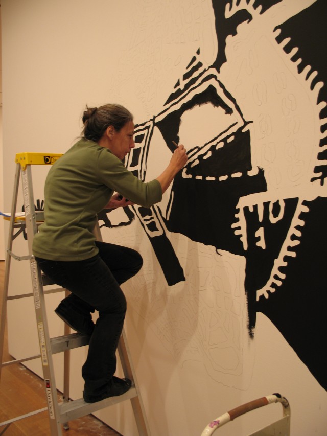
By the time the second coat was to be applied, the rest of the exhibition had mostly been installed, which gave Giguere an opportunity to study The Battle of Rorke’s Drift at Club Dirty Den in order to get a sense of the artist’s technical approach. Like this large drawing, Kwakuhlekisa emulates and pays homage to the linocut medium. It also pays homage to Muafangejo, an artist who Platter clearly admires; in a 2006 interview, he said, “When I was growing up, I had a John Muafangejo print in my bedroom and I always looked at that…I have always been fascinated by him. He was a guy who could convey a message without portraying it in a way.” In light of South Africa’s past and present-day social challenges, Platter’s spaceship has come to represent, according to the artist, the “ushering in or delivering [of] change when things get out of control on Earth.”