
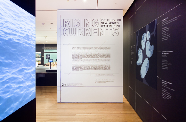
Rising Currents exhibition entrance.The exhibition's graphic design was made to appear similar to blueprints, the mode of graphic communication among architects and builders. Photo: Jason Mandella
Rising Currents: Projects for New York’s Waterfront is a unique exhibition for its subject matter, but also because of the process of putting together the exhibition. As graphic designers, it was heartwarming to have the full support of both the curator and the exhibition designer throughout the entire process. We were particularly gratified to be given the opportunity to take take our creativity beyond the title wall and into the individual displays—yeah!
Because of the five very different design proposals within the show, we knew from the beginning that our biggest challenge would be uniting the projects and presenting them in a harmonious way. We started with setting up some guidelines: one typeface throughout; three type sizes for basic information; and uniform width for the presention areas (height and depth decisions would be left up to the teams). One minor roadblock: at this point, one month before the exhibition opened, we had no idea what these presentation areas would look like! The amazing end result came together quickly and collaboratively—a combination of curator’s innovative vision, the input of an experienced exhibition designer, help from dedicated team members, and a graphic designer’s bold willingness to take on authorship of the space.
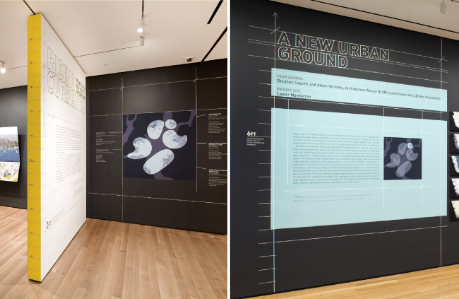
The yellow measuring tape bordering the title wall powerfully evokes the metropolitan problem of rising water levels. Photos: Jason Mandella
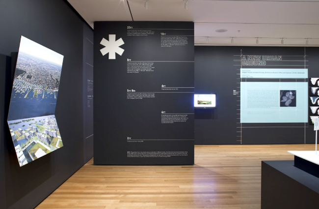
The "asterisks/glossary" wall is visually unique yet functional, making sense of complex issues through data and design. Photo: Thomas Griesel
As graphic designers, our job is essentially one of translation, making complex content digestible and accessible. In this case, the exhibition content was multilayered and data-driven, so the design needed to work particularly hard to help underscore the urgency of sea level rise and the opportunities for addressing it effectively through the architects’ proposals.
We started by thinking about how visitors were expected to interact with the space. In an attempt to create both conceptual and visual cohesion, the overall look and type treatment were made to appear similar to blueprints, the archetypical form of graphic communication among architects and builders.
The wall displaying a glossary of terms was one solution to explaining some of the underlying research and data that the teams worked with. Connecting definitions for storm surge and flood level terminology with the actual sea level measurements was our attempt to connect concepts with an experiential understanding for the visitor. Conceptually, the “asterisks/glossary” wall bordered by the yellow measuring tape captures the essence of the metropolitan problem of rising water levels; visually it served as the “book spine,” binding distinct proposals together.
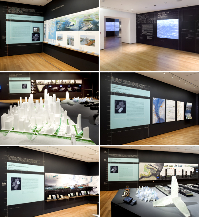
From the exhibition entrance to each individual display, the exhibition's disparate elements are united by a cohesive graphic design. Photos: Jason Mandella and Thomas Griesel