
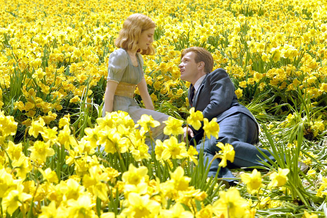
Big Fish. 2003. USA. Directed by Tim Burton. Columbia Pictures. Photo credit: Zade Rosenthal
One of the perks of having an exhibition on view is the excuse to go into the Museum’s galleries every day (one of my curatorial responsibilities is to regularly check on my exhibitions). After poring over the 700+ works in the Tim Burton gallery exhibition, I often make it a point to visit other shows (to bring my mind out of the Burton zone, as I call it), whether to take in my favorite painting (Piet Mondrian’s Broadway Boogie Woogie, by the way) or to check out a new special exhibition.
Lately, I’ve been particularly drawn to our Bauhaus exhibition (catch it before it closes on January 25!), because it includes one of my all-time favorite artists, Bauhaus instructor and color theorist Johannes Itten. What attracts me to Itten’s principles are their practical beauty and rigorous simplicity. As Leah Dickerman writes in the Bauhaus catalogue, Itten led “an effort to define the primary elements of visual form” at the school, to simplify the deconstruction of artistic impulses. He proposed a systematic and functional way of looking at color, taking into account the simple physiological fact that in order for the brain to achieve equilibrium and negate discord, the eye requires any given color to be balanced by its complementary color, leading to a pleasing effect. This harmonious design forms the basis of Itten’s color theories, which maintain that a color’s overall effect can be weakened or intensified via contrast. To illustrate his thoughts, Itten devised a color sphere (see below), which in its three-dimensional form serves as a reference for his seven color contrasts: hue, warm/cold, light/dark, complementary, simultaneous, saturation, and extension. The closer two given colors are to being diametrically opposite, the more intense the contrast between them.

Johannes Itten. Color sphere in 7 light values and 12 tones (detail). 1921. Lithograph on paper. Bauhaus-Archiv Berlin
Visiting all of the Museum’s various exhibitions day after day, one finds that the vein of modern art pulsates throughout this place and connects all artists in one form or another. It is easy to see Itten’s color theories in practice in Tim Burton’s films—especially Itten’s discussion of complementary contrast in The Art of Color: the subjective experience and objective rationale of color, wherein he declared that complementary colors “incite each other to maximum vividness when adjacent.” In Burton’s films, there often exist simultaneously two distinct worlds, one foreboding and one inviting, and color helps to delineate their contrast. The “real” world is depicted with a monochromatic and desaturated color palette, while the “other” world (whether imagined, fantastic, or supernatural) is saturated with color. The pleasing effect of the “other” world is achieved not only by the mere presence of color, but also through the pairing of colors that appear opposite each other in Itten’s color sphere. It is this simple contrast between the two that makes each so dramatic in impact.

From left: Charlie and the Chocolate Factory. 2005. USA. Directed by Tim Burton. Warner Bros. Pictures. Photo courtesy of Warner Bros. Pictures; Corpse Bride. 2005. USA. Directed by Tim Burton. Warner Bros. Pictures. Photo courtesy of Warner Bros. Pictures