
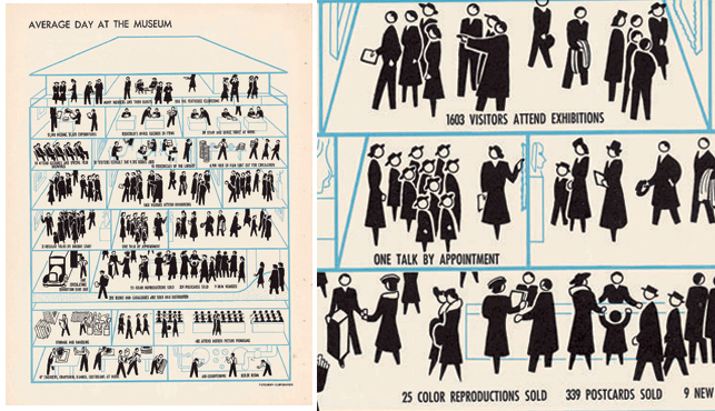
Left: Diagram, Average Day at the Museum: The Year's Work: Annual Report to the Board of Trustees and Corporation Members of the Museum of Modern Art for the Year June 30, 1939–July 1, 1940. Annual reports 1931–40. MoMA Archives. Right: Detail.
An average day at the Museum, which appeared in MoMA’s annual report in 1940, was designed by the in-house graphic design department as a way to show the diverse activities taking place at the Museum. The design has been resurrected in recent years on products such as totebags and notepads in the MoMA Design Store. We always liked this infographic, and wondered what a cross-section of MoMA would look like today, seventy years later? Christoph Niemann, whose illustrations appear in The New Yorker and on his NYTimes.com blog Abstract City, was the perfect candidate to update the illustration for 2009. While the activities stayed roughly the same, the physical space has changed drastically. For this post I asked Niemann to shed some light on his process and the challenges involved in creating this new illustration, which we used to announce this year’s fall exhibition season.

Illustration by Christoph Niemann. 2009.
What was your initial reaction to the 1946 infographic?
I am a great fan of this very reduced graphic approach. What I especially liked was using such a restrained visual language for a museum, where one would not necessarily expect this.
What did you deliberately change and why?
I wanted to play with the actual works of art. Like most people I have my personal favorites in the collection, and one of the greatest treats is always coming back to them and almost developing a personal relationship.
What was your biggest challenge in this illustration?
I wanted to get away from the very dry perspective of the original design. The problem was that if I created a setup that was loosely inspired by the actual MoMA floorplan, but took great liberties (which I would have had to do), I was afraid the reader would get confused. I was very relieved when I came up with the idea of the floors made out of the letters MoMA, since it is slightly reminiscent of the actual architecture, but obviously an invention that is not to be taken literally.
Which of the artworks that you integrated in the illustration do you think is the most surprising in terms of location?
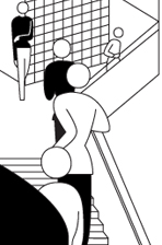 The hardest one to fit in was certainly the Bauhaus Staircase, since i had to change the perspective and the composition, while trying to still keep the image recognizable, but i like that it now barely stands out and blends in with the architecture and the people. The most enjoyable ones were the small elements that I added t the very end, like the [Odilon] Redon spider or the [Salvador] Dalí watch (above the subway).
Did you run into challenges to draw the actual artworks, and which ones were the most challenging to make an abstraction from so it was still recognizable?
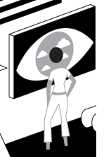 I went through a lot of versions with the Chuck Close. I am so mesmerized by his art and the play between photographic realism and utter abstraction. Creating another layer of abstraction on top of all that is pretty difficult, and I can’t really tell if I succeeded (though I can say that I had fun trying). The most satisfying ones were the elements where the audience and the artwork interact, like the [René] Magritte (the woman standing in front of the eye) and the [Henri] Rousseau (the visitor looking at the assortment of plants with the lion).
__
The online version of Niemann’s illustration allows you to discover the thirty-eight artworks that he cleverly integrated into the structure and the activities happening there. By clicking on each artwork you can compare the abstract representation with the actual artwork in the collection.
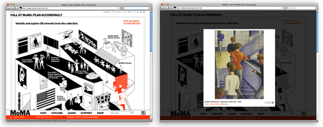
Screenshots of the online version on moma.org/fall