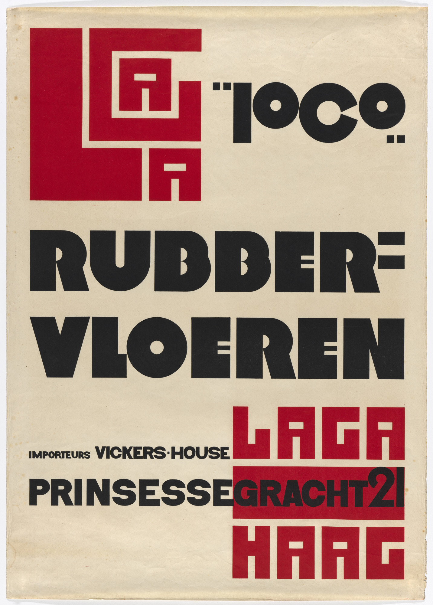
Curator, Ellen Lupton: Piet Zwart was a Dutch architect and he designed interiors, and products, and furniture throughout his whole life. But in the early 20's, he discovered graphic design and we're looking at a poster of his for rubber flooring, in which he used the tools of the architect to draw all of his letters—so, he used a triangle, a T-square, a compass.
In the upper left-hand corner, you see this big logo that spells out the word Laga, which is one of the companies being advertised. He was inspired to try to create letterforms that conform to that pure geometry of right angles. Some of the other letters conform to the perfect circle. So, he was trying to find a kind of ideal geometry that was related to contemporary architecture.
Throughout his life, Piet Zwart was a very committed socialist. He was very concerned with the rights of workers. But he was also a commercial designer. He did posters for bread, and butter, and ham, you know, things that we would find in the supermarket. He brought his avant-garde design mentality to promote this material of everyday life.