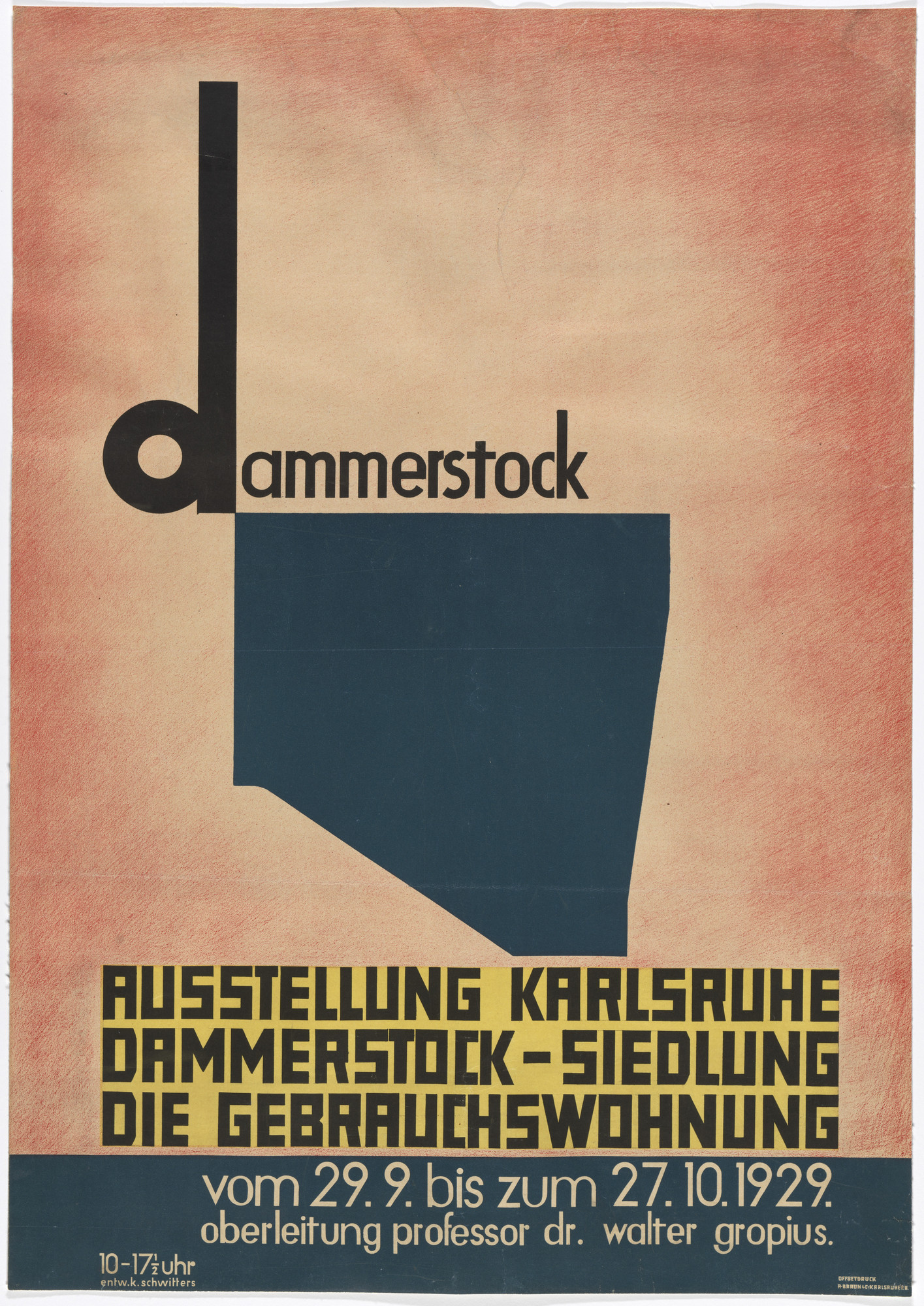
Curator, Juliet Kinchin: One of the projects that Schwitters' Merz publicity agency undertook was the design identity for a housing estate exhibition, the Dammerstock Housing Estate. Schwitters actually takes the outline plan of the Dammerstock housing estate and attaches it to the letter "D" of Dammerstock. So, it's this idea of the synergy between topography and architecture at that time. And it's also about creating a graphic identity that wasn't just about the poster for the exhibition, it was the labels, the tags, the envelopes, the letterheads, the entrance tickets. And giving the whole event this very unique and clear identity.
But I think for Schwitters, graphic design became one of the frontiers through which modernism, he felt, could enter society at large. He very much wanted to take his ideas into the public realm. He saw text and topography as one of the great ways of confronting bourgeois life.