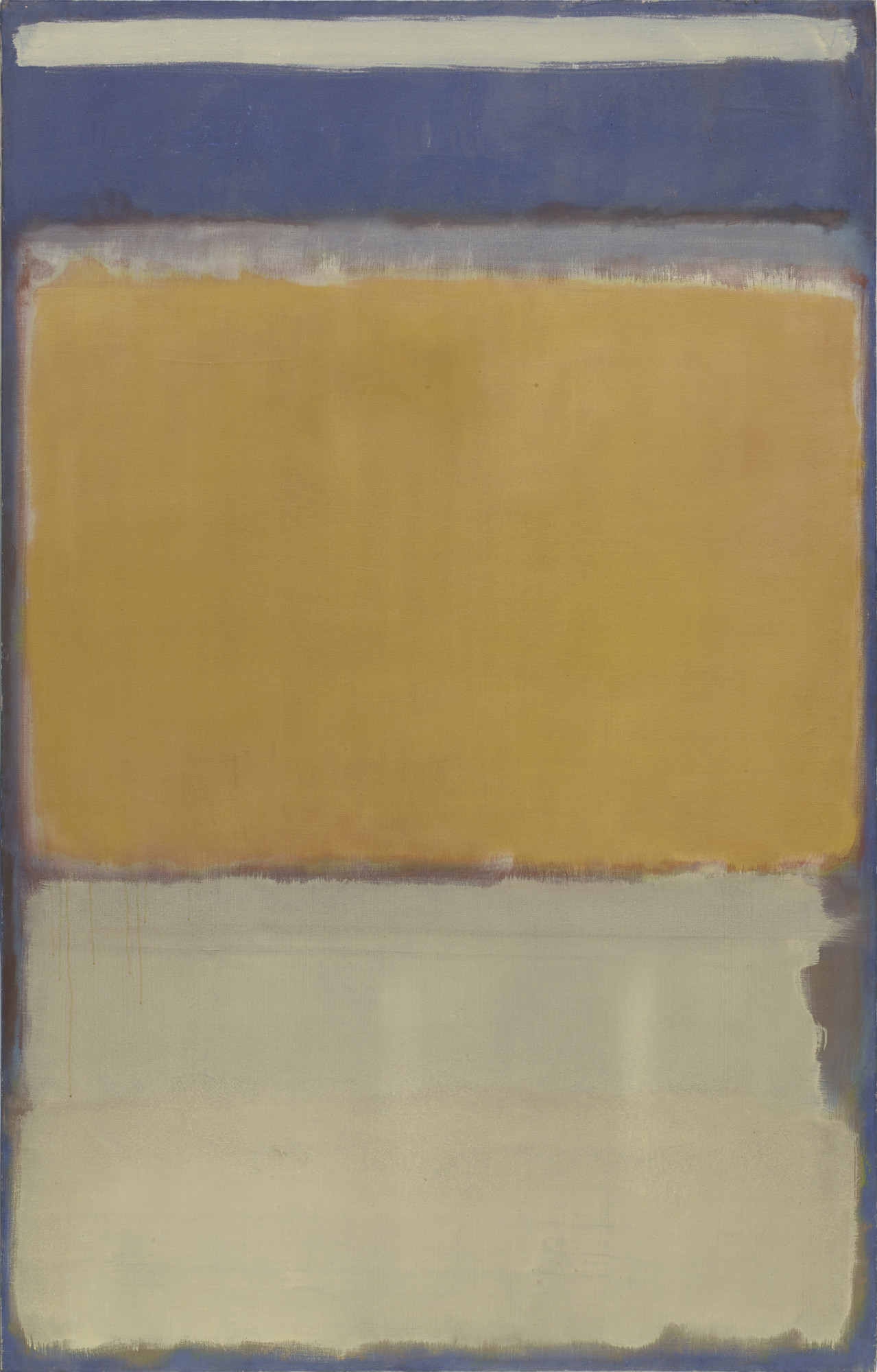
Narrator: The artist Mark Rothko made No. 10 in 1950, using oil paint on canvas. The work measures about 7.5 feet high and five feet wide. In metric units, it’s about 2 meters high and 1.5 meters wide.
This rectangular, vertically-oriented abstract painting is around the size of an extra-long full-size mattress. And because of this large scale, it might seem to envelop or immerse us. The work consists entirely of white and yellow rectangular bands or blocks that seem to float atop a sweeping field of indigo. These colors layer and overlap, forming a vertical stack with distinct zones. Let’s describe them, moving from top to bottom.
Near the top edge of the canvas, there’s a thin band of chalky white, about three inches in height. Traveling down, the indigo background shows through, creating a thicker band of deep purplish-blue—about a foot in height. Below that is the thickest block: a warm golden yellow that, which, about four feet high, occupies almost half the canvas. Finally, closest to the bottom, there’s a thick cream-colored band—about two-and-a-half feet high—which takes up the final third of the canvas.
At first glance, these bands feel somewhat separate and simplistic. But as we approach the painting, we begin to discover layers of hues that are quite complex.
To make this painting, Rothko first covered the entire canvas with a thin layer of indigo. Then, on top of that purply-blue layer, he built up additional blocks or bands of contrasting colors. However, none of the bands quite reach the painting’s edges, so about an inch of that deep indigo background borders the entire picture, almost like a thin frame.
Importantly, though, these color bands are not perfect rectangles. Their edges are blurred and irregular, exposing the artist’s hand-painted brushstrokes.
Here’s the artist’s son, Christopher Rothko, explaining his father’s painting style:
The Artist's Son, Christopher Rothko: You have to look really hard for a true rectangle. They're always rounded, softened, cut off suggestions of rectangles. And I think in doing that, he is always emphasizing the humanness of the painting.
Narrator: Exploring the perimeter of Rothko’s feathery blocks, we can deduce something else about the artist’s technique. Because it is around these edges that we notice different colors peeking through. For example, if we focus on the edges of the yellow block at the painting’s center, we discover a red underlayer. Additionally, a passage of blue seems to skim the top edge of the block, which is also stained with a chalky diluted mixture of white paint.
Christopher Rothko: I think it's in those transition points between the rectangles where you have the sort of feathery end of one rectangle, and the feathery beginnings of another, and juxtaposed with the background color. That's where the real electricity is.
Narrator: Even if we move away from the edges and observe the yellow band as a whole, we’ll notice that the top layer of yellow paint is actually thin and slightly translucent in places, so that the red underlayer transforms the yellow into a warm, golden color. These moments of transparency occur throughout the entire work, as Rothko mixed his paint with a lot of solvent, diluting it into these thin washes of color that build up over multiple layers.
And because Rothko’s paint was so diluted, it sometimes dripped down the canvas. And we can notice that happening here. There are at least seven long, thin drips of dark mustard paint originating from the yellow band’s lower left corner. The longest one drips about halfway down the thick cream-colored band below.
Christopher Rothko: Sometimes he would actually turn the painting upside down so as to be able to paint the top section more easily, which, of course, makes us all crazy when we try to figure out which way is up, and the drip marks are going both directions.
Narrator: Rothko made work in a style known as “color field painting,” which is characterized by flat, expansive areas of stained colors. For him, this was a way of arriving at pure emotions. He once said: “I’m not interested in relationships of color or form or anything else. I’m interested only in expressing basic human emotions — tragedy, ecstasy, doom, and so on.”
We invite you to reflect on the colors in this particular painting. How might the warm yellow and creamy white play with the cooler tones in the purple-blue background? What emotions or effects might this contrast evoke? If the painting could make a noise, how would you characterize the sound of these colors coming together?